| Image |
Comment |
| 01/17/2005 10:35:54 PM |
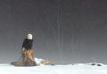
Portrait of Majestyby CantiqueComment: Great composition, and love that fog! I'd have cloned out that twig on the right and darkened the bird's plumage just a bit, and maybe blurred (or NoiseNinja/NeatImaged) the background just a tad - 7 |
 Photographer found comment helpful. Photographer found comment helpful. |
| 01/17/2005 10:29:19 PM |
Haunting Sunsetby vtruanComment: Extraordanary subject! Too bad about all the chromatic noise, you could probably control it somewhat using tools like NoiseNinja or NeatImage. Also, I'd crop half an inch or so off the bottom. 7 |
| Photographer found comment helpful. |
| 01/17/2005 10:25:23 PM |
Sweet Waterby dwterryComment: Bet this would have done really well in the "Centered Composition" challenge! 7 |
| Photographer found comment helpful. |
| 01/17/2005 10:24:05 PM |
Seahorseby JamesterComment: Wonderful subject and very well composed. Just wish the whole head had been in focus - 7 |
| Photographer found comment helpful. |
| 01/17/2005 10:20:45 PM |
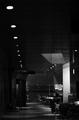
lumière de soiréeby Ecce_SignumComment: Gorgeous lighting. A narrower (and same thickness all around) border would have been better (640 is small enough as is!) 7 |
| Photographer found comment helpful. |
| 01/17/2005 10:17:52 PM |
Retroby AnastasiaComment: Technically immaculate! And love that mole, and how the lighting gives it extra contrast by putting it right in the middle of a highlight - 10 |
| Photographer found comment helpful. |
| 01/17/2005 10:12:36 PM |
Dancer of the Seaby lilnukeeComment: Love the sharp black tentacles contrasting with the diaphanous bright body. Being such an engaging subject, I wish it occupied more of the frame - 7 |
| Photographer found comment helpful. |
| 01/17/2005 10:07:10 PM |
Lightning Lacesby Geo_GriffinComment: As I mentioned first time around, fantistically imaginative photo! Last time I thought the neon effect was too much, this version is defiinetily better - 9 |
| Photographer found comment helpful. |
| 01/12/2005 10:47:06 AM |
Late afternoon coffeeby helgihelgiComment: Definitely deserved a higher score, I still think this is one of the best in the challenge. Something about it that makes me think it would make a great poster. |
| Photographer found comment helpful. |
| 01/10/2005 12:29:22 AM |
The Players Edgeby GolferDDSComment: Superb idea! Somehow the photo looks like the ball is just pasted into a blurred image, but the idea is so good I'm giving it a 7 anyway. |
| Photographer found comment helpful. |
Home -
Challenges -
Community -
League -
Photos -
Cameras -
Lenses -
Learn -
Help -
Terms of Use -
Privacy -
Top ^
DPChallenge, and website content and design, Copyright © 2001-2025 Challenging Technologies, LLC.
All digital photo copyrights belong to the photographers and may not be used without permission.
Current Server Time: 08/08/2025 10:51:48 AM EDT.