| Image |
Comment |
| 10/18/2003 07:05:26 PM |
|
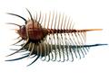
| 10/18/2003 07:04:19 PM |
Circumference = 2 * Pi * Radiusby basia03Comment: The idea is okay although a different POV (I'm thinking of a higher one) would have brought much more appeal to the photo. A major weakness is the amount of sharpening; there is too much of it. |
 Photographer found comment helpful. Photographer found comment helpful. |
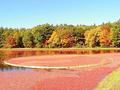
| 10/18/2003 07:00:39 PM |
Revealing the Pastby kjensenComment: There is too much going on in this picture. It is very hard to decide what to view; i.e. there is no clear subject. It would have been better if you got up closer and showed us part of the rock in more detail.
Other things which could be improved is the saturation (too much) and sharpness/ focus. |
| 10/18/2003 06:57:40 PM |
|
| Photographer found comment helpful. |
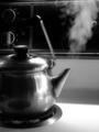
| 10/18/2003 06:56:30 PM |
100 º Cby mariomelComment: A nice idea: the steam looks like it is almost in motion. I like the composition. The choice of colours works very well with the kettle. Unfortunately the background is distracting. I think it would have been better to get rid of it; it would give the photo much more appeal. |
| Photographer found comment helpful. |
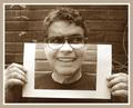
| 06/25/2003 02:35:04 AM |
Me & myselfby pikytoComment: pikyto congratulations with your fourth place.
Cheers,
KING aka Traveller |
| 06/20/2003 03:23:53 PM |
Look Deeper.by GeocideComment: The way how you blend in the background is very nice. The expression, light, focus and composition makes this one of the better photo this challenge. (8) |
| Photographer found comment helpful. |
| 06/20/2003 03:23:43 PM |
A Canvas Upon Which to Drawby danh669Comment: While nude males don't attract me at all, I do think that you have made a very good and tasteful image. The choice of colors is great. The composition is wonderful. It almost looks as though you're trapped between the borders of the photo. One of my favorites this week. (8) |
| Photographer found comment helpful. |
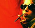
| 06/20/2003 03:23:33 PM |
cigarettes will kill you...by aimster702Comment: Very stylish! The choice of colors is great just like the light. They provide an appealing contrast. What could be improved? The wrinkles in the red cloth are a little distracting and I don't understand the pencil (maybe a real cigarette would have been better?) (8) |
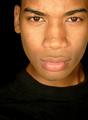
| 06/20/2003 03:23:24 PM |
Whiteby rll07Comment: You achieved a nice contrast between yourself, your clothes and the background. Well done. (8) |
Home -
Challenges -
Community -
League -
Photos -
Cameras -
Lenses -
Learn -
Help -
Terms of Use -
Privacy -
Top ^
DPChallenge, and website content and design, Copyright © 2001-2025 Challenging Technologies, LLC.
All digital photo copyrights belong to the photographers and may not be used without permission.
Current Server Time: 08/19/2025 11:17:45 AM EDT.