| Image |
Comment |
| 05/21/2004 11:32:55 AM |
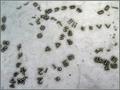
Going Against the Flowby GPComment: I tried but I just could not see what you were going for here. I don't see how this meets the challenge. How is it a habit? There isn't much happening aesthetically either. |
 Photographer found comment helpful. Photographer found comment helpful. |
| 05/21/2004 11:31:52 AM |
Boob Tube Habitby chik0325Comment: There really isn't much going on in terms of aesthetics here. It's a picture of a television showing a Tom and Jerry cartoon. It doesn't give the viewer anything 'new' to look at. |
| 05/19/2004 11:29:07 AM |
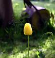
Tulipby Ecce_SignumComment: There are some weird globular shapes to the left of the flower that are extremely distracting. The machinery (a lawnmower?) in the background is also distracting. Nice focus and detail on the flower. |
| Photographer found comment helpful. |
| 05/19/2004 11:24:32 AM |
The Dawn Of Timeby wkoffelComment: It's dead center but the subject is dull.
Edited for clarity: Sorry, I was looking over your entries and I saw my rather blunt comment. I think my problem with this image had to do with the relevence of the watch and the dart board. I had originally meant to make a comment to this effect. I don't know why I came up with something so terse (perhaps I was feeling grumpy about my own entry which I regretted entering pretty immediately) From a strictly graphic view, this composition is interesting. It may have worked better if the dart board had been a bit more colorful. As it is there is very little interest in terms of color. The black provides the only real contrast. The texture provides some interest. I think my biggest issue is that there doesn't seem to be any reason to have the watch there except it happens to fit smack dab in the middle and looks kind of cool. Sometimes looking cool is good enough (that was what my '40' photo was all about). I think if this were much larger it would have more impact. Message edited by author 2004-06-04 00:03:35. |
| Photographer found comment helpful. |
| 05/19/2004 11:23:08 AM |
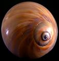
Snailby PoobaComment: This is a nice shot. The hot spot to the left is not great. There is also a bit to much highlight at the center of the snail. Which brings me to the challenge guidelines. They specified dead center. To my eye, the main visual element of this shot is the center of the spiral. You've placed that to the right of the frame. |
| Photographer found comment helpful. |
| 05/19/2004 11:21:17 AM |
Capitol Reflectionby kostiaComment: This is a nice shot. I like the reflection. It's a bit contrasty. This shot is horizontally centered but the challenge specified dead center, which in this shot would be somewhere around the strip of lawn---not the main visual element. I gave this a five. |
| 05/19/2004 11:18:59 AM |
|
| Photographer found comment helpful. |
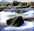
| 05/19/2004 11:18:03 AM |
Standing Stillby oskarComment: This is a nice shot but the main visual element (to my eye, the rock in the foreground) is only horizontally centered.The challenge guidelines specified dead center so, in fairness, I shaved a point of for that. I gave it a five. The water looks great but the rocks are very contrasty. |
| Photographer found comment helpful. |
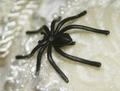
| 05/19/2004 11:14:53 AM |
Crawling Around My Lifeby mirdonamyComment: It's centered but the subject is really uninteresting. Maybe if it wear a real spider. The choice of a sweater or afgahn for the background was kind of odd. |
| Photographer found comment helpful. |
| 05/19/2004 11:13:46 AM |
|
Home -
Challenges -
Community -
League -
Photos -
Cameras -
Lenses -
Learn -
Help -
Terms of Use -
Privacy -
Top ^
DPChallenge, and website content and design, Copyright © 2001-2025 Challenging Technologies, LLC.
All digital photo copyrights belong to the photographers and may not be used without permission.
Current Server Time: 08/27/2025 12:48:24 AM EDT.