| Author | Thread |
Comments Made During the Challenge  |
|
|
05/21/2004 06:16:46 AM |
|
clever thinking nice image and detail |
|
 Photographer found comment helpful. Photographer found comment helpful. |
|
|
05/19/2004 11:24:32 AM |
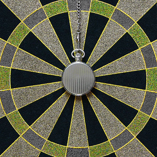
It's dead center but the subject is dull.
Edited for clarity: Sorry, I was looking over your entries and I saw my rather blunt comment. I think my problem with this image had to do with the relevence of the watch and the dart board. I had originally meant to make a comment to this effect. I don't know why I came up with something so terse (perhaps I was feeling grumpy about my own entry which I regretted entering pretty immediately) From a strictly graphic view, this composition is interesting. It may have worked better if the dart board had been a bit more colorful. As it is there is very little interest in terms of color. The black provides the only real contrast. The texture provides some interest. I think my biggest issue is that there doesn't seem to be any reason to have the watch there except it happens to fit smack dab in the middle and looks kind of cool. Sometimes looking cool is good enough (that was what my '40' photo was all about). I think if this were much larger it would have more impact.
Message edited by author 2004-06-04 00:03:35. |
|
| Photographer found comment helpful. |
|
|
05/18/2004 08:32:01 PM |
|
Is the dartboard-like pattern supposed to be symbolic of sun rays? I would rather see the face of the pocketwatch vs the backside. Contrast seems a bit dark. |
|
| Photographer found comment helpful. |
|
|
05/18/2004 01:11:13 PM |
Exceptionally wonderful "mandala-like" image. The back of the watch - with the vertical lines changing color midway is superb. (How many folks asked you why you didn't show the front?)
There absolutely no doubt about its "centeredness" - micrometer gang will go nuts. Wonderful selection of colors, textures.
Basically a "perfect" image that should be way up in the standings. Thanks for sharing it. |
|
| Photographer found comment helpful. |
|
|
05/17/2004 09:41:49 PM |
|
i'm drawn to the shadow reflected in the watch, but it's an awesome shot ... 9 |
|
| Photographer found comment helpful. |
|
|
05/17/2004 06:59:19 PM |
|
| Photographer found comment helpful. |
|
|
05/17/2004 06:51:26 PM |
|
Pretty cool shot here. Nothing wrong with the shot but I may have had the face of the pocket watch open to present a little more detail. It might even be cool to have had the face open and expose a broken watch (glass part) to give a Chaos in the middle of organization type feel. |
|
| Photographer found comment helpful. |
|
|
05/17/2004 06:01:09 PM |
Good sense of some sort of texture, though it might well be due to processing rather than your shot, as far as it looks. God, what an awful attempt to say what I mean :-)
There is interest here; but it isn't a shot that does anything for me photographically, must be final judgement. 4 |
|
| Photographer found comment helpful. |
|
|
05/17/2004 04:52:26 PM |
|
I recognize it as a watch, but why didn't you show the front of it?? Even when you've called the picture 'dawn of time'... Further: smart use of two objects that together create an almost surreal sphere (I realy would have liked seeing the numbers..), but a bit boring colouring..great idea though! |
|
| Photographer found comment helpful. |
|
|
05/17/2004 02:17:08 PM |
|
I like the idea, and title..but there isn't enough contrast to make this shot interesting for the eye. The cool colors all run together. You did a good shot with the shot. |
|
| Photographer found comment helpful. |
|
|
05/17/2004 01:20:51 PM |
Challenge centered –10
Creative – 7
Appeal (is it interesting?) –6
Technical -10
score 8
|
|
| Photographer found comment helpful. |
|
|
05/17/2004 07:11:19 AM |
|
I was waiting for the dartboard shot, but was expecting 2 darts in the bullseye, not a watch. Not sure how this picture makes me feel, since I can't see the Dawn in the picture. Nothing I can say is wrong with the picture, but it just doesn't seem interesting to me. |
|
| Photographer found comment helpful. |
Home -
Challenges -
Community -
League -
Photos -
Cameras -
Lenses -
Learn -
Help -
Terms of Use -
Privacy -
Top ^
DPChallenge, and website content and design, Copyright © 2001-2026 Challenging Technologies, LLC.
All digital photo copyrights belong to the photographers and may not be used without permission.
Current Server Time: 06/29/2026 01:18:36 AM EDT.