|
|
|
Showing 3251 - 3260 of ~3604 |
| Image |
Comment |
| 05/28/2003 07:47:47 AM | Evolve by VipermikeComment: Nice trick, nice photo, nice scoring - and you didn't get a single '1' (which is really rare). Two 3rd's, one 2nd - what's next - another 2nd or are you going straight for the top? |
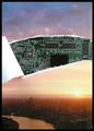
| 05/28/2003 06:39:24 AM | You think that's air you're breathing now? by e301Comment: Oh my - what a fabulous feeling. Whoooo.
I thought as soon as I got the idea (and that was almost as soon as I read the challenge) that it would be a winner, provided I could control the reflections in the glossy paper - and that proved to be no problem. Had to drop more of the tear than I wanted due to it saying 'Epson' on the back. What I didn't expect was to be up in this rarefied air of 22nd ever (and 3rd with the 602z).
JJ - the air feels great, as you should know very well!
Fiver - unlucky - it's a Creative/S3 Savage 4 :-)
One thing no-one picked up on that really bothered me: the perspective distortion of the video card beneath the picture (I couldn't shoot from directly overhead because of reflections, nor could I tilt the set-up). There actually is that same distortion in the sunset, but it doesn't register, and I thougght it clashed visually.
Anyhow - huge thanks for all the votes: you've all made me outrageously happy.
PS. and when i checked in this morning, hoping like crazy there wasn't anything to beat it, the site was down! Pure agony for about an hour :-) Message edited by author 2003-05-28 07:07:29. |
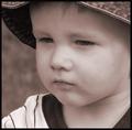
| 05/27/2003 07:11:45 AM | Deep Thinkerby karmatComment: Not sure that a pure black and white wouldn't have been more effective - the tone you've chosen gives a very odd cast to the skin-tones, especially around the mouth area. Nice study though. |  Photographer found comment helpful. Photographer found comment helpful. |
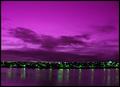
| 05/25/2003 07:55:37 AM | In the absence of orangeby tyrkinnComment: Critique Club
Hi Haraldur
I like the idea behind this shot - in many ways perhaps the most imaginitive I've seen from this challenge: just take a normal image, and adjust out until you have two secondary colours - it's added interest to what would perhaps be a pretty ordinary scene whilst sticking completely to the challenge.
Whilst 5.5 is an acceptable score in my eyes, and 63rd a pretty good placing, I think it's the original shot rather than the processing that has kept the score down, and I think the problem with that shot is the composition - there are no verticals here at all, nothing really to disturb the horizontal lines other than the points of streetlighting. The cloud pattern is interesting, but not very interesting, and the reflections in the water likewise. I think perhaps also the horizon is set too low - that top area of sky doesn't really add a great deal to the image. I'd like to have seen it cropped or framed much closer in to the town, to let some real detail come out - you could even have made a feature of the progression from water to town to sky in a portrait composition, which would have been quite striking.
Interesting shot though - and a top idea. With a really dynamic base image you could have been in ribbon territory I think.
ed
| | Photographer found comment helpful. |
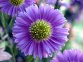
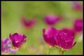
| 05/25/2003 07:29:17 AM | Purple Explosionby pirelandComment: Hi Paul, your critique club moment is at hand ...
First entry, huh? I shall be gentle with you :-)
One thing really jumps out of this image at me, and that is the light. The exposure is perfect to capture it (this after all, is what taking a photograph is), and it's from that that the tonal range of both the purple and the green is so rich and so wide. Remarkably good detail for a low-light handheld shot too.
As others have commented, the petals do seem to be just fractionally out of the field of focus - I could see a reason for this, given your title: to aid the illusion of a bursting out of something, but if that were the case I don't think you've gone far enough with it, so what it looks like now is that you've not quite got it right. Very close, perhaps half a stop more aperture, or perhaps I mean less - f/4.0 say.
Compositionally the two background flowers are good too - give a dynamic to what would otherwise have been purely a flower portrait. The brightness ot the right of frame is a pity - pulls the eye away from your primary subject: a shame you couldn't have shaded it with something (though you'd fall foul of the school of 'mustn't tamper with nature').
This is good work, and is a good result for a first challenge - hope you'll submit many more, I'll be interested to see your approach to other subjects.
Ed |
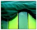
| 05/25/2003 07:12:47 AM | ice cream hutby deceptiveComment: Have come back to this shot from just browsing around the site: really like it now, much more than I did at the time of voting. Two contrasts going on, betweeen the shades of green and the textures, and both excellently brought out. I'd guess it didn't score better because you only used one colour, but I'm not that much of an expert on the dpchallenge communal mindset. Now if those darker panels had been orange ... :)
Ed | | Photographer found comment helpful. |
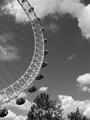
| 05/25/2003 06:48:06 AM | Quarter-Eyeby mbardeenComment: Such an interesting subject the eye, aspecially as you get closer to it. Those damn trees are a pain though, I think: never quite present enough to really help the composition, and almost impossible to get out of sight. This is a good shot though: love the way blue skies go black in b/w photography.
Ed | | Photographer found comment helpful. |
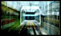
| 05/24/2003 11:01:27 PM | Hyper Driveby DennisFComment: In a way, I can't see this as an interpretation of the movie - however, I like it so much that hardly matters: it has an impression of the effects from the film. Love the colours, the motion (is it a multi-exposure?), and the wierdness of the viewpoint. would have done wonderfully in the transportation challenge. 8 | | Photographer found comment helpful. |
| 05/24/2003 10:10:49 PM | Impressionist canvasby GordonComment: Hi Gordon, your Critique Club moment is at hand ...
I'm not really going to make any technical comments - you're obviously fully in control of your camera and get pretty much the image you chose.
So I get to be artistic. The first thing that struck me was the odd mirror-like feeling with the two flowers bottom right (and this gives the lie slightly to you 'unconventional composition' comment: the TWO of them are right on the thirds line). I find that a quite alluring effect - though it's disturbed by the left of frame flower, which moves into the field rather than existing wholly within or out of it as do the others. That, visually, produces a tension that might otherwise have been missing from the shot.
The in-focus flower does have the fragility you speak about - perhaps most because of the light - that direct sunlight (presumably), emphasises the thinness of the petals, the transparency of them, the fact that they are so breakable - rather than the effect of the 'accepted' diffused light which simply brings out the colour. This i think works well with the previous observation - that movement through the field of focus is contrasted again with the fragility here to make another tension; a friend once said about making radio programmes that one should never produce anything where only one thing is going on.
What there also is here is some sort of evolution of shape: as the flowers come into focus, there's an intersting progression from complete blob to the complex definition of the flower; a little like watching it grow.
Which is enough for now: that's an attempt to be specific about why I like this shot - I didn't vote, and couldn't tell you what I'd have scored it, as I doubt I'd have spent as long looking at it as I have now.
a down-side (there has to be one): the 'other' colours in the background - I think it would have been cleaner, and keot attention more purely to the flowers and those purple shapes, had there been simply green in the background, and not the white and pale purple moments too.
Good luck
Ed
| | Photographer found comment helpful. |
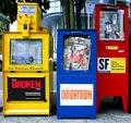
| 05/24/2003 03:56:43 AM | Pri, Mary and Colorsby Pep VentosaComment: Critique Club
Think this scored pretty well - one of those shots I don't understand why it did so well. The things that bother me: the barrel distortion, the confusion of the background and the stickers, and the relative positions of the boxes themselves.
Obviously the colour is fine, focus is fine, and challenge appropriateness is good. My immediate reaction, and after looking for a while it hasn't changed, is 'it's just a photo of some newpaper dispensers', and there's nothing there that makes it any more for me: perhaps if you'd included MORE background you could effectively have contrasted the colour with the rest of the street? Or perhaps a more unusual angle to shoot from would have helped.
I just find that very head-on shot, well, boring, I'm afraid. This is not to say that it isn't an entirely competent shot, but it doesn't have anything unusual about it.
It's ocurred to me that the barrel distortion may have been deliberate - in which case I think you need more of it: here is looks like an accident I think.
Just my opinion, of course; 5.6 is pretty respectable :-)
Ed |
|
Showing 3251 - 3260 of ~3604 |
Home -
Challenges -
Community -
League -
Photos -
Cameras -
Lenses -
Learn -
Help -
Terms of Use -
Privacy -
Top ^
DPChallenge, and website content and design, Copyright © 2001-2025 Challenging Technologies, LLC.
All digital photo copyrights belong to the photographers and may not be used without permission.
Current Server Time: 08/07/2025 04:24:59 PM EDT.
|