| Image |
Comment |
| 02/18/2004 05:29:43 AM |
Survival from Deathby PDavisComment: Good contrast of subject, but the framing of them lets this down. Also the moment of light you've chosen - I get no real sensation of variation of texture between these two things. |
 Photographer found comment helpful. Photographer found comment helpful. |
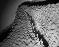
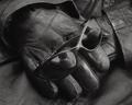
| 02/18/2004 05:27:53 AM |
Rawhideby DJLubaComment: Good. Almost nothing but texture. Like the low-key, like the suspicion of movement within the leather, perhaps the suggestion of it having formed to s body, and those creases being an echo of that person. Perhaps too close to the abstact, too minimalist to do well here; and also to hold my interst very long, I'm afraid. Competent stuff though. |
| 02/18/2004 05:25:17 AM |
Starfishby ladpupmoeComment: This may be the first time I've seen a shot with on-board flash that actually achieves some quality of texture :-) makes it look very hard - though as it's presumably dead that's probably accurate. The top shadow is a shame - constantly pulls the eye away from that in-focus area where I think, for this challenge, you'd want the eye to rest. Actually, in classicla composition terms, you have leading lines working against your area of interst, which is what makes this a little unsatisfying despite the good texture. |
| Photographer found comment helpful. |
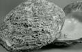
| 02/18/2004 05:21:16 AM |
Whetstoneby ArmadilloComment: Interesting thinking - and at least trying to do more than one thing. Compositionally a bit blunt (did you try positioning the knife further left in frame?), and the texture of the stone is not well shown - no sensation of that light graininess of it, for me. |
| Photographer found comment helpful. |
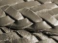
| 02/18/2004 05:18:58 AM |
Leather Beltby bil99Comment: Lighting seems a bit too head-on to really emphasise the texture. Some feeling of rough/smooth with those edges and surfaces survives, however. Perfectly well in focus, but seems to lack that edge of detail - processing? camera? don't know... |
| Photographer found comment helpful. |
| 02/18/2004 05:16:50 AM |
Will she get ready again?by maelmsComment: Intersting graphically - but I think it's a question of colours here rather than texture - I get no sensation of roughness from any of this wood, and only a suggestion from the metal bar. I also think your composition could be improved - all the 'weight' of this is to the left (the metal, the join of the planks, and even that hole is almost centre. |
| 02/18/2004 05:13:44 AM |
Contrastsby RgarciaComment: There's a 1970's low-contrast feel to this - quite interesting. Certainly captured the texture of the outside, but the pearl and the inside of the shell seem to have been relegated to almost an insignificant detail. Composition doesn't work for me - perhaps because of the tight crop on the left of the shell and leaving the right side open. |
| Photographer found comment helpful. |
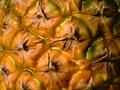
| 02/18/2004 05:11:38 AM |
Pinappleby siggiComment: Very white highlights - give a plastic feel. Perhaps a softer light would reduce that. Some detail missing, just lacking that edge of sharpness. Kind of 'ugly' to do well here, but nice idea. |
| Photographer found comment helpful. |
| 02/18/2004 05:09:08 AM |
money with lots of textureby nottogoodComment: Interesting approach - quality of image has let this down a touch, as that detail that would really show the texture has disappeared. You have kept some tactile quality though, which is good. |
| Photographer found comment helpful. |
| 02/17/2004 05:15:35 AM |
Baby. It's cold outside.by pcodyComment: Near perfect exposure, in my eyes. There is something about the composition, and it certainly is black. 7 for now. |
| Photographer found comment helpful. |
Home -
Challenges -
Community -
League -
Photos -
Cameras -
Lenses -
Learn -
Help -
Terms of Use -
Privacy -
Top ^
DPChallenge, and website content and design, Copyright © 2001-2025 Challenging Technologies, LLC.
All digital photo copyrights belong to the photographers and may not be used without permission.
Current Server Time: 06/22/2025 04:21:35 PM EDT.