| Image |
Comment |
| 02/19/2004 07:55:00 AM |
Denim Rainbowby Patents4uComment: Dark, mysterious, forbidding, odd, flat, evocative, suggestive, but for me, without the challenge bounds - interesting shot, but not in my mind a great one. Refreshingly different though. |
 Photographer found comment helpful. Photographer found comment helpful. |
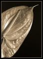
| 02/19/2004 07:52:50 AM |
Anthuriumby admart01Comment: Tonality reminiscent of Mr Setzler - and a capture of a quality of waxiness in that leaf that wouldn't be out of place in his work either. I don't know that allowing the curl of the leaf to drift out of frame bottom left is so reminiscent though, and vertainly not a choice I would have made. Strong feeling that the composition would be more harmonious if that stem and the rest of the leaf were included, so that they didn't appearto be emerging separately into view. That said, great meeting of the challenge, and great feel and life to the photography - kind of orthodoxly classical, if you understand. A great example. |
| Photographer found comment helpful. |
| 02/19/2004 07:46:28 AM |
Birch Curlsby snowflakeComment: Choice of colour temperature is different - and quite effective. Lends a mystical quality to the subject, makes the first perception one of a landscape rather than a detail, which I quite like - in fact I'd go so far as to say you might have cropped this to contain only the tree, and lose the sky and stuff top right of frame. DOF is a bit too shallow to really show us a breadth of texture - it rather concentrates on a very narrow area bottom third of frame, but there's still great interest there. One function of this colour that I don't like so much is the coldness it brings to the image, but that's inevitable. Intersting. |
| Photographer found comment helpful. |
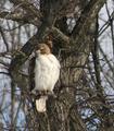
| 02/19/2004 07:42:45 AM |
fluffyby Rando D300Comment: Good capture, though missing the fine detail needed for a great shot. You seem to have set contrast more for the tree than the bird - the graduation of light across the white feathers is muted. There is a sense of featheriness neverthless, so good work there. The confusion of branches doesn't help the coherence of the image, in 'dpc' terms, but its nice work. |
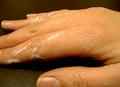
| 02/19/2004 07:40:31 AM |
Painting for a Livingby LeniceComment: Kind of clumsy looking composition - random cropping out of fingernails, bottom half of thumb. Movement of shapes through the frame is difficult on the eye. The moderate depth of field makes the two more distant fingers appear to belong to a different hand. Some sense of skin texture. |
| 02/19/2004 07:36:29 AM |
My Blanketby marboComment: Good mood - great use of muted colour, and you've captured a wistful moment well, and the catch-light in the eyes really lends some life to what might have been a rather drear scene without it. I do find the out-of-focus foreground area to be distracting - mainly because it seems to loom up into the image, rather than being a function of distance - don't get much sense of teh blanket receding into focus, if you follow me. texture? Good smoothness of skin, and a sense of softness and not or wiriness in the blanket. Borderline twee for me - I find that with a lot of child portraits, but excellently done. |
| Photographer found comment helpful. |
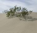
| 02/19/2004 07:28:53 AM |
Dry Heatby beekperComment: Good work - a first thought was that this was too muted in its contrast, but I don't know now whether that's really the case. next though was that it was a desert shot - that those were trees, and it maintains that sense of scale even after the realisation that they're perhaps more properly termed shrubs. Great use of the lines in the dune and the lines in the sky to emphasise the composition. |
| Photographer found comment helpful. |
| 02/19/2004 07:26:16 AM |
Napkin Stashby NebulousComment: I'm never going to put one of these muted, low-contrast images in my favourites, but I do rather appreciate them when they come up. I mean low contrast in the sense of subject, rather than technically in terms of black and white points I should say. A criticism would be that the pure rhythm of this shot focus the mind more on pattern than texture, but I'm perhaps being pedantic. |
| Photographer found comment helpful. |
| 02/19/2004 07:23:13 AM |
Lindor Chocolateby mcraelComment: Good work - great use of the light-tent kind of trick, although there is suspicion of some detailed reflection toward (presumably) camera. Gives a sense of the smoothness and creasing of the foil very well. Perspective is well handled too - no sign of distortion that I can see. That glow of light toward the top of the thing really speaks quality - advertisers would love you. A bit bland, as a subject, but you're by no means the only one to suffer from that here. |
| Photographer found comment helpful. |
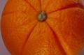
| 02/19/2004 07:20:04 AM |
Orange Orangeby 37vaComment: Great subtlety of tone and colour - really a good piece of work. Lighting is excellent for the purposes, and there is a great sense of texture to it. No real reservations other than that in neither its subject nor its presentation does it really get to me at all. But technically, rather good. |
| Photographer found comment helpful. |
Home -
Challenges -
Community -
League -
Photos -
Cameras -
Lenses -
Learn -
Help -
Terms of Use -
Privacy -
Top ^
DPChallenge, and website content and design, Copyright © 2001-2025 Challenging Technologies, LLC.
All digital photo copyrights belong to the photographers and may not be used without permission.
Current Server Time: 06/23/2025 03:43:01 PM EDT.