|
|
|
Showing 1561 - 1570 of ~3604 |
| Image |
Comment |
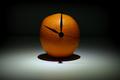
| 01/14/2005 07:11:06 AM | A Clockwork Orangeby casualguyComment: By far the best of the ornage shots so far. What annoys me, with all oranges, is the shininess of the skin, and the fact that it's almost impossible to avoid those bright white reflections. Not sure what to suggest could be done about it - perhaps some hairspray or something to give it a more matte surface? it takes an edge off the intensity of the image for me. |  Photographer found comment helpful. Photographer found comment helpful. |
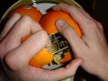
| 01/13/2005 08:23:31 PM | Dead Aim (1987)by smellyfish1002Comment: Not a darts player then - at least, not any good - not with that grip :-)
I like the intensity of that stare, like the high-key work, like the light on the hand and face. Overall, the image doesn't do a lot for me - and i think that's a compositional issue - the closeness of the hand and the dart to the face, without being directly in front, seems awkward, unreal; and yet doesn't have a natural balance of attention through the frame tthat makes it comfortable despite that. technically, in terms of light and focus and all that stuff, it wonderfully done. But I think the actual set-up itself lacks drama, lacks immediacy. It feels like a posed photograph, in other words, rather than communicating the imminent launch of the dart. |
| 01/13/2005 08:17:31 PM | got HEAD?by Drummerjd356Comment: Slightly intriguing image. Small. Oh, I really can't be bothered with this kind of nonsense ... |
| 01/13/2005 08:15:13 PM | A Clockwork Orangeby Amram7111Comment: The idea is neat, but your lighting is (forgive my bluntness) dreadful. Head-on lihgt, or on-borad flash, however soft, simply serves to make the objects nearest the camera the brightest, and thus the most attention-grabbbing: here, the hands. But the point of your image, surely, is the clockwork - yet half of it is shadowed, it forms barely 10% of the image, there's no sense of texture to it, it's hard to focus on without the eye being drawn to the left-most hand (no co-incidence that that's the brightest thing in frame). MMy attention is pulled between the hand that's in focus on the right, and the brighter hand on the left, and it's only by an effort of will that my eye moves to either the orange or the clockwork, and that doesn't make for an effective image. | | Photographer found comment helpful. |
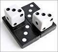
| 01/13/2005 08:10:23 PM | Domino (http://romanticmovies.about.com/od/domino/)by TampaDanComment: Technically highly proficient, although it lacks that edge of reach-out-and-touch-it detail somehow. Photographically ... well; it just doesn't appeal to me. I'd want some kind of sensuality of light, or neatness of composition, or surprise with the level of detail, and I'm afraid I don't get anything from this that takes it past being a technically proficient photograph. Nevertheless, that technicality get you some points. | | Photographer found comment helpful. |
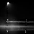
| 01/13/2005 04:54:06 AM | Snow Dayby pitsamanComment: Good exposure, which is tricky for snow. Good job you put that border in too - given the closeness to the dpc grey of most of it. I would wish that hte buildings weren't there, they affect the sense of remoeness of the scene, the isolation. Use of negative space is very effective. | | Photographer found comment helpful. |
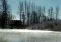
| 01/13/2005 04:49:42 AM | Mystic Riverby tdgri1Comment: The silhouetting of theat house/barn and the trees adds a sense of mystery, certainly, and I enjoy the light on the water, and in the smaller bushes. Slight downside: having to push the exposure as far as you have, some of that glare on the water is perhaps a bit strong? you composition is the weakest element of the image though: i can't see that lifting the camera a touch would have harmed the exposure - though I suppose the sun might have begun to flare - but the very bottom part of frame seems to add little, and the cutting off of the trees at the top does harm things: and especially when you end up with that building placed a little weak in frame. |
| 01/12/2005 07:43:06 PM | The Good Egg (1939 )by gaurawaComment: There was a shot somewhat like this in The Egg challenge, way back: the first challenge I entered. I even put it in mym favourites. This however, achieves more than that shot did - to keep this extreme high-key, without a real feel of simple burn-out, and yet to keep texture in the eggg's surface, and a sense of progression through the frame, is work of extremely high technical prowess. A graceful, immensley likeable photograph. | | Photographer found comment helpful. |
| 01/12/2005 04:57:48 PM | What Lies Beneath by crabappl3Comment: This is comment number 2000. Thought I'd just mark that little landmark. And a very fine image to bring that up with too. There's a lot that I really like here too - the composition, the mystery, the sense of solitude, and space. it may onyl be a optical illusion, but there's a sense of the image being slightly tilted to the right that doesn't help the feel - even if it is an optical illusion, surely a touch of rotation to the left might have eased that sense? A beautiful shot, nevertheless. Top work. | | Photographer found comment helpful. |
| 01/12/2005 04:51:29 PM | The Wallby neehaiComment: I like the mood, the composition, the structure of this. It's too wacky - too much about the effect, and thus about the graphic of it, for me to like it very much though. That might, of course, just be that i don't understand :-) |
|
Showing 1561 - 1570 of ~3604 |
Home -
Challenges -
Community -
League -
Photos -
Cameras -
Lenses -
Learn -
Help -
Terms of Use -
Privacy -
Top ^
DPChallenge, and website content and design, Copyright © 2001-2025 Challenging Technologies, LLC.
All digital photo copyrights belong to the photographers and may not be used without permission.
Current Server Time: 08/25/2025 09:38:12 PM EDT.
|