|
|
|
Showing 1381 - 1390 of ~3604 |
| Image |
Comment |
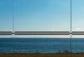
| 03/21/2005 05:07:04 PM | horizontal linesby visaksenComment: this remains compositionally gorgeous, and what what might term 'brave' in it's simplicity. It's a disgrace that only three people voted this higher than did I - and I voted nothing higher than this. But you do get the big compliment, from me at least. +fav |  Photographer found comment helpful. Photographer found comment helpful. |
| 03/21/2005 05:03:31 PM | Life Through A Lensby SimonjwComment: Robbed, you were, sir. Thoroughly robbed. This is up there with my top rated shots in this challenge.
e | | Photographer found comment helpful. |
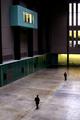
| 03/18/2005 07:46:50 PM | 1. Proceed. 2. Hold.by SkipComment: I was just about to PM you and say I hadn't seen your shot yet. You even got the tonality right, I think. (This had better be you, Skip - but it makes sense). You know what - with my own prints beside me to compare - I really can't decide between the portrait or landscape approach to the subject. This way, the blue0ish room protruding into the space is more effective. landscape way, he space is guven a greater sense of size. You were either lucky or very patient with thse two punters, too. Nice work. | | Photographer found comment helpful. |
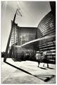
| 03/18/2005 05:25:53 AM | Vertical Linesby pogboy4Comment: I'm no fan of this stuff, generally. That's not a reference to the 'seen before' thing, but the type of shiny designer photography. There are a couple of areas where it falls down, I think; firstly, there just isn't the punch of colour these things cry out for - here, they seem washed out, muted. Secondly, the fold line of your background seems out of place with the curves and graduations of the glass: if you could have held it so that it curved round, rather than folding ... |
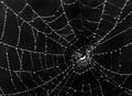
| 03/18/2005 05:22:18 AM | Convergenceby arpitaComment: Your extreme sharpness, and contrast, makes this a near-abstract - and not one that I don't like. even at a reasonable viewing distance, it appears to be simply an oganisation of white pixels on a black background. Quite fun, but I prefer more sensation of depth, progression, in photography: this moves too far to the purely graphic for my taste - but of that 'type' of shot, I would place this quite highly. | | Photographer found comment helpful. |
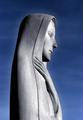
| 03/18/2005 05:19:25 AM | Graceful Linesby smellyfish1002Comment: That gentle halo-ing around the figure is effective, even if it feels like slightly over-doing things. I wonder whether your highlights, for web display at least, haven't been taken just the smallest touch too far - this is a very minor observation, but in such a very controlled and precise image, I think it matters. Good light, and the blue/grey tonality is very fine. It's a beautiful thing - I wonder how many folks will hit you for lack of lines? Not me ... |
| 03/17/2005 03:10:08 PM | Lunch Line!by DrakeComment: A very tricky situation to expose correctly - that snow immediately behind the swans is always going to make things hard, and they're not the easiest creatures to photograph anyway, given the white plumage. You've allowed the highlights to gotoo far, for me: not so much on the birds, which would (just) be OK, but certainly in the snow. I think the solution is to under-expose more, and then select and bring back the brightness in the birds heads whilst trying to maintain a sense of the real. This is not a bad go though. | | Photographer found comment helpful. |
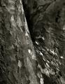
| 03/17/2005 12:08:00 PM | Skin Tonesby ImagineerComment: The 'peeling' bark is an entirely natural phenomenon, for those that don't know - it's part of an overall process of air scrubbing, really - particles of various pollutants are isolated in sections of bark, which the tree then sheds. The many plane trees in London are sometimes referred to as the city's lungs. Glad this shot was yours Jon - highly underrated. | | Photographer found comment helpful. |
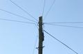
| 03/17/2005 05:15:42 AM | Telephone Linesby justinbrookComment: A very blunt composition. The sky colour is pretty dull, especially in such a graphical image - a touch of darkening, or underexposure, would deepen that colour quite efffectively. | | Photographer found comment helpful. |
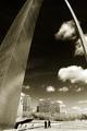
| 03/17/2005 05:13:30 AM | Safe Vertigoby GBrummettComment: Very pleasant grain here - especially effective, rather surprisingly, on the steel (?) of the arch. I like the strong 'antique' feel, like a documentary shot from the 50's, poorly cared-for, when this architecture was ground-breaking. |
|
Showing 1381 - 1390 of ~3604 |
Home -
Challenges -
Community -
League -
Photos -
Cameras -
Lenses -
Learn -
Help -
Terms of Use -
Privacy -
Top ^
DPChallenge, and website content and design, Copyright © 2001-2025 Challenging Technologies, LLC.
All digital photo copyrights belong to the photographers and may not be used without permission.
Current Server Time: 08/24/2025 02:11:19 PM EDT.
|