| Image |
Comment |
| 05/04/2007 01:05:20 PM |
day 04by FirstyComment: This is a fantastic photo, great idea great delivery, In a challenge I would have given this a high score, the only thing that could have made it higher would have been if you could have got the ear as sharp as the rest of the face
Love the eye (even with the reflection) and the fact that the lashes stand out as they do gives it a real wow element
Absolutely top shot! |
 Photographer found comment helpful. Photographer found comment helpful. |
| 05/04/2007 01:02:05 PM |
Day 3: Night Schoolby RebeccaComment: I had the same problem with wind yesterday when I was taking an outdoor shot (OMG I have just realised I could only ever use that sentance to a photographer without causing some very odd looks)
I do love the actual idea of the image and would like to see it again when you have a tripod to hand
On the even more positive side NO MORE STATISTICS!!!!! |
| Photographer found comment helpful. |
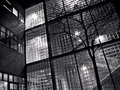
| 05/04/2007 12:56:20 PM |
Hotel lobbyby MelethiaComment: I bet you stayed in a way more upmarket place!!! After the symettry of day two some lovely assymetry. Not a big fan of borders but this one works well.
Not sure what it is but the item obscurring a part of the flat screen tv is a bit distracting and just as an aside it felt a bit off that it was so (apparently) bright outside yet the lights on the right appear to be on
(my goodness I am paying wayyyyy too much attention to these pics)
J |
| Photographer found comment helpful. |
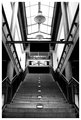
| 05/04/2007 12:52:11 PM |
Stairs, lights, birdby MelethiaComment: Your obsession with German train stations grows ever stronger!!!
I love the symettry of this shot (you should have shooed that pidgeon away!!!) and the really harsh whiteness coming through the skylight (Is this wonderfully reflected behind the platform sign or is it another section)
Not sure how much cropping went on but I do like the effect |
| Photographer found comment helpful. |
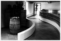
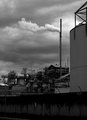
| 05/04/2007 07:59:57 AM |
Bleakby RetroesqueComment: Nicely titled and an excellent image of urban blight. The smoke coming out of the chminey is great in terms of standing out against the clouds (It cant be good news when the smoke stack looks clearer than the sky)
I love the range of shots you are taking for this challenge
Possible thoughts for minor tweaks
Crop a fraction higher to lose the curb?
Crop slightly to the left to losr the lamppost (which just doesnt quite have enough omph in terms of it standing out)
Maybe(????) clone out the poster on the wall (but definitely leave the graffiti)
Jon |
| Photographer found comment helpful. |
| 05/04/2007 07:54:22 AM |
Light and darkby UrfaKComment: OK, well for me this a pic of two elements
Technically super, love the dof, the contrast and tones
In terms of being appealing as an image in its own right perhaps less good.
|
| Photographer found comment helpful. |
| 05/04/2007 07:50:43 AM |
Day Two: Comtemplativeby Art RoflmaoComment: Look into my eyes....You WILL learn the nefarious black art of photoshop
Really like this shot (certainly my favourite in the challenge to date) and excellent self portrait, with beautiful lighting tones and contrasts and the bookcase background works brilliantly for the pose
Possible tweaks I would consider would be to get rid of the label on the cuff, which for some reason really attracts the eye away from what you should be looking at. Possibly also lose the watch, although the (I'm guessing) canvas strap actually works quite well with the (corduroy?) material of your top and if the label disappears then it may be fine to keep it
Jon |
| Photographer found comment helpful. |
| 05/04/2007 06:51:29 AM |
NINA_IMG_1846.jpgby dsternerComment: Fantastic to see such a natural smile< Not sure if she posed for this or if you just captured it? Either way it has a lovely feel to it (and what I guess is a white T-shirt sets it off a treat in this format)
Love the shadow play as well
Jon |
| Photographer found comment helpful. |
| 05/04/2007 06:48:24 AM |
DSC_0277-man_in_blu_01_web.jpgby alexjackComment: Great portrait, which works very well being centred as the slightly asymettric tilt of the head does not make it feel too 'blocky'
DoF just right
|
| Photographer found comment helpful. |
| 05/04/2007 06:44:35 AM |
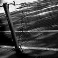
day 2 - tennis courtby GinaRothfelsComment: I like this shot, lovely feel of slight dilapidation that is enhanced by it being in B&W. Nice DoF and cropped to perfection |
| Photographer found comment helpful. |
Home -
Challenges -
Community -
League -
Photos -
Cameras -
Lenses -
Learn -
Help -
Terms of Use -
Privacy -
Top ^
DPChallenge, and website content and design, Copyright © 2001-2025 Challenging Technologies, LLC.
All digital photo copyrights belong to the photographers and may not be used without permission.
Current Server Time: 08/05/2025 10:00:40 AM EDT.