| Image |
Comment |
| 09/22/2005 06:35:13 PM |
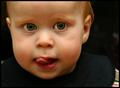
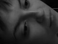
Mischievousby DogAngelComment: Greetings from the Critique Club.
This is a funny picture. I like the facial expression and it totally matches the title, he really looks like he's secretely planning something. Great capture.
As far as the composition, nice job with filling the frame. I think a slighly tighter crop would have been beneficial as it would have gotten rid of the distracting bright area on the lower right corner. My eyes keep getting drawn to it and it takes attention away from the subject. Since this was an Advanced Editing challenge, I would have probably gotten rid of the bright spot on his right shoulder and on the middle right hand area of the picture as well.
The focus is right for a portrait of this nature but I think perhaps slightly sharper eyes would look better. The lighting is also good, no blown highlights. Keep up the good work.
If you have any questions or comments about this critique, please feel free to PM me.
June
|
 Photographer found comment helpful. Photographer found comment helpful. |
| 09/22/2005 06:20:28 PM |
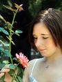
Sweet Revelationby esdarbyComment: Greetings from the Critique Club.
I like the lighting in this image, it is even and flattering. I like the composition too. I find the background a little distracting, specially the bright areas by the model's face. Perhaps a slightly different angle would have taken care of that. Another thing that bothers me is that her eyes seem to be closed, I would have liked to see them. The soft focus works well here, the image is soft but not blury. This is a good image that could be greatly improved with just a few minor changes. Keep up the good work.
If you have any questions or comments about this critique, please feel free to PM me.
June |
| Photographer found comment helpful. |
| 09/06/2005 05:14:47 AM |
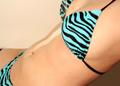
Milk, It Does a Body Good...by JonLudComment: Greetings from the Critique Club.
Composition:
The composition is good, the placement of the model in the frame accentuates the midsection which I am assuming was your intention since that is where the milk is.
Background:
I don't think this background color works because it is to close to the model's skin color. Perhaps something darker would have worked better, it would have given the picture a bit more overall contrast.
My opinion:
To be honest, this picture doesn't really do much for me. To me, it doesn't really meet the challenge. I think that if you had used the theme "milk" in a bit more obvious way, this would have done better.
If you have any questions or comments about this critique please feel free to PM me.
June
|
| 08/31/2005 05:39:40 PM |
In Darkness Let Me Dwell...by jasm8Comment: Greetings from the Critique Club
The first thing that came to my mind when I saw this picture was "concentration camp". You can almost feel the agony this picture portrays. The choice of sepia is perfect for the subject. I have seen many concentration camp pictures and I really think this is a lot like them. I don't mean that in a bad way, on the contrary. This picture has managed to stir almost the same feelings and thoughts in me. That is always a good thing, you've made your point. Perhaps that is not at all what you were going for but you've succeeded anyway.
I like the compostion and the exposure is pretty balanced as well. Good job. I really think this picture should have done better.
If you have any questions or comments about this critique, please feel free to PM me.
June |
| 08/31/2005 05:30:29 PM |
Mom, Get Out!by kyeboshComment: Greetings from the Critique Club
First off, I want to say this is a really funny picture. I love the expression on the guy's face and it makes you think about what is really going on in the scene. However, I just can't get passed the fact that he seems to be floating in mid-air. There is no context, if you know what I mean. I think perhaps it would be better if the person was in a real life environment.
I think the exposure is pretty balanced and detail was kept where needed. I like the black and white conversion and the warm tones. This is just my opinion and you did very well, so congratulations.
If you have any questions or comments about this critique, please feel free to PM me.
June |
| Photographer found comment helpful. |
| 07/02/2005 08:46:02 AM |
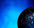
Space. The Final Frontierby CorySmithComment: Greetings from the Critique Club.
I must admit that I may be a bit biased here......I love blue. I like the different shades in the background, I think they compliment the subject well.
As far as meeting the challenge, I don't think it does. If it wasn't for the title that is.
Good composition and overall feel. I like it but it would have perhaps done better in another challenge. If you have any comments or questions about this critique, please feel free to PM me.
June |
| Photographer found comment helpful. |
| 06/27/2005 04:16:39 AM |
Dreamingby gizzComment: Greetings from the Critique Club.
The first thing I thought when I saw this picture was "out of focus". This picture had potential but I really think the lack of sharp focus killed it.
I like the composition but it bothers me a bit that part of the left eye is cropped off at the top of the picture. I think it's good that you tried to fill the frame with your subject.
If you have any questions or comments about this critique, please feel free to PM me.
June |
| 06/27/2005 04:11:20 AM |
Dark Partyby KaupsComment: Greetings from the Critique Club.
To be honest, this image does not represent darkness to me. The fact that the sky is still somewhat blue and that there is a light shining on the left side of the frame is not helping. Perhaps it would have worked better if you had cropped the light out. The colors are nice but I don't really think it meets the challenge very well. Maybe next time you should try filling the frame a bit more with your subject. If you have any questions or comments about this critique please feel free to PM me.
June |
| 06/24/2005 06:22:41 AM |
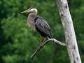
Wild blue heronby bormicComment: Greetings from the Critique Club!
Composition:
The subject is a little too centered for my liking and the tree trunk on the right side is a bit distracting and takes the attention away from the main subject. I think a tighter crop would have worked better here.
Background:
The background is perfect for this subject and compliments it very well. I like the bokeh and the way it contrasts against the foreground without being distracting.
My opinion:
I would have personally given this picture a 6. It meets the challenge just fine but I am not crazy about the crop. I like the colors and the subject but I really would have liked to see more of the bird and less of the surroundings. Perhaps the bird's head filling the frame would have had a much stonger impact.
If you have any questions or comments on this critique, please feel free to PM me.
June
|
| 06/14/2005 06:54:09 AM |
|
| Photographer found comment helpful. |
Home -
Challenges -
Community -
League -
Photos -
Cameras -
Lenses -
Learn -
Help -
Terms of Use -
Privacy -
Top ^
DPChallenge, and website content and design, Copyright © 2001-2025 Challenging Technologies, LLC.
All digital photo copyrights belong to the photographers and may not be used without permission.
Current Server Time: 09/03/2025 10:16:58 PM EDT.