| Image |
Comment |
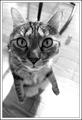
| 01/20/2004 11:09:15 PM |
Curiosityby JackoComment: This looks almost like a cartoon cat. The fact that she's standing up really enhances the almost caricature look of the close/wide angle. Black and white was a good choice too. Only negative would be what looks like a chair/table frame coming out of her head, but I bet it was quite difficult getting her to cooperate for the shot. One of my favs! |
 Photographer found comment helpful. Photographer found comment helpful. |
| 01/19/2004 08:45:09 AM |
Weighing In the Futureby librodoComment: I like the choice of angle you have used, being above the subject, as I think it shows his/her vulnerability a lot more than if you had gone down on their level. The expression on his/her face is good too. Looks very much like a shot that would have been featured in NG. |
| Photographer found comment helpful. |
| 01/19/2004 08:37:03 AM |
By the riverby marboComment: It's unfortunate about the overcast sky, but with the photograph only having a small amount I dont think it pulls away from the beauty of the shot all that much. I love the layered look of the shot. The water looks cold, the green looks very vibrant, the house/estate very stately, and the hazed town in the distance all adds up to a great shot. |
| Photographer found comment helpful. |
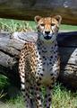
| 01/19/2004 08:32:20 AM |
Big Catsby svitalComment: Good shot! The composition is good, although I think I would have liked his feet in the shot so it didnt feel so incomplete. Very good texture and color, and nicely sharp. |
| 01/15/2004 12:42:23 PM |
Abstract Infinityby shareinncComment: Not sure what this is but it looks kinda odd. The placement of the item doesnt really compliment it well, and seems to unbalances the composition. The effects look very similar to funky editing filters, which I personally am not a fan of when seemingly used this way. I'm sure there are fans of funky abstract art, I'm just not one of them, sorry. |
| 01/15/2004 12:37:51 PM |
Neon Guitarby tolovemoonComment: Hrm, not had much experience with shooting or looking at neon sign photographs so not sure how to critique this. Personally, I dont get much of a reaction to this. The diagonal composition is good, it doesnt appear blurry although there are a few strands of light in a few places. I assume that was the thickness of the light and most neon is bright so not quite sure about the exposure either. It's not a bad shot, it's just kinda there. Sorry I couldnt have been more helpful. |
| Photographer found comment helpful. |
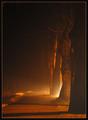
| 01/15/2004 12:31:40 PM |
Friendly Giants guide your Wayby Harz_JoergComment: This has a great atmosphere and mood to it. I'm tempted to feel that the light is a little too extreme/harsh to be ambient and so it doesnt feel as soft as I would have liked, but I like the gradient of dark to light. Composition is good, the trees seem nicely sharp, and the shadows falling across the path is a nice touch too. Very nicely shot. |
| Photographer found comment helpful. |
| 01/15/2004 12:27:33 PM |
Ready to Goby md8speedComment: Not going to get too far with less than half a tank of gas! The angle is interesting in an unconventional kinda way. It's certainly bright and the water on the windscreen to blur and abstract whatever was beyond it is interesting too. Everything seems fairly sharp and exposed just fine. It's a good technical shot, but doesnt really do much for me personally. |
| 01/15/2004 12:25:03 PM |
Arboretum at Nightby mcrochipComment: What looks like water/ice and snow makes for an interesting foreground addition. Unfortunately the vehicles take away something, and with them being so distant and soft as well they really dont help much at all. The lights seem a little overexposed too. I like how the buildings seem to go up higher with each one, like stairs. |
| Photographer found comment helpful. |
| 01/14/2004 10:31:16 AM |
Helping Handby timj351Comment: This has a great human interest angle. It's not original, but bah, doesnt always matter. The tones are good, dof is good, lighting is just a tad too bright on his hand, but not distractingly so. Nice shot. |
Home -
Challenges -
Community -
League -
Photos -
Cameras -
Lenses -
Learn -
Help -
Terms of Use -
Privacy -
Top ^
DPChallenge, and website content and design, Copyright © 2001-2025 Challenging Technologies, LLC.
All digital photo copyrights belong to the photographers and may not be used without permission.
Current Server Time: 08/09/2025 09:30:53 AM EDT.