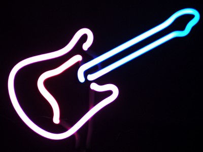
This definately fits the challenge and seems to be in good focus. The problem I find with it is it seems to be washed out some. I feel like there should be some pink in the bottom and more blue at the top.
Also try to do your image as close to the 640 on the largest side. It will help a lot.
INteresting image. I like the angle of the guitar in the frame. For some reason, it doesn't look really sharp, but perhaps that's the way of photographing neon. i like this!
In an effort to give more feedback, here goes. The colors in this could definetly be more vibrant, being a neon sign and all. And the crop is uninteresting. Maybe if it had been off center or there was something else in the picture to add a little more interest. The idea is good for an after dark shot though.
Hrm, not had much experience with shooting or looking at neon sign photographs so not sure how to critique this. Personally, I dont get much of a reaction to this. The diagonal composition is good, it doesnt appear blurry although there are a few strands of light in a few places. I assume that was the thickness of the light and most neon is bright so not quite sure about the exposure either. It's not a bad shot, it's just kinda there. Sorry I couldnt have been more helpful.
Nicely framed and interesting capture of an "icon" image - it has an abstract quality to it. Hard to tell if it's the glow of the neon but it seems a bit fuzzy??





 Add photograph to your favorites
 Add photographer to your favorites


 Photographer found comment helpful.


