| Image |
Comment |
| 07/07/2006 11:12:42 AM |
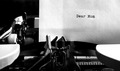
Dear Momby vprndsgComment: What I like: Very sharp w/ a good focus. Black and white works well. Great composition.
What I didn't like: |
| 07/07/2006 11:11:16 AM |
|
| 07/07/2006 11:09:17 AM |
Corneredby meo729Comment: What I like: The compositoin and lines travelling across the image are pleasing.
What I didn't like: overall image quality seems fairly low. Did you consider B&W? |
| 07/07/2006 11:07:02 AM |
Syntaxby rubienneComment: What I like: Sharp focus, interesting colors.
What I didn't like: I wish it was exactly the tip of each writing device that was exactly in focus. |
 Photographer found comment helpful. Photographer found comment helpful. |
| 07/07/2006 11:06:02 AM |
The end of a school yearby dreamyComment: What I like: The idea is amusing, and that is some weird sharpener
What I didn't like: background fabric isn't my favorite. |
| Photographer found comment helpful. |
| 07/04/2006 05:46:23 PM |
|
| 07/04/2006 05:43:32 PM |
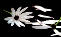
Of course he loves me and I've got the daisies to prove itby tinky2Comment: Technical: Focus - 1
Exposure- 1
Quality - 1
Aesthetic: Comp. - 1
Light - 1
Color - 1
Wow factor: 0
Personal tilt: 3/3
What I like: Great composition, and the purple middle of the flower works great
What I didn't like: Some of the pedals may be a little overexposed |
| Photographer found comment helpful. |
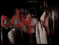
| 07/04/2006 02:55:54 PM |
Bloody Mary.. She'll scratch your eyes out...by xXxscarletxXxComment: Technical: Focus - 1
Exposure - 0
Quality - 1
Aesthetic: Comp. - 1
Light - 0
Color - 1
Wow Factor: 0
Personal Tilt: 0/3
What I liked: I like the eye contact with the camera and the highlights in the eyes.
What I didn't like: I'm afraid I'm not a fan of dark images in the emotional sense or exposure. The light seems very harsh, causing the skin and hair to be more reflective than it should be. I would like to see more detail in the eye especially. |
| Photographer found comment helpful. |
| 07/04/2006 02:52:07 PM |
Red skies at morning, sailors take warningby taseComment: Technical: Focus - 1
Exposure - 1
Quality - 1
Aesthetic: Comp. - 1
Light - 1
Color - 1
Wow Factor: 0
Personal Tilt: 1/3
What I liked: Great sight. The light is very pleasant and warm
What I didn't like: The pole visually splits the image. Skies aren't red enough to get the correct effect across to the viewer. |
| 07/04/2006 02:50:10 PM |
See a penny? Pick it up, and all day long you'll have good luck!by RebeccaComment: Technical: Focus - 1
Exposure - 1
Quality - 1
Aesthetic: Comp. - 0
Light - 1
Color - 0
Wow Factor: 0
Personal Tilt: 1/3
What I liked: Nice toes, great texture.
What I didn't like: Not sure why the penny is on the toe. All of the reds and yellows de-emphasize the warm metallic tones of the penny. |
| Photographer found comment helpful. |
Home -
Challenges -
Community -
League -
Photos -
Cameras -
Lenses -
Learn -
Help -
Terms of Use -
Privacy -
Top ^
DPChallenge, and website content and design, Copyright © 2001-2025 Challenging Technologies, LLC.
All digital photo copyrights belong to the photographers and may not be used without permission.
Current Server Time: 08/27/2025 06:07:54 AM EDT.