DPChallenge: A Digital Photography Contest You are not logged in. (log in or register
 
Challenge Entries
Portfolio Images
This image is not part of a public portfolio.
Cornered
Cornered
meo729


Photograph Information Photographer's Comments
Challenge: Stationery (Basic Editing III)
Camera: Fujifilm FinePix S5100
Location: Home
Date: Jul 3, 2006
Aperture: f4
ISO: 200
Shutter: 1/8 sec
Galleries: Macro
Date Uploaded: Jul 3, 2006

crop
adjust contrast
adjust color
sharpen
resize

Statistics
Place: 101 out of 122
Avg (all users): 4.7564
Avg (commenters): 4.8000
Avg (participants): 4.4151
Avg (non-participants): 4.8378
Views since voting: 633
Views during voting: 364
Votes: 275
Comments: 11
Favorites: 0


Please log in or register to add your comments!

AuthorThread
07/18/2006 09:29:53 PM
Critique Club Comment

Initial thoughts: Very brown, a little dull, and the focus is off, but definitely meets the challenge

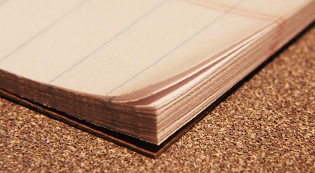
Subject & background: I like the weathered old pages look, but I'm not sure I like the texture of what appears to be corkboard, also the brown on brown is a little much, like someone suggested, maybe this would look nice in BW or sepia or just a different background... also, I like the idea that's been suggested of having something written on the pages

Angle, framing & composition: I think you've done some nice work here, I would prefer a more squarish crop, maybe some more space at the bottom, but placement and balance seem right

Focus, clarity & DOF: I think this is what got you the most... seems your focus is on the ground (cork?) directly below the book and then out of focs toward the edges, which is a little dizzying given the texture and then your subject, the page corners, are out of focus, a deeper DOF could help you out, I'm looking again, and maybe that's motion blur? either way, crisp clean page edges would have definitely boosted your score

Lighting & exposure: lighting looks even and exposure is also good

Post processing: again, maybe BW

Overall, my opinion: fairly good photo, I think you had a nice idea to work with here, nice subject, seems the focus and the background are the main things to improve

If you have any questions regarding this critique, feel free to PM me

Amanda
 Comments Made During the Challenge
07/11/2006 08:44:50 AM
Message not clear nor very interesting to me in this photo. Close, but no cigars.
07/10/2006 01:55:31 PM
The focus is a bit gross to me here. Sharpness would have been key here, but otherwise a nice idea.
07/10/2006 08:18:45 AM
the edge of the paper really leads you off, I like it
07/07/2006 05:15:06 PM
nice old ledger.
07/07/2006 11:09:17 AM
What I like: The compositoin and lines travelling across the image are pleasing.

What I didn't like: overall image quality seems fairly low. Did you consider B&W?
07/07/2006 09:32:04 AM
For being the main focus of the composition, the corner should be in better focus. It would have been nice to see something written in the ledger as well.
07/06/2006 08:44:44 PM
You need more curl. If you look at some of the other similar entries, I think you will see what I mean.
07/06/2006 06:55:37 AM
Good detail and DOF work.
07/06/2006 03:39:34 AM
A bit too simple to capture the imagination.
07/05/2006 09:50:45 AM
Nice close-up. could use something more, likle page movement


Home - Challenges - Community - League - Photos - Cameras - Lenses - Learn - Help - Terms of Use - Privacy - Top ^
DPChallenge, and website content and design, Copyright © 2001-2025 Challenging Technologies, LLC.
All digital photo copyrights belong to the photographers and may not be used without permission.
Current Server Time: 06/19/2025 10:43:25 AM EDT.