| Image |
Comment |
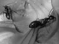
| 06/17/2005 11:52:24 AM |
Blackby dphillipsComment: Kudos to you for a fascinating macro. B&W is perfect for this shot even though I am sure it is quite colorful in reality. The first impression is that it is inside someone's ear which is a very "dark" thought. :) This is fresh lettuce or something like that. The fact the ant is feeding contributes to a feeling that gives the viewer the willys. :) Great job and congrats on a fine image. |
 Photographer found comment helpful. Photographer found comment helpful. |
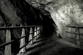
| 06/17/2005 11:48:22 AM |
Treacherous Pathby LevTComment: Conveys a sense of darkness well. Good view toward the darkness of the cave. A significantly lower or significantly higher angle for this photograph would work well in this situation. The technical quality of the rock wall fine detail seems harsh and overcontrasty which is very hard to process properly. Wish there were a sharpening technique to recommend to take care of that. I'd use in myself. :) |
| Photographer found comment helpful. |
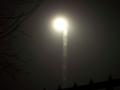
| 06/17/2005 11:44:32 AM |
Streetlight at midnightby sinelvahoComment: If your intention was purposeful very soft focus to convey the sense of darkness it probably will not work for most voters. It appears more or less out of focus. If the lamppost or tower is purposely off horizontal then it would be more effective if it had an even greater angle, otherwise it should be made perfectly horizontal. It is always good to try things out to se how they work. However, most viewers will likely find the composition and content of this image uninteresting. |
| 06/17/2005 11:30:39 AM |
Favorite Dark Barby kcumanComment: Intersting concept and decent sepia. Good use of the rule of thirds to add interest to the image and the fact there is not facial detail works very well here. It is usually hard to pull that off. Good job. |
| Photographer found comment helpful. |
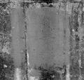
| 06/17/2005 11:28:47 AM |
"untitled"by BarryComment: Good abstract concept for this challenge. Many voters will rate it low because the do not "get it". ghis image suffers from "digtal granularity" which is very hard to get rid of or deal with. That is where there is a lot of granular detail but it does not appear in proper focus. That granularty is intentional in this image but is a little overdone. When you find a sharpening technique that cures this problem send me a message, i'd like to get rid of it from a lot of my own images. :) |
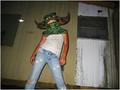
| 06/17/2005 11:25:00 AM |
unfounded fearsby cheleComment: The first question most viewers will ask is... why did you take this picture? Because it is not immediately apparent your score will suffer. Taking the picture from a low perspective is a good idea, but should have chosen a different and darker background. The background is far to distracting and adds little to the composition. The image has more of a look of a kid playing around than it does to darkness. A different posture and different lighting from unexpected angles with a less a distracting and clutter background could make this image work. |
| Photographer found comment helpful. |
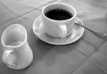
| 06/17/2005 11:19:59 AM |
Cup 'O' Morning Darknessby mahobbesComment: Interesting twist on the darkness theme. Looking into the cup of black coffee is like looking into the darkness of and overworked life that just repeats itself over and over every day. It is a certainty that many voters will NOT see the darkness in this image. The simplicity and perspective of this image is it's strength. |
| Photographer found comment helpful. |
| 06/17/2005 11:17:47 AM |
Why don't people show some respect to Mother nature?by vignir_mComment: Agreed with the sentiment of your title but this image is probably a little gross for most viewers and some will think it gratuitous. The image is on the small side, the bird feathers lacks detail and is a little overexposed. The bird is too small in the image and focus is not particularly good. |
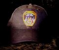
| 06/17/2005 11:15:11 AM |
Fallen Heroby thomaspeopleComment: 9/11 certainly conjures up a dark time in this country's history. This concept is good. Another approach to this image would be shooting from a "ground zero" (ground level) perspective looking upwards at the hat and making the surroundings even darker than they already are so that no complete edge of the hat except the brim is visible in the frame. Of course, a helmet would likely be a more effective subject rather than the hat. The logo on the hat is not level. If that is intended then it should have a greater and more pronounced angle. |
| Photographer found comment helpful. |
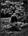
| 06/17/2005 11:10:23 AM |
....For those left behind.by barbaraanneComment: High contrast imaging is a good technique for this type of theme. Don't be surprised if some voters feel the technique was selected to mask what might otherwise be an average image. A ground level perspective with the tombstone looming above the viewer in the image would work well with a high contrast image like this. |
| Photographer found comment helpful. |
Home -
Challenges -
Community -
League -
Photos -
Cameras -
Lenses -
Learn -
Help -
Terms of Use -
Privacy -
Top ^
DPChallenge, and website content and design, Copyright © 2001-2025 Challenging Technologies, LLC.
All digital photo copyrights belong to the photographers and may not be used without permission.
Current Server Time: 08/18/2025 10:08:57 PM EDT.