| Author | Thread |
|
|
07/22/2005 09:58:49 PM |
|
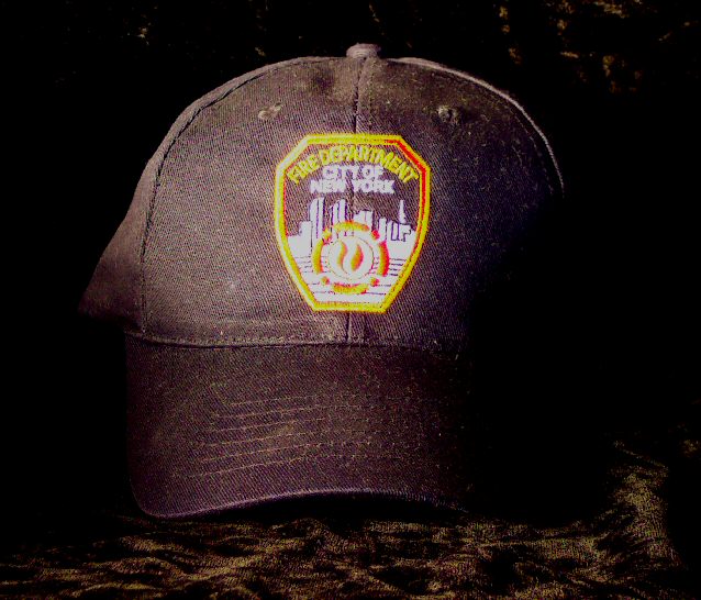
I like this shot though it I think it's either out of focus or the light is too bright on the badge. Keep shooting! |
|
Comments Made During the Challenge  |
|
|
06/21/2005 02:45:55 PM |
|
Bit out of focus I'm afraid |
|
|
|
06/21/2005 01:56:42 AM |
|
Outstanding. Great focus and lighting. I find this image so simple, yet SO emotive. Very creative shot. I think I can almost feel your heart in this. Thank-you. |
|
 Photographer found comment helpful. Photographer found comment helpful. |
|
|
06/17/2005 10:32:48 PM |
|
I think the image is a nice take on the challenge, and tries to go beyond a physically dark image and into the realm of emotional darkness. The background material is a bit of a distraction with all the shiny reflection, particularly evidenced in the right upper corner. The lighting on the logo of the hat is a bit too harsh, I feel. And I'm also nagged by the slight tilt of the hat, horizontally. 6 |
|
| Photographer found comment helpful. |
|
|
06/17/2005 07:23:38 PM |
|
sorry, i don't find much interest in the composition of this shot. it appears that you are going for the sentiment for the NYFD alone to hold the viewer. |
|
|
|
06/17/2005 11:15:11 AM |
|
9/11 certainly conjures up a dark time in this country's history. This concept is good. Another approach to this image would be shooting from a "ground zero" (ground level) perspective looking upwards at the hat and making the surroundings even darker than they already are so that no complete edge of the hat except the brim is visible in the frame. Of course, a helmet would likely be a more effective subject rather than the hat. The logo on the hat is not level. If that is intended then it should have a greater and more pronounced angle. |
|
| Photographer found comment helpful. |
|
|
06/16/2005 10:30:54 PM |
|
Love the concept, and it certainly evokes darkness. I wish the fabric underneath the cap wasn't there or wasn't as noticable. Perhaps slighly overexposed on the cap? |
|
| Photographer found comment helpful. |
|
|
06/16/2005 10:07:08 PM |
Not sure I see darkness in a FDNY hero...
Your highlights are blown out. There are ways to make things dark and still have the highlights =) |
|
| Photographer found comment helpful. |
|
|
06/16/2005 08:54:23 PM |
|
|
|
06/16/2005 06:29:48 PM |
|
I'm sorry, but fishing for sympathy doesn't do it for me. |
|
|
|
06/16/2005 03:20:46 PM |
|
|
|
06/16/2005 12:03:02 PM |
The idea is really neat. I'm thinking I would prefer if this were not smack dab in the center of the photo though. Maybe you could add some dramatic angle or different crop.
The colors are bright. maybe a bit too bright. They appear to be oversaturated giving off kind of a bad 'glow'.
That area with the words in it appears to have a softer focus than the hat itsself. The hat has nice focus and we can see the texture in the area surrounding the decal.
The decal though is hard to look at due to the color and the 'glow' and the appearance of soft focus there.
I think I'd like it if the background did not have a pattern on it. Maybe just a solid black background would work for this and that way, our eyes could focus on the texture of the hat and the words on the hat. Try messing with saturation and brightness/contrast. That may be able to lessen the color a bit and darken the background some.
Overall a nice representation of the challenge, just needs a bit of 'cleaning up'.
~Heather~ |
|
| Photographer found comment helpful. |
|
|
06/15/2005 07:22:21 AM |
|
I like the idea. It looks like you brightened just a bit too much. Too much color noise. |
|
| Photographer found comment helpful. |
Home -
Challenges -
Community -
League -
Photos -
Cameras -
Lenses -
Learn -
Help -
Terms of Use -
Privacy -
Top ^
DPChallenge, and website content and design, Copyright © 2001-2026 Challenging Technologies, LLC.
All digital photo copyrights belong to the photographers and may not be used without permission.
Current Server Time: 06/28/2026 02:26:20 PM EDT.