DPChallenge: A Digital Photography Contest You are not logged in. (log in or register
 
Browse Settings
Currently viewing:
Registered UserArtifacts

Show comments:

Per page:

Order:

Comments:


Comments Made by Artifacts
Pages:   ... [111] [112] [113] [114] [115] [116] [117] ... [319]
Showing 1131 - 1140 of ~3187
Image Comment
Hidden valley
06/23/2005 05:05:00 PM
Hidden valley
by tasha4paws

Comment:
The fog with the wind generators is the main strength of the image and the connection to the challenge theme. Most voters will make the connection. The trees silhouetted against the fog is also super nice.

Most of the really interesting elements are tiny in the frame. Zooming in or cropping out a lot of the image would make the composition stronger. You could crop from just below the fence posts to the left of the trees upward and righ to just above the dark bank of clouds. This will include everything interesting and get rid of the rest that is repetative and less intersting. You might consider making this B&W.
Photographer found comment helpful.
A plain looking ad for an iPod? ONLY in a fantasy world!
06/23/2005 04:58:01 PM
A plain looking ad for an iPod? ONLY in a fantasy world!
by thewriterside

Comment:
An excellent stock photo image. Very clean and the lighting is outstanding without any overexposed areas. The iPod looks surrealistic.

Some viewers will feel this image does not fit the challenge topic and will vote it lower.

Technically there is little wrong with it. It does seem a little unbalanced with darkening between the left and right side of the image but that may be just individual taste. If the middle left side were darked about 15-20% more than it be balanced better with the right side.

Good picture.
Photographer found comment helpful.
Journey Through Middle-earth
06/23/2005 04:52:03 PM
Journey Through Middle-earth
by Joey Lawrence

Comment:
Color, lighting and framing are excellent without excessive noise.

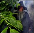
This natural looking image fits the challenge perfectly in a way most all voters can recognize. The Gandolf character is outstanding and the misty look a nice touch. That coupled with its high technical quality will likely put this in the ribbons with the blue possible.

On a technical note a few things can be said.

There is some minor haloing around the main characters garments near the top that can be removed.

The nearest leaves are out of focus. It could be validly argued it is that way on purpose to convey the sense of a journey through middle earth but most viewers will probably find that slightly distracting. That is generally true of most foreground elements that occupy a prominent position in a composition.

The image is lower contrast. Even a simple autocontrast adjustment will add considerable "pop" to an already amazing image. Again it might be said low contrast is purposeful to retain greater image detail and a sense of the mystical but most viewrs would likely think the added "pop" outweighs the other items.

If this image fails to get the blue ribbon it is likely because of the contrast.

A super photograph! Kudos to you for a great shot!

Message edited by author 2005-06-27 03:20:32.
Photographer found comment helpful.
Rising Moon
06/23/2005 11:44:16 AM
Rising Moon
by LadeeM

Comment:
From a technical standpoint this image is one of your best. What is great about it is that the moon is properly exposed with respect to the rest of the image and the fine detail shows up nicely.

Though you don't like them, the trees add considerable interest to the composition. The branch in the upper right isn't really a distraction so much as it makes the image seem unbalanced without a similar branch on the upper right side. It is debatable whether or not the tiny branches should touch the moon or not. Usually it is a little more eye appealing if they do not.

The sky color is a dull blue resulting from use of curves to bring out that great lunar detail. You could apply color painting on a 50% greyscale layer to bring out a deeper, darker blue that would make the moon stand out spectacularly and look great. It would also help mask the slight haloing around the branch detail. The sky is noisy and needs noise reduction applied.
Photographer found comment helpful.
Grok the Dark
06/22/2005 02:10:38 AM
Grok the Dark
by Mick

Comment:
Mick... congrats on another great shot!

I get so homesick for Oregon I can't stand it sometimes when I see your guys' work. My son, Orion, is going to school at OSHU (Oregon Health Sciences University) right now and I'd sure like to get back up that way again. If I get there I want to go on a photo safari with you guys. Your planned Silver Creek Falls trip is only 26 miles from where I grew up so I am really jealous about that! :)
Photographer found comment helpful.
Night Falls
06/22/2005 02:03:12 AM
Night Falls1st Place
by NovaTiger

Comment:
Congrats on your blue ribbon on a great shot! Yup, ya got Zoomer... But something tells me he is OK with that. :)

Message edited by author 2005-06-22 02:04:35.
Let there be Light
06/21/2005 12:41:11 PM
Let there be Light
by discgolfer

Comment:
This is to bad... such a great photograph presented in such a small format. I sure hope that you can make a full sized print of this image. It is a great picture.
Chess in the dark
06/21/2005 12:36:22 PM
Chess in the dark
by ofirk

Comment:
This is an exceptionally high quality photograph with superb tones and full range of tonality to sold black.

The only technical flaw is that the lighting is unbalanced on the board. You should have another similar light on the right side. If this was done intentionally then you may have considered putting the light at a steeper angle to magnify the effect and produce some shadows. That would add interest and make the effect more obvious to the casual viewer.
harvest
06/21/2005 12:25:12 PM
harvest
by Figo

Comment:
Nobody can say this is a dull photograph. The tones are perfect and the black point is right. Clarity is exceptional. It has a nice side lighting.

A technical flaw is the 'jaggies' on the appliance on the far left of the frame and a little on the bucket. The inside of the bucket and the large white pipe on the left top are a little overexposed.

If anything hurts the scoring for this image it will be that viewers are confused about the message you are attempting to convey. Most DPC voters need that in order to give something a high score. This might be a little to artistic for our group. :)

Despite that this image will score well and place high.
Night walk
06/21/2005 12:15:19 PM
Night walk
by pmotta

Comment:
What a fascinating composition! It is higher contrast yet still retains decent mid-tones. It has a full range of tonality. Capturing the girl in the center of the overexposed wall space is a stroke of genius. The use of motion blur is terrific.

This image provides the viewer with so many things to think about that it is doubtful all of them could be identified.

There are not enough superlatives to describe this image. Kudos to you for an incredible photograph!
Photographer found comment helpful.
Pages:   ... [111] [112] [113] [114] [115] [116] [117] ... [319]
Showing 1131 - 1140 of ~3187


Home - Challenges - Community - League - Photos - Cameras - Lenses - Learn - Help - Terms of Use - Privacy - Top ^
DPChallenge, and website content and design, Copyright © 2001-2025 Challenging Technologies, LLC.
All digital photo copyrights belong to the photographers and may not be used without permission.
Current Server Time: 08/17/2025 02:21:28 AM EDT.