| Image |
Comment |
| 06/24/2005 03:11:55 PM |
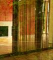
Fairy Ballroomby emorgan49Comment: Nice idea that fits the challenge topic well. Color is generally OK.
Compositionally it lacks a central focal point. This composition would be improved tremendously if you could have had an actual 'fairy' model reflected as well. That would give the viewer a focal point and support your theme much better.
Other than the reflection this is a very ordinary view. It will not work well for some reviewers and they will give it a low score. |
 Photographer found comment helpful. Photographer found comment helpful. |
| 06/24/2005 03:05:26 PM |
A Soul Entering the Lightby skiefComment: Great clarity and detail, decent color and good use of the rule of thirds. Technical quality is superior.
It remains to be seen how voters will relate this to the challenge topic but will probably feel its technical merit outweighs any "meet the challenge" issues they might have.
Only a couple technical suggestions. This image would benefit if noise reduction is applied. It is particually apparent in the blue background. There are two tiny specks on the upper right edge of the jellyfish that are slight distractions. Even though they are real they should be cloned out.
Overall this is one of the very best images in the challenge and should finish very high. |
| Photographer found comment helpful. |
| 06/24/2005 02:57:11 PM |
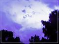
Chemical Purple Hazeby CLarson557Comment: A curious attempt at a fantasy world. Natural framing is right and you have nice clouds to work with.
Low technical quality will hurt its score. The blurriness of the tees will be interpreted as poor focus or an ill attempt at motion blur by most reviewers. Reviewers will also easily detect that your color is artificially added and that it does not look natural. It is most visible in the transition area to the trees where the purple color is much more intense in a way that does not happen in the real world. You see this all the time in DPC entries where the color is overdone. You have to work at it but there are techniques you can apply that will reduce that edge effect and make it look more natural.
You might argue that this is a fantasy world and not intended to be real. Most reviewers would reject that premise. Even in movies they demand plausibility. |
| Photographer found comment helpful. |
| 06/24/2005 02:45:39 PM |
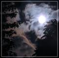
Above the Clouds ...by LadeeMComment: Nice framing and clouds. Composition is excellent.
Technical quality is the main issue most voters will have with this image. The moon is overexposed in the frame and that is a major distraction. Even with this overexposed area the image is still very low contrast and does not have a proper black point set. The tree silhouettes should be jet black. It needs to have noise reduction applied. |
| Photographer found comment helpful. |
| 06/24/2005 02:38:49 PM |
Interdimensional Visitorby amberComment: Good black point and an alien theme meets the challenge.
Some reviewers may not feel this is a very creative attempt at the challenge topic and vote it lower.
The main downfall of this image is noise. It has a lot of electronic noise that will be interpreted by most voters as a low quality image. This effect is pronounced since it does not have much detail to begin with. This image would benefit greatly with noise reduction applied. Message edited by author 2005-06-27 14:40:11. |
| Photographer found comment helpful. |
| 06/24/2005 02:33:52 PM |
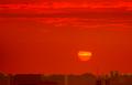
Jupiter rising over IOby mpembertonComment: Valient attempt at surrealism to create your fantasy world. The sun - whoops, I mean Jupiter - is exposed very well.
Unfortunately this is a good example of a perfectly fine image that is destroyed in post processing. It is obvious to the viewer that the redish orange sky is artificially generated since the cloud edges are not white as they should be.
It is also very obvious that the horizon and sky were artificially separated. The lighting on the horizon is not even remotely accurate given the sky. It is very washed out and the transition line needs a better feathering.
This just did not turn out very well. You probably worked pretty hard on it too.
It is also possible some reviewers will know that Io is the wierdest and most volcanically active object in the solar system and vote you lower because they know it could not have buildings like yours does.
There were something like 10 simultaneous volcanic erruptions detected on Io when the first Pioneer spacecraft flew by it in the late 70s. They are so common and so large that the first erruption was discovered well before arrival by the navigational team. They only wanted to take a picture to see the exact location of the moon with respect to the spacecraft so they could make final flightpath adjustments. You can imagine their surprise seeing a giant volcanic plume a quarter the size of the moon.
I'd chalk this attempt up to experience and move on. |
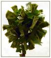
| 06/24/2005 02:11:26 PM |
If Only.......by singsunshineComment: A money tree fits a fantasy world concept in a way anyone can relate to. Sharpness is good and the choice of a white background works very well.
There are a couple technical items that will hurt this image in scoring. One is that the background is not solid white. Some 'dirtiness' shows through that will be a distraction for some viewers.
There are some digital 'jaggies' that show up prominently on the edges of the dollars on the tree. These are also distracting and should be corrected.
The biggest flaw is lighting. The tree needs some front illumination. It is too dark in the center and it is made more apparent when contrasted to the white background.
There is something you might try in post processing without reshooting that might work well with this image for this particular challenge. You could apply dodging to lighten various areas in the darkened interior of the tree to give it a more surreal look and added viewer interest. But you have to be careful not to overdo it. It is very easy to lighten to much and give the image a washed out look. I'd recomment a brush opacity of around 5% or maybe a little more and make broad circular strokes. |
| Photographer found comment helpful. |
| 06/24/2005 01:58:10 PM |
Solaris by LevTComment: Nice job. High technical quality. Picking an outdoor location for the tiny refracted images in the bubbles is a terrific idea. Does not look like camera or photographer got into those images. This image will place very high in voting. |
| Photographer found comment helpful. |
| 06/24/2005 01:53:36 PM |
Woodland Fairy Castleby SJCarterComment: Good attempt at creating a fantasy world. The use of softness in the background is a good idea. Colors are fine, particularly the surrealistic look of the background tree trunk.
Some viewers will not buy into the world as you've created it and will vote it lower.
Technically, there are a couple things that hurt the image. There is a high amount of detail in the main focal point and it does not come across as sharply focused. It is very difficult to get fine detail like that correct in digital images. It also has a couple of hot spots on the lower left of the side of the main subject that should be corrected.
You might try some burning to both mute the oversharpened granulated appearance and remove the hot spots. 10% darkening of the near trunk and foreground will also soften the image and bring out more detail with better tonal transitions. |
| Photographer found comment helpful. |
| 06/24/2005 01:44:18 PM |
Ylguby bucketComment: Concept works, colors are fine and the image is not overexposed.
Viewers will not be able to figure out what the fantasy is and that may hurt it in voting.
On the technical side the head is tilted clockwise considerably. This is a distraction that will hurt it in scoring. Unfortunately the only way to correct it is to reshoot after repositioning the head in the composition.
This is an otherwise fine image. |
| Photographer found comment helpful. |
Home -
Challenges -
Community -
League -
Photos -
Cameras -
Lenses -
Learn -
Help -
Terms of Use -
Privacy -
Top ^
DPChallenge, and website content and design, Copyright © 2001-2025 Challenging Technologies, LLC.
All digital photo copyrights belong to the photographers and may not be used without permission.
Current Server Time: 08/17/2025 12:48:49 AM EDT.