| Image |
Comment |
| 05/19/2006 09:27:29 PM |
Man vs Natureby trainComment: I know you probably have a bunch of dnmc comments - but this shot rocks anyways. Great capture. (I voted earlier so you wont see a change if you are watching) |
 Photographer found comment helpful. Photographer found comment helpful. |
| 05/19/2006 09:26:10 PM |
Emu Eggsby pointandshootComment: Cool shot. Great colors and textures. You did well with the lighting - it adds alot to this shot. Well done and bumping up. |
| Photographer found comment helpful. |
| 05/19/2006 09:25:58 PM |
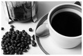
Coffee, Blackby no__1__hereComment: Great layout on this one. B&W traetment works very well as well as the light grain. Good shot. Bumping up. |
| Photographer found comment helpful. |
| 05/19/2006 09:25:53 PM |
Baited and Readyby ericwooComment: Good shot and nice colors. The overall composition has a very nice texture to it if that makes any sense. Bumping up. |
| Photographer found comment helpful. |
| 05/19/2006 09:25:48 PM |
Limboby aznymComment: I like this hsot alot. Great feel and a great capture with basic editing. hope this does well for you. Bumping up. |
| Photographer found comment helpful. |
| 05/19/2006 09:25:41 PM |
|
| Photographer found comment helpful. |
| 05/15/2006 01:50:25 PM |
Waves of Colorby BosborneComment: Greetings from the Critique Club -
I guess I will begin with the fact that this shot didnt work for me personally. I am still trying to figure out what it is - not that it being abstract had anything to do with my vote, I just didnt think it was an appealing abstract. The color blending and blur didnt leave enough detail to be interesting. The curved lines do give some sense of rhythm, but as a whole the shot just felt rather uninteresting. I am sorry that I can't really give any technical areas to improve or any other areas to critique. It is always good to get a new pic and score in your profile page. Shows that you are improving in your entries. Your two higher entries are very well done and Ilook forward to seeing your future improvement and growth at DPC.
Tim |
| Photographer found comment helpful. |
| 05/15/2006 01:38:18 PM |
Delightfully Psychotic Cyclistsby MelethiaComment: Trading Post -
A shame that the focus isnt sharper on this one. The angle/lean is good and the colors are nice. Cloning out the cyclist in the very back would have given you a clean sharp line with the other 3 cyclists. But the big issue is focus. Keep working with your lens and I know you will be doing better soon. |
| Photographer found comment helpful. |
| 05/15/2006 01:34:16 PM |
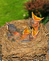
Documenting Predatory Chicksby tngrndreamComment: Trading posts -
Did the parent robins damage you at all? I have been attacked several times by these vicious birds just from walking close to a tree with a nest in it. I gave you a 6 on this one. I think the title with the pic was kind of funny. You have pretty good sharpness on the birds and the colors on them are nice. The hsot overall seems a bit too bright. Some burning work on the nest could have toned down the brightness of it. A slightly darker feel would have been nice. I dont know whats on either side of the nest but a slightly wider crop on the sides and the top cropped down a bit more may have helped as well. The grass and bush seem saturated a bit too much and dont do much for the shot. I think you have a good shot here and with a little more refined processing you could have done much better. I still think you scored too low on this one. |
| Photographer found comment helpful. |
| 05/15/2006 01:28:20 PM |
Dad's Patricide Comedyby chaliceComment: Trading Post -
First off - if you had lost the glasses and we couldhave seen your eyes your score would have been higher IMO. It looks as though you have them bugging out great but they are hidden by the shades and the bad reflection in them. A different background would have helped as well. One solid piece without the division and stepping away from it a bit would have been nice. THere is also an odd yellow color cast. Maybe the lighting that you used. I give you kudos on the shot ingeneral as self portraits can be challenging. You got pretty good focus on your face. As a movie poster shot - I am on the fence on that one. |
| Photographer found comment helpful. |
Home -
Challenges -
Community -
League -
Photos -
Cameras -
Lenses -
Learn -
Help -
Terms of Use -
Privacy -
Top ^
DPChallenge, and website content and design, Copyright © 2001-2025 Challenging Technologies, LLC.
All digital photo copyrights belong to the photographers and may not be used without permission.
Current Server Time: 08/06/2025 03:23:34 PM EDT.