| Image |
Comment |
| 12/02/2002 11:31:00 PM |
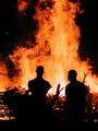
Bonfire 2002: Texas Aggies Remember 1999 Collapseby FrooberComment: Clearly, the first thing that caught my eye was the dramatic contrast of the flames against the blackness. The small aperture was very effective in capturing a fairly wide depth of field so that we can appreciate the sharp details of the figures and the burning wood. Honestly, I'm not sure what I would change. Someone mention having a preference for a faster shutter speed to be used but I disagree. I would not want the flames to be frozen anymore then they are. The slightest bit of motion blur only adds to the effect of rapidly moving flames and the parts that are sharp adds to the edgy contrast. The cropping is excellent in the way that the bottom of the photo begins as solid black leading up to the figures and then the way that the flames extend into the top of the photo creating the effect of extending much higher into the night. There appears to be some communication going on between the two men by the way the man on the left is looking in the direction of the other. There is a naturalness that is believable rather then looking posed. All in all this adds up to a powerful and interesting photo. Tim Jensen |
 Photographer found comment helpful. Photographer found comment helpful. |
| 12/03/2002 12:02:00 AM |
A City United: Public Transportation Success Storyby magnetic9999Comment: I think I would have left some of the grain in. Grain in candid or photojournalistic photos is acceptable. As iit is there is some plasticity that I find a little distracting. The photo is very successful, however, in large part because of the black male who's looking straight at the camera contrasting with the beautiful white female who is absobed in her book. Even the little girl seems to be looking at the camera. There is a lot of visually contrasting relationships in this photo to make it very effective as a black and white. I think it is cropped just right with just enough information included to show these people in their environment. I love photos like this because it makes me wonder what everyone is thinking about and I start to imagine a story about them. Technically, I think it could be a little better but it is still a very engaging photo. Tim Jensen |
| Photographer found comment helpful. |
| 11/27/2002 02:16:00 AM |
Smiling to victory by arnitComment: This is nice. It has a lot of emotional impact and action. The composition is good too. T |
| 11/27/2002 02:29:00 AM |
Do we care?by sahkoComment: Should I be looking at the woman or the guy on the bench? They are competing visually. It is a pretty intersting photo still. T |
| 12/03/2002 02:07:00 AM |
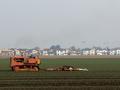
Farmers Losing Groundby autoolComment: I think farms and tractors always make for good photos. I think it is the hardwork and freedom they seem to convey. I wish I could see a little more of that sense from this photo. It is the row of houses and the amount of sky that is being shown that detracts from this sense. I think if you were to use a faster aperture setting of F2 to F5.6 then you could have blurred the background and some of the foreground in order to isolate the tractor and focus our attention on in. I would also prefer to see more of the field in the foreground. After all, it is the tractor and the field that is the subject. Perhaps even trying it so that the horizon line is only a third of the way from the top. I would have to see it to know for sure. Framing the tractor so far to the left seems to crowd the edge and I feel it would work better compositionally if you centered the tractor and plow. This way the tractor would still be a little heavy on the left making it interesting but not so much that it crowds the edge. I know this probably would not be possible but it would be interesting to me to see this image from higher above the ground so as to see more of the crop lines. Simply showing more of the field would accomplish this somewhat as well. The orange of the tractor with the blue of the farmer contrasts nicely with the green grass. For the most part I find this to be a good photo which could use a little work with the DOF and composition. As for meeting the challenge, I think this photo is a very good choice and one that helps to tell a story. Tim Jensen |
| 11/27/2002 02:20:00 AM |
|
| 11/27/2002 02:13:00 AM |
Killer Stormby mrguilleComment: It probably could not be avoided but I would have preferred the photo without the fire line. It is also a pretty ordinary angle which I think could be improved on. Maybe tighter cropping. T |
| 12/02/2002 10:40:00 PM |
Big Dipper Attacked By Leonid Meteorby SSonnentagComment: I'm still trying to determine how I feel about this photo in regards to the photojournalism topic. I think I am leaning more towards it successfully meeting the challenge. I feel it is a strong photo with some very nice subtleties to it with the detail in the hills, the stars, and of course, the meteor. Even the stars form a nice shape. what bothers me a little bit is the blurred bush in the foerground clearly due to the long exposure and I'm sure, unavoidable. I may have cropped the photo at the base of the mountains but I'm not sure. The colors are true and I'm glad you didn't try to oversaturate them. The beauty of this photo lies in it's simplicity. It does not overpower you yet it drws you in to explore the details. Nice job. Tim Jensen |
| 11/10/2002 11:02:00 PM |
|
| 11/10/2002 11:04:00 PM |
Seven Years of Bad Luckby JackoComment: I would have given this a higher score if the expression didn't look so staged. The composition is pretty good. T |
Home -
Challenges -
Community -
League -
Photos -
Cameras -
Lenses -
Learn -
Help -
Terms of Use -
Privacy -
Top ^
DPChallenge, and website content and design, Copyright © 2001-2025 Challenging Technologies, LLC.
All digital photo copyrights belong to the photographers and may not be used without permission.
Current Server Time: 08/06/2025 04:34:27 AM EDT.