|
|
|
Showing 171 - 180 of ~497 |
| Image |
Comment |
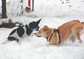
| 12/22/2002 10:59:44 PM | Why you.....!!!! Bite me, will you?by mcraelComment: After I saw the image and what camera you used my question is why Automatic mode? It is a pretty fun picture as it is and I am sure you are enjoying it. I know these kinds of images are extremely tough. I've taken quite a few myself of my dog playing with my sister's dog. My preference is normally to not use the burst mode because I usually miss something good in the 7 or 8 seconds the camera takes to process the images. I'm finding that I am having better success by manually focussing at a distance that is close enough to keep the dogs tight in the frame, setting the camera to shutter priority at a very fast speed like from 1/250 to 1/500 while trying to keep the aperture somewhere towards a small size to try to maintain some DOF to work with, and then running around like crazy staying as low to the ground as I can trying to capture one quick shot at a time. As long as I stay at a consistent distance from the dogs the focus should be good and I should be able to take quick photos. It does take lots of practice and there certainly is nothing wrong with using the burst mode. It looks like you needed to crop the photo quite a bit to fill the frame. This is evidenced by the level of softness as well the pronounced haloeing around the darker edges. I think it captures a sense of motion very well and I don't think that all images need to have motion blur to show motion. While I often prefer a real tight crop to my images, in this photo I prefer to see the background because it is interesting as well and serves to place the dogs in their environment. It's part of the story. However I dont like how the yellow dog is crowding the right edge, there needs to be more room on that edge. It can also use a little more punch by increasing the black level slightly more and increasing the saturation a little bit. While it can use some improvement technically it is still a nice photo that is a pleasure to look at. Good job.
Tim Jensen |  Photographer found comment helpful. Photographer found comment helpful. |
| 12/22/2002 10:23:30 PM | Seven car pileup!by kanid99Comment: This is one of those difficult types of photos to critique because it seams the opinions are so varied on what makes a good sports action photo. I find it very intersting and think that it should have rated higher. What I do like is the color and the business where everyone seems to be off balance. It is sharp with nice contrast. What bothers me is the cropped ref and the guy right behind him. It just doesn't seem to fit the rest of the action. It is probably the whole scene that is the attraction but I would still prefer to see an additional element like the football that I could stop and focus on. I think #8 probably has the ball but I would still like to see it to know for sure. It might have even worked well to slow the shutter down a little more to include a little bit of blurring. When it is handled properly it can be very effective. I think it is a good shot but I feel it needs a little something more. Maybe if you had cropped it even tighter and filled the frame with the players it would have given the photo an abstract quality that conveyed only a colorful mass of bodies in movement.
Tim Jensen |
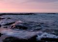
| 12/22/2002 03:51:47 AM | Motion From The Oceanby WalenaComment: This is a very pretty image with lovely colors. However, I find myself a little uncomfortable with the sky. If the sky had more interest and contrast from the clouds than I would think that you had the right amount of sky showing but as it is, which is somewhat plain, I would prefer to see you position the horizon line further upward to show more of the water and rocks in the foreground. You are hinting at something more interesting at the bottom and left edges and I am wanting to see more of that. A slightly faster shutter speed would have increased the sharpness which would have lead to more visual interest for me, like where the water is splashing up from the rock, yet, at the same time, maintaining some of the motion in the water. I get the impression from the blurrying on the rocks that a tripod was not used. I think it would I been very important to maintain the sharpness of the rocks while still showing the motion of the water. I think it is a pretty good photo and with just a few adjustments it could be made very good.
Tim Jensen |
| 12/22/2002 03:26:06 AM | Christmas colorsby kevinswopeComment: The colors are pretty and the material looks very soft but there is something missing. Maybe it needs something bright and shiny lying on top of the stockings or they need some other arrangement to create a lot of interest. I'm not sure what is going on in the background. I would prefer to either see more of it or less of it. It needs some specific area of interest. I keep thinking that the stockings with their softness and bright colors would actually provide a great background for something like a shiny ornament, toy, or something like that which would create a nice visual contrast. I do like the low angle and closeness to the foreground stocking. There is a feeling like you can reach out and feel the softness of the stockings. The color, exposure, sharpness, and DOF look appropriate. You have some great material to work with I just think it needs some more elements of interest.
Tim Jensen |
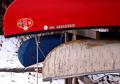
| 12/22/2002 03:00:27 AM | Something old, something new, something borrowed, something blue.by RiderGalComment: My first thought when I first viewed this was that it was upside down because of the lettering. But of course it isn't. I would have to agree that it is somewhat boring as it is but it probably didn't have to be. It is very difficult to offer how to make the photo more striking by not actually seeing the scene. I think there are some very good elements to work with such as the white snow, the color and texture of the boats, the branches and the rope. I may have tried to show more of the snow and/or displayed the boats at an odd angle. Maybe you could have even taken a shot from underneath the boats aiming upward with a blue sky behind them. Even if you think you have a great idea at the time for the composition it is worthwhile to also explore every other possible way to view the scene. There is probably one angle you never would have thought of that looks great in the camera. It looks like there are many nice textures in the snow with the branches, leaves, and wood structure that would be fun to look at as well. The image appears properly exposed with good color and sharpness. I think it is a nice photo that has the potential to be great.
Tim Jensen Message edited by author 2002-12-22 03:27:09. |
| 12/21/2002 10:07:22 PM | Corne by muckpondComment: I know I should try to be real objective when I am critiquing an image but 'Wow' this is a great photo. I am having a very hard time deciding what I don't like about it. Probably the biggest gripe I have is that it is your photo and not mine : ) I usually like color best in my photos but this one really is best in black and white because it keeps the focus squarely on the shapes, forms, and lines that are the essence of this photo. Color could have introduced an unwanted emotion. Besides being in black and white the other thing that stands out is the near perfect execution of the shot. The lines are very clean except for a slight hint of pixelation or stairstepping in one of the lower left shapes. The contrast gives it powerful impact without being exaggerated. The square cropping was very smart because it is neither a portrait nor a landsscape, it is abstract and thus does not need to be a rectangle. All and all, a great photo.
Tim Jensen |
| 12/12/2002 04:36:48 PM | Eerie blue lightby billypComment: I gave this photo a 6 and I think it should have done better then it did in the ratings. Like others have mentioned, a better composition could have improved it. I can imagine the light being possitioned or cropped at an angle to improve the interest and it would probably help if the light was not so centered. I would have loved to see more of the surrounding texture. I think it would have contrasted nicely with the smooth, bright light. Maybe brightening the middle values using the Levels tool could have helped to bring out that texture some more as well as little more sharpening. It wouldn't take too much to make this photo even better.
Tim Jensen |
| 12/12/2002 04:03:26 PM | Bubblesby JamieWillmottComment: I thought this was a pretty cool photo and I gave you an 8 on it. I'm getting more and more into abstract photos and I can appreciate the simplicity and interesting details of this photo. I feel it can use some improvement, however. It looks like it wasn't real sharp to begin with and you needed to sharpen it up and it shows, unfortunately. I think increasing the constrast would have helped. By deepening the back ground color with the Levels tool the photo would have some more 'snap' to it. There is also some funny, fuzzy shapes among the bubbles that are distracting. I don't know if they could have been prevented or not. For the most part it is a fine photo that meets the theme but with some room for improvement. Keep up the good work.
Tim Jensen | | Photographer found comment helpful. |
| 12/12/2002 03:21:51 PM | Absolute Zeroby KonadorComment: I have to hand it to you, you certainly come up with some of the most creative photos. This one is very cool, it sends shivers up my spine, I was frozen in amazement! Ok, enough with the puns : ) Actually I like it quite a bit but I must admit I think it needs a certain something else like over exposure to really brighten things up. If you had blown out the highlights a bit I think it would have added to the mysteriousness of this photo and really made it stand out in an abstract way. I think the composition is very good. It's much like going down into an ice cave. Of course it really is, on a smaller scale. It's that illusion of being a much larger space that really adds to this photo. With the colors you nailed the theme and technically it is very sharp but not overprocessed. Great job Konador.
T | | Photographer found comment helpful. |
| 12/11/2002 02:20:55 PM | INK by marboComment: This is one photos that definitely looks better when it is enlarged. I am a little curious about the shadow. Did you use a separate flash or do you rotate your camera to the right instead of the left? Something about the shadow, maybe the location of it, bothers me a little. It's fairly minor though. For me it is the vibrant blue and the sparkles that make this photo stand out. I would have cropped even tighter and focussed more on the lines of the swirls. Technically it is very clear and sharp without any flaws. The creative factor is very high. It's not everyday that you see a photo of ink in this fashion. Nice job.
Tim Jensen | | Photographer found comment helpful. |
|
Showing 171 - 180 of ~497 |
Home -
Challenges -
Community -
League -
Photos -
Cameras -
Lenses -
Learn -
Help -
Terms of Use -
Privacy -
Top ^
DPChallenge, and website content and design, Copyright © 2001-2025 Challenging Technologies, LLC.
All digital photo copyrights belong to the photographers and may not be used without permission.
Current Server Time: 08/04/2025 02:54:27 AM EDT.
|