|
|
| Image |
Comment |
| 05/01/2010 01:20:29 PM | Summer Casuals Collectionby amateurboiComment: Greetings from the Critique Club :)
My vote: 6. If I recall my first impression, it was something like: good portrait, without any technical flaws, but nothing studio-like. The nice colors go well with a cheerful expression.
Obviously it would have scored much higher if the challenge would just have been 'Full-Length Portrait'. One cannot expect everybody to rent a studio, but the minimum would have been to use a flash light as a fill. Maybe a specular reflection in her eyes would have been enough to create a little bit of studio mood.
The composition is solid, I like it. The location is very well chosen, it's a fantastic place for a portrait. The background does not interfere with the subject but does enhance it, as noticed by  nikuser nikuser. The crop is a bit too tight. I am not as offended by it as  LalliSig LalliSig, but the toes for instance look as if they were physically touching the border. This looks a bit weird in a comical way, if this was your intention then it's OK.
The pose is not very flattering. I mean, only the slimmest models get away with a full frontal view. Tilting the body would have been far better I think, most notably because with leaning her against the pillar, it would have looked very natural and sophisticated (and no snapshot comment).
As already mentioned, technically it's very good. Optimal focus, nice contrast, beautiful color tones, good job!
If you have any questions or remarks about this critique, feel free to contact me.
Mike
|  Photographer found comment helpful. Photographer found comment helpful. |
| 05/01/2010 11:35:35 AM | | | Photographer found comment helpful. |
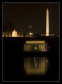
| 05/01/2010 11:31:45 AM | Tub With a Viewby npaselComment: Great inspiration here, the two pictures go really well together (composition, complementary colors, textures)! 8 | | Photographer found comment helpful. |
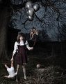
| 04/20/2010 03:24:05 PM | Walking the Dogby TransitComment: There's a bit too much going on in there for my taste. But thanks for the laugh :) 7 | | Photographer found comment helpful. |
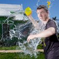
| 04/20/2010 03:13:01 PM | 0wnedby glodaComment: Impressive technical achievement, well composed, funny :) For me it's by far the best of the water balloon shots! 9 |
| 04/19/2010 04:05:03 PM | Thirstyby bob350Comment: One of my top favorites in this challenge. Well done & clever, except the boring title. | | Photographer found comment helpful. |
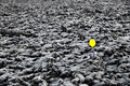
| 04/19/2010 03:07:21 PM | Lostby BogiComment: It's a fantastic concept, but the blown out yellow is a real pity. The lack of detail makes it look as if a hole had been cut out. |
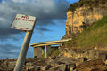
| 09/16/2009 04:50:48 PM | No Stopping Waldoby VonneypixComment: Greetings from the Critique Club :)
My first impression was a big WOW about the fantastic perspective!
A key to great landscape photography is to recreate a 3D feeling with only 2 dimensions. You succeeded so perfectly that this image could be used as a textbook example. The sign does most of the job and I certainly do not agree with the comment which asks for leaving it out. There are loads of prominent lines in your composition, which are very interesting for the eye to be followed. They are nicely balanced by the curve of the bridge.
The early time of the day gives a nice warm lighting with pleasant colors. The side lighting enhances the shape of the rocks. The focus and exposure seem perfect. But you should know that using small apertures creates diffraction blur, I'm not sure if you really needed that small for a good depth of field. So far so good for the technicals. But I am not convinced by your choice of HDR. One of the disadvantage of this technique is that it can produce quite flat color tones. If you look at the cliff for instance, there's a terrible lack of detail (I thought it was from sharpening first). Also the rocks in the foreground could look better by increasing a bit the contrast in the mid-tones. Moreover, I cannot see any advantage you get from HDR in this specific case. If you just had some exposure issues in some areas, it could be more effective to work with layer masks.
The subject (Waldo) is very difficult to make out. There's a strangely colored 'rock' between the utmost left pillars of the bridge which must be him. I know that the challenge is that he is difficult to be found, but once I do find him I want to distinguish a bit more.
From my two last points you should have a possible explanation why your picture scored relatively low. And low it is for such an outstanding composition. As the composition is the hardest thing to learn in my opinion, I am pretty convinced that we will see some ribbons from you in a near future :)
If you have any questions or remarks about this critique, feel free to contact me.
Mike
|
| 08/31/2009 05:46:38 AM | Pink fishby jonthrComment: Greetings from the Critique Club :)
First of all, congratulations on the nice catch!
The composition is effective, its strongest element is the beautiful curve formed by the fish. I would have tried to make this curve even more dominant by filling more the frame or croppping. I do not agree with the comment saying that the other side of the fish would look better, because you captured wonderful contrasting colors this way.
Technically, it is well in focus, but you could have sharpened it a bit more. The depth of field is well chosen, the water background looks great. The biggest improvement you could make to this picture is using the full tonal range: make the blacks look really black, and the pattern of the net will pop out nicely. Make the white of the fish belly look white and you'll have a beautiful contrast with the colours. Check the colour values in photoshop with the colour sampler, then adjust with levels or curves.
Coming to the challenge subject, the pink tones are subtle but are there. Of course you could have tried to make them look a bit stronger with processing. Or title it 'Salmon', then everybody would know that the flesh is pink.
It's the cruel world of DPC, if the link to the challenge is not blatantly obvious, it gets punished by a lot of voters. Without this aspect, it would have scored much higher, because it is a strong picture.
Don't lose courage because of some nasty comments from people who cannot afford to repair their CAPS LOCK key. You have a great future around here. If you have questions or remarks about this critique, please conatact me.
Mike |
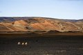
| 08/29/2009 03:35:04 PM | Wastelandby thesonComment: LOL, great photo! They are walking towards the thirds, don't they? 10 for the originality! |
Home -
Challenges -
Community -
League -
Photos -
Cameras -
Lenses -
Learn -
Help -
Terms of Use -
Privacy -
Top ^
DPChallenge, and website content and design, Copyright © 2001-2025 Challenging Technologies, LLC.
All digital photo copyrights belong to the photographers and may not be used without permission.
Current Server Time: 08/03/2025 11:11:14 PM EDT.
|