Greetings from the Critique Club :)
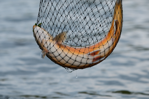
First of all, congratulations on the nice catch!
The composition is effective, its strongest element is the beautiful curve formed by the fish. I would have tried to make this curve even more dominant by filling more the frame or croppping. I do not agree with the comment saying that the other side of the fish would look better, because you captured wonderful contrasting colors this way.
Technically, it is well in focus, but you could have sharpened it a bit more. The depth of field is well chosen, the water background looks great. The biggest improvement you could make to this picture is using the full tonal range: make the blacks look really black, and the pattern of the net will pop out nicely. Make the white of the fish belly look white and you'll have a beautiful contrast with the colours. Check the colour values in photoshop with the colour sampler, then adjust with levels or curves.
Coming to the challenge subject, the pink tones are subtle but are there. Of course you could have tried to make them look a bit stronger with processing. Or title it 'Salmon', then everybody would know that the flesh is pink.
It's the cruel world of DPC, if the link to the challenge is not blatantly obvious, it gets punished by a lot of voters. Without this aspect, it would have scored much higher, because it is a strong picture.
Don't lose courage because of some nasty comments from people who cannot afford to repair their CAPS LOCK key. You have a great future around here. If you have questions or remarks about this critique, please conatact me.
Mike |