| Image |
Comment |
| 01/14/2003 09:37:37 PM |
Reflectionby Hotshot132Comment: My favorite for the week. This is AWESOME! I love the warm colors here and your composition is truly phenomenal. I also like the fact this is totally different then all the other entries. Great job, you deserve a place in the top 3! Good luck! :-) |
| 01/14/2003 09:29:33 PM |
Golden Gateby GeneralEComment: This looks unnatural and more like a painting then a photograph. I really don't care for whatever you did, I'm guessing in photoshop or a similar program. This would have been a really cool photo just in black and white, not sure why you choose to do such dramatifc stuff with the coloring. Just having the piece of the stteple is kind of bothersome, but I love your framing of this shot. |
 Photographer found comment helpful. Photographer found comment helpful. |
| 01/14/2003 09:09:31 PM |
Stand Tallby TurbotechComment: I\'m not sure this was the best choice for a landscape entry. The entry seems to focus more on the building then on the land around it... especially because that is what the lines lead to. Also it looks like the sun was coming from behind the building creating that glary white you get sorrounding the building which is fairly destracting. Very intresting building though? what is it? |
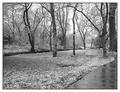
| 01/14/2003 09:06:21 PM |
Winter Serenityby crabappl3Comment: Excellent composition on this photo! I love the way the lines of the sidewalk and the line of the creek cross paths, that is where your eye is drawn to. I think this might have been cooler with just slightly more contrast but it's a really neat photo. I like your perspective of looking down rather then up... it looks like a very peaceful walk! You get a 9 from me! Nice job and good luck! |
| Photographer found comment helpful. |
| 01/14/2003 08:59:42 PM |
Prominent Thornsby smellyfish1002Comment: I LOVE this perspective on landscape. IMHO this is one of the most creative photos in the challenge. It's really beautiful. It fit in the landscape, but it's excellent photography as well. The horizon looks maybe a tad bit slanted, but this is still a really cool photo. Nice job, and good luck! -9- |
| Photographer found comment helpful. |
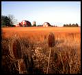
| 01/14/2003 08:37:41 PM |
Hay, thats nice!by MartinComment: Lovely subject, perfect for the challenge, one big problem I see here was that you were shooting into the sun which caused the white spot more in the left hand corner... too bad, because I love the rich colors of the land, and the sky. Also I think your horizion is a little tilted.... fixing that in photoshop might have worked... cool idea though. |
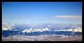
| 01/08/2003 05:15:59 PM |
View from Seat 6A, 33,000 ft.by albright1Comment: Critique Club
Wow this shot is awesome! It was one of my few 10's for the challenge.
Composition - Great, good use of the rule of thirds... very nice, I love how the first third is pure blue, then you have a few clouds in the second third and then you have the action. Awesome job here!
Exposure - Amazing especially for shooting through a plane window! The whites of the snow are well exposed which can be tough sometimes... good job.
Color - wow that is one blue sky! Did you use a polarizing filter by any chance, or play with that in PS or is that how it really looked. Awesome color to this. I love all the different blues here.
Focus - wonderful... great job for focusing through the plane window.. really excellent work
Background - no complaints
Fit For challenge - hey you were in the midst of travelling, thats pretty obvious! Great fit.
Wowability - Really beautiful photo that catches your eye.
Final Comments - you did an awesome job with this photo! I think it should have placed higher, even your use of border turned out very nicely. I really have nothing to complain about hence the 10. Great job! and keep up the beautiful work! :-) |
| Photographer found comment helpful. |
| 01/06/2003 05:08:15 PM |
Screaming Daughtersby HoogieComment: Critique Club
First off this is a very good photo, I think it would have done much better if it was in a different category, obviously by your comments this did not fit into travel.
Composition - though this isn't classical composition I think it comes off very nicely. I really think it is a very appealing photo to the eye...Especially that the girl on the right is just a tad bit higher up, helps it.
Exposure - the exposure here is excellent... very nice job with that
Color - the color here is great, I love how the blue background they are on brings out the color of their eyes. It's really cute. Also the way the pinks in their shirts match is great as well.
Focus - no complaints here
Background - nice that you have them with a solid background, this would not have worked if the sheet (?) had flowers or stripes or something.
Lighting - excellent even lighting, no shadows, nice job on that.
Fit for the challenge - this is where you lost points, with DPCers you have to make sure it's obvious to people how it fits the challenge... As I said before this would have done better in a different challenge.
Wowability - the cuteness of the two girls, and the looks on their faces really catches the viewers attention.
Overall I think you came up with a nice photo. Definitely a keeper for the family album ;-) |
| 01/06/2003 03:07:17 PM |
Where Men Fear To Treadby mcmurmaComment: Hahahaha... now this is a very funny one. Thanks for the laugh! Overall not a bad picture, especially good job with the lighting, which can be extremely tough in an indoor situation like this. Nice job with that. It definitely gets the point across as well. |
| Photographer found comment helpful. |
| 01/06/2003 03:04:17 PM |
untitledby FranziskaLangComment: Excellent use of the challenge. Definitely a stranger literally in strange land :-) Not an extremely appealing photo visually, but cute all the same. Good choice of using a plain background, and I like the fact that it's blue. Also not bad lighting. -7- |
| Photographer found comment helpful. |
Home -
Challenges -
Community -
League -
Photos -
Cameras -
Lenses -
Learn -
Help -
Terms of Use -
Privacy -
Top ^
DPChallenge, and website content and design, Copyright © 2001-2025 Challenging Technologies, LLC.
All digital photo copyrights belong to the photographers and may not be used without permission.
Current Server Time: 08/26/2025 12:24:35 PM EDT.