| Image |
Comment |
| 05/18/2006 04:16:27 PM |
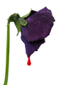
Don Petronio Corleoneby seebrownComment: Greeting from the Critique Club Chad!
First impression - a nice shot. I'm fond of the colors and the drop of "blood" tell me, "nice capture". I also like the bright white background.
How could it score better? I'd say for starters you could shut that aperture down a bit more to maybe f8 of so. Of course you may or may not need a bit more lighting (I don't think you would though) to help stop the motion of the droplet but f4 leaves the stem just a bit soft. While the colors are certainly beautiful it just doesn't have the "pop" that DPC voters need to give you an abundance of the eights that it takes to put images on the front page. Hit it with a bit of unsharp mask as well to see what you get.
Overall a lovely image!
Thanks for the opportunity to critique this photo Chad.
Cheers - Phil |
 Photographer found comment helpful. Photographer found comment helpful. |
| 05/18/2006 01:25:26 PM |
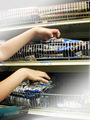
Driving Pop Crazyby GeneralEComment: Greetings from the Critique Club!
If text would've been allowed you'd have definitely got a better reception here. Your post challenge shot was well done.
The idea is really creative. Driving Pop Crazy was an excellent choice and I like how you incorporated that shopping cart buggy to get it across. I'm guessing you know what hurt you: the faded corners you left to insert the text. Most people, myself included, would've never considered that adding text was what it was for and probably voted it down wondering what the heck the photographer was thinking to post process an image like this. I didn't vote in this challenge but would've done the same thing.
Like I said, overall a great idea.
Thanks for the opportunity to critique this image!
Cheers - Phil |
| Photographer found comment helpful. |
| 05/18/2006 01:05:21 PM |
Middle of Nowhere part 2by GivemeashotComment: Like this crop much better than the other one. Right side subjects with open space to the left are much more appealing to the eye as most of us start left and move right. Like the toning as well. Nice job. |
| Photographer found comment helpful. |
| 05/18/2006 01:03:20 PM |
|
| Photographer found comment helpful. |
| 05/17/2006 10:37:49 AM |
|
| Photographer found comment helpful. |
| 05/16/2006 10:41:45 PM |
pagesby DigitalSoulComment: Greeting from the Critique Club from a fellow Tennessean Hank!
To be perfectly frank, this is an extremely tough image for me to critique as I really can't much add to what's already been said. Good composition and shadowing. The spacing is near perfect and was a great choice for this challenge - which your score of 6.2924 reflects. It has a nice flow from left to right as well.
As was mentioned, the tone is probably what kept you off the front page here. DPC voters really need that "pop" or "wow" to make them click a higher number. The bit of extra curl on the far right sheet is just a tad distracting as well.
Overall a very nice first submission that you should be proud of.
Thanks for the opportunity to critique this image Hank.
Cheers - Phil
|
| 05/16/2006 01:12:36 AM |
|
| Photographer found comment helpful. |
| 05/16/2006 01:09:46 AM |
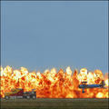
Dangerous Pyro Chaseby SeanachaiComment: Wow. Looks so unreal. It's a shame that the "heat" challenge was just announced. This one would be a winner indeed. Great job. |
| Photographer found comment helpful. |
| 05/16/2006 01:08:30 AM |
|
| Photographer found comment helpful. |
| 05/16/2006 01:07:40 AM |
|
| Photographer found comment helpful. |
Home -
Challenges -
Community -
League -
Photos -
Cameras -
Lenses -
Learn -
Help -
Terms of Use -
Privacy -
Top ^
DPChallenge, and website content and design, Copyright © 2001-2025 Challenging Technologies, LLC.
All digital photo copyrights belong to the photographers and may not be used without permission.
Current Server Time: 08/04/2025 09:35:02 PM EDT.