| Author | Thread |
|
|
05/18/2006 04:16:27 PM |
Greeting from the Critique Club Chad!
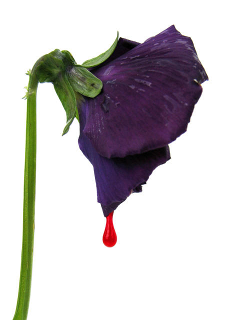
First impression - a nice shot. I'm fond of the colors and the drop of "blood" tell me, "nice capture". I also like the bright white background.
How could it score better? I'd say for starters you could shut that aperture down a bit more to maybe f8 of so. Of course you may or may not need a bit more lighting (I don't think you would though) to help stop the motion of the droplet but f4 leaves the stem just a bit soft. While the colors are certainly beautiful it just doesn't have the "pop" that DPC voters need to give you an abundance of the eights that it takes to put images on the front page. Hit it with a bit of unsharp mask as well to see what you get.
Overall a lovely image!
Thanks for the opportunity to critique this photo Chad.
Cheers - Phil |
|
 Photographer found comment helpful. Photographer found comment helpful. |
Comments Made During the Challenge  |
|
|
05/14/2006 02:51:49 PM |
|
| Photographer found comment helpful. |
|
|
05/14/2006 10:42:07 AM |
|
I hope this is a winner...fantastic concept! |
|
| Photographer found comment helpful. |
|
|
05/13/2006 11:44:40 PM |
|
very well photographed - the colors are excellent... your composition is very nice... |
|
| Photographer found comment helpful. |
|
|
05/12/2006 10:40:13 AM |
|
nice effect. I am not sure how it fits the title but I like it. may have been better on a different color background. |
|
| Photographer found comment helpful. |
|
|
05/11/2006 07:55:44 PM |
|
This lacks atmosphere but a good concept. |
|
| Photographer found comment helpful. |
|
|
05/10/2006 05:31:24 PM |
|
Very creative, love the idea... technically very well done, with good light and composition. Nice! |
|
| Photographer found comment helpful. |
|
|
05/09/2006 05:29:31 PM |
|
Really nice idea and yes it does tell me about the movie in a very subtle yet powerful way. Nice job. |
|
| Photographer found comment helpful. |
|
|
05/09/2006 01:58:55 PM |
|
I like your idea here and I like the colors. I do see the flower as a bit too dark for interest. Overall a good job. |
|
| Photographer found comment helpful. |
|
|
05/09/2006 07:57:05 AM |
|
I'm jealous that I didn't have such a great idea! Love it! |
|
| Photographer found comment helpful. |
|
|
05/09/2006 06:09:14 AM |
|
Good shot. I like the clean look. |
|
| Photographer found comment helpful. |
|
|
05/09/2006 03:16:14 AM |
|
| Photographer found comment helpful. |
|
|
05/08/2006 02:13:33 PM |
|
Interesting subject and good composition, the drop of blood is a nice dramatic touch. Seems a little overlit and/or overexposed, or maybe it's just the white background is too strong. |
|
| Photographer found comment helpful. |
|
|
05/08/2006 12:33:50 PM |
|
I don't think the marketing execs are going to like the purple rose. What does it mean? Why not a drop of blood from a red rose? But I'm not a marketing exec. I'll trust the movie to explain the purple. Maybe Louie the Lilac is back in town! Many movie posters create a symbolic image like yours instead of a still from the movie. This is a good example. The drop of blood tells us plenty about what to expect. |
|
| Photographer found comment helpful. |
|
|
05/08/2006 09:40:58 AM |
|
| Photographer found comment helpful. |
|
|
05/08/2006 03:18:19 AM |
|
what I am looking for in this challenge is for a creative 'wow' shot that would go on a movie poster. I think that's what the challenge is all about...this is OK, but no WOW. I guess once some text was on it with the movie title it would improve, so I will give you the benefit of the doubt |
|
| Photographer found comment helpful. |
|
|
05/08/2006 02:16:35 AM |
|
I really like this shot ... the use of the blood from the flower is lovely. |
|
| Photographer found comment helpful. |
Home -
Challenges -
Community -
League -
Photos -
Cameras -
Lenses -
Learn -
Help -
Terms of Use -
Privacy -
Top ^
DPChallenge, and website content and design, Copyright © 2001-2026 Challenging Technologies, LLC.
All digital photo copyrights belong to the photographers and may not be used without permission.
Current Server Time: 06/29/2026 10:07:02 AM EDT.