| Author | Thread |
|
|
05/16/2006 10:41:45 PM |
Greeting from the Critique Club from a fellow Tennessean Hank!
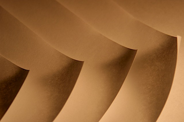
To be perfectly frank, this is an extremely tough image for me to critique as I really can't much add to what's already been said. Good composition and shadowing. The spacing is near perfect and was a great choice for this challenge - which your score of 6.2924 reflects. It has a nice flow from left to right as well.
As was mentioned, the tone is probably what kept you off the front page here. DPC voters really need that "pop" or "wow" to make them click a higher number. The bit of extra curl on the far right sheet is just a tad distracting as well.
Overall a very nice first submission that you should be proud of.
Thanks for the opportunity to critique this image Hank.
Cheers - Phil
|
|
|
|
05/10/2006 08:04:00 AM |
Everyone, I appreciate your feedback. This was my first challenge. I've been watching on the sidelines for over a year. Hopefully, my skills will improve. See ya at my next challenge!
Message edited by author 2006-05-10 08:04:42. |
|
|
|
05/10/2006 08:00:25 AM |
Originally posted by arngrimur:
Nice work. the color tone is a bit dull. |
arngrimur, I agree the tone is really dull. The light was bad and thinking back, I could've tinted the whole photo another color. Live and learn. I appreciate your comment. Overall I'm happy with the placement, this is my first challenge. |
|
|
|
05/10/2006 07:57:39 AM |
Originally posted by magnus:
Really great idea, but for my taste the corners should be tack-sharp. It would also have been good to bring out the paper's texture more prominently. |
magnus...not sure what you mean by "tack-sharp"...what I was going for was the curl of the page and how the light could cast a shadow. I agree that the papers texture should be clearer...it was photographed on my kitchen counter in the dark - with a crappy light. Appreciate your feedback! |
|
Comments Made During the Challenge  |
|
|
05/09/2006 10:58:32 PM |
|
Really great idea, but for my taste the corners should be tack-sharp. It would also have been good to bring out the paper's texture more prominently. |
|
 Photographer found comment helpful. Photographer found comment helpful. |
|
|
05/09/2006 09:58:47 PM |
|
this is really simple but effective. soft but stonge. |
|
| Photographer found comment helpful. |
|
|
05/06/2006 08:35:35 PM |
|
Nice work. the color tone is a bit dull. |
|
| Photographer found comment helpful. |
|
|
05/06/2006 04:11:24 PM |
|
Very unique idea. Simple too. This picture will be in my top picks. |
|
| Photographer found comment helpful. |
|
|
05/05/2006 08:23:44 AM |
|
nice like th shadows gives it contrast |
|
| Photographer found comment helpful. |
|
|
05/05/2006 04:41:58 AM |
|
| Photographer found comment helpful. |
|
|
05/04/2006 07:07:33 PM |
|
Okkkkkkk..., now I get ittttt... I hope.... well done... |
|
| Photographer found comment helpful. |
|
|
05/03/2006 08:32:16 PM |
|
| Photographer found comment helpful. |
|
|
05/03/2006 01:28:30 PM |
|
i love the tone. excellent concept. good luck! |
|
| Photographer found comment helpful. |
|
|
05/03/2006 12:10:27 PM |
|
cool. could have been sharper. and i like borders on images like this. |
|
| Photographer found comment helpful. |
|
|
05/03/2006 08:59:27 AM |
|
Beautiful colour. Graceful lines. |
|
| Photographer found comment helpful. |
|
|
05/03/2006 04:51:07 AM |
|
nice photo, I love the shadows |
|
| Photographer found comment helpful. |
|
|
05/03/2006 03:57:33 AM |
|
nice light and shade effect ..... good composition |
|
| Photographer found comment helpful. |
Home -
Challenges -
Community -
League -
Photos -
Cameras -
Lenses -
Learn -
Help -
Terms of Use -
Privacy -
Top ^
DPChallenge, and website content and design, Copyright © 2001-2026 Challenging Technologies, LLC.
All digital photo copyrights belong to the photographers and may not be used without permission.
Current Server Time: 06/28/2026 09:16:54 PM EDT.