| Image |
Comment |
| 12/18/2002 08:26:53 PM |
|
| 12/18/2002 08:23:23 PM |
|
 Photographer found comment helpful. Photographer found comment helpful. |
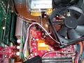
| 12/18/2002 08:18:01 PM |
Upgradeby cdhukComment: The wires are a bit messy, and that heatsink looks a lot nicer without the fan in the way, but we can't see it :( And if available to you, a dif. Mobo would have been less contrasting and look better in the picture. |
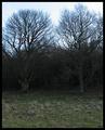
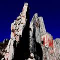
| 12/16/2002 02:09:19 AM |
The Dark Dark Woodsby ManicComment: I don't like how light the sky is in this shot. I think it would have looked better at dusk with a darker sky. it would have felt a lot more eerie. When the blue sky is covered up this shot looks a lot cooler. |
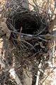
| 12/16/2002 02:05:52 AM |
Summer Homeby boyte1Comment: The lighting isn't the best here. The nest is awfully dark in comparison to the well lit background. I like the placement of the nest in the shot, and the cropping and sizing is done well. |
| 12/16/2002 02:04:24 AM |
|
| 12/16/2002 02:03:39 AM |
untitledby aelithComment: I like the angle the treetrunk is on in this shot. the way the background is present in the top right hand corner and lower left hand corner is nice, but I think I would have liked to see it a bit more blurred. The subject of the picture is a little on the boring side, but it looks good overall. |
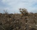
| 12/16/2002 02:02:27 AM |
Desolationby ChaszmyrComment: A tad too dark, a brighter day would have been a better choice I think. |
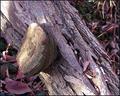
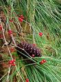
| 12/16/2002 02:01:44 AM |
Nature Trims Her Treeby DougPazComment: This shot feels a little chaotic to me... there's pine needles going everywhere. If the shot focused more on the pinecone and berries around it I think it would have flowed a little better. Also eliminating the twig infront of the pinecone would have helped. |
| 12/16/2002 02:00:22 AM |
Strandedby kevinswopeComment: The green mossy looking area on the rock in the dead center seems to be the focus of this picture, but my eye isn't drawn to that at all. Instead I find myself looking at the slightly fuzzy background. if the background were blurred more I think it would have turned out better. |
Home -
Challenges -
Community -
League -
Photos -
Cameras -
Lenses -
Learn -
Help -
Terms of Use -
Privacy -
Top ^
DPChallenge, and website content and design, Copyright © 2001-2025 Challenging Technologies, LLC.
All digital photo copyrights belong to the photographers and may not be used without permission.
Current Server Time: 08/24/2025 05:58:49 AM EDT.