|
|
|
Showing 221 - 230 of ~659 |
| Image |
Comment |
| 06/09/2003 06:57:18 PM | |  Photographer found comment helpful. Photographer found comment helpful. |
| 06/09/2003 06:56:17 PM | |
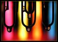
| 06/09/2003 06:55:50 PM | The Highlighted Area by inspzilComment: Absolutely great! Fantastic colors. Excellent use of water drops. great composition. Nice crop and frame. 10. | | Photographer found comment helpful. |
| 03/25/2003 01:10:30 PM | Jugglingby DougPazComment: Greetings from the Critique Club!
Good try with this one! It shows you are trying to be creative.
The composition is what works best in this photo. The horizontal cropping works really well and the cropping is just right. The outfit, colors and expression are excellent too. Unfortunately, there's just too much blur. It could have been solved with a faster shutter speed. Raising the shutter speed would have been a tough compromise because we would have lost some of the interesting blur effect in the balls and arms, loosing at the same time the the dynamic energy from them. But it seems it would have been better with a face in focus and sharp in order to really connect with the juggler.
The photo is on par with the challenge's theme. The view from above really adds to the composition.
In short: excellent compostion, nice colors, excellent cropping, nice expresion. Unfortunately, the overload of blur is simply too distracting to appreciate the photo. 4
Keept up the good work!
|
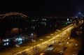
| 03/25/2003 01:07:55 AM | Travel to the Pyramidby kandyjComment: Greetings from the Critique Club!
At a quick glance, this photo is very well shot. The composition is well executed, although I feel it might have been improved by panning the camera down a littlebit.
The oblique line of the street meeting up at the pyramid with the horizontal line created by the bridge and lights at the horizon work like a charm.
The only problem IMO is that the photo is lacking the extra little thing that would raise its interest value. As it is, it's well executed, but it's just uninspiring. Fortunately, the pyramid raises the bar a littlebit visually by breaking the horizon line and being at the juntion of the other two lines I described above maikes it even more interesting.
On a minor note, although it was obviously shot from a roof or a high platform, I do not feel it deserves to be considered a "From Above" shot. This is more a straight shoot with a smal tilt down. The camera is pointing to the horizon. But it's just my opinion on this matter.
In short: very well executed. Nice night shot. Good composition. Unfortunately uninspiring visually. 6
Keep up the good work. | | Photographer found comment helpful. |
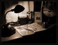
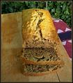
| 03/25/2003 12:54:11 AM | The Art of Breadby mbardeenComment: Greetings from the CRITIQUE CLUB!
Watching this photo, many things come to mind. It is clear that its subject is right on par with the challenge's theme. Most obviously, you wanted to show the art of cooking in all its splendor by presenting this visually very tasteful home made bread. The intention was very good.
Unfortunately, the photo is simply uninspiring and most probably because of the lack of inspiration in the first place.
Such a nice bread deserves all the attention it can get! :-)
In technical terms:
Visually, the lighting as it is is very flat. The use of a very low F-Stop could have helpted in creating a nice depth of field and emphasize the visual quality of the bread by isolating it from its surrounding, but even though we see the background leaves in a soft off focus, the image still looks kind of flat- most probably due to the choice of angle used and the light source. The composition and choice of angle could have been revised to find the best and more appropriate framing/omposition to present this subject in a more original way. The blue/white/purple cloth on the right is very distracting and doesn't seem to fit in the photo. The leaves are distracting as well.
Maybe a close up on the bread would have made it more interesting. Or simply putting it in a different setup.
This photo is the basic example of the high level of difficulty encountered when shooting a simple subject: the simpler the subject, the more the photographer needs to work hard on creating an interesting ambiance (lighting, setting, angle and composition) to reach the viewer.
Your "Photographer's Comment" indicates to me that you were aware about the basic problems of this photograph. My suggestion would be to listen to your instincs and to use these thoughts to challenge yourself. When you feel your photograph is "pretty cliche and you think you couldn't come up with anything else good", my suggestion to you is to either push the enveloppe further to surpass yourself, or simply put your mind into finding something else either by yourself, or with the help of friends during a conversation or a brainstorm.
Challenge yourself.
4/10
| | Photographer found comment helpful. |
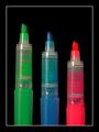
| 03/25/2003 12:35:50 AM | Kitchen Vortexby kosmikkreeperComment: Fantastic composition. Crisp as it can be. Great choice of color! Very dynamic. One of the best in this challenge. I think it deserved a better rank than it got. Keep it up! | | Photographer found comment helpful. |
| 03/24/2003 06:34:58 PM | Life from aboveby GeocideComment: Greetings from the CRITIQUE CLUB!
At first glance, this photo is intriguing and interesting visually. The fact that it's very hard to tell what the subjet is is not a problem at all and the photo can be seen and interpreted on many levels which brings this photo in the abstract category. Its composition is very well done. The lines pointing to the orange circle works extremely well. The crop is excellent and the two larger sections on the right really add something to the visual quality of the photo. The orange color on blue is interesting as well.
Shot at a lower ISO would have surelly helped to reduce the high grain especially noticable in the orange and shadows on the white areas. Also, the photo doesn't seem to meet with the challenge. There is no indication that it was shot from above. The blue seems to be the sky and therefore indicates that it was shot from bellow. Wether ot not it was the case, the simple fact that as a viewer there is not way to know is enough to conclude that it doesn't meet with the challenge.
Original shot. Very nice composition. Excellent effort. Would get a 7 on its own when not considering the challenge theme. Rates under 5 when considering the challenge. | | Photographer found comment helpful. |
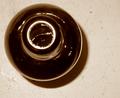
| 03/24/2003 06:23:06 PM | Beer above all!by kosmikkreeperComment: Greetings from the CRITIQUE CLUB.
The photo has an intriguing quality to it. It's hard to tell what the subject is. Without the title, I must say I probably would not have guessed about the bottle of beer. My first impression was that it was an ink bottle or something. Never the less, this shouldn't be a problem with this kind of imagery.
The choice of color is interesting. The table lines and textures adds to the visual quality of the photo. The blur at the top of the bottle is somewhat distracting. The hard flash seems to bring out nice shines on the bottle surface and the shadow is not bothering. The composition seems a bit off to the left, but it's not distracting.
The only problem I find with this photo is it's lack of punch. It just doesn't seem to provide a high enough level of interest visually. Although it does meet with the challenge, the fact that it was shot from above doesn't actually add to the feeling of the composition. The simplicity of a composition is actually something hard to achieve because its subject and lighting has to have a very high level of visual impact to affect the viewer. In this case, the subject is plain and the ovarall impact is quite low. Adding beer drops on the table with light reflections might have helped- or any other detail to enhance the visuals. Unfortunately, as it is, it's a technically ok photo with a less than average visual interest. 5
Keep it up.
| | Photographer found comment helpful. |
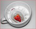
| 03/24/2003 06:06:12 PM | Strawberries and Creamby kandyjComment: Greetings from the CRITIQUE CLUB!
The photo has a nice overall feeling to it. This kind of shot is very classic and, although has been done many times before with all sorts of variations, always achieves to provoque a dynamic and spectacular effect when well done. I believe yours is successful as well in that department. The red of the strawberry in contrast with the greys that surrounds it adds to the dramatic effect and the splash of the milk has been captured very nicelly.
Technically, the high quantity of grain in the grey areas in and around the cup is more distracting than not. The same thing happens in the dark areas of the milk. It's hard to tell if it's due to the JPG compression, to the act of desaturating all colors except the reds, or to the camera. At ISO 100, I don't think the camera would create such a high grain, but then again, I am not familiar with the DSC-F707.
Visually, the cropping well executed. The choice of angle seems to work well. The choice of emplacement for the handle in the overall composition is questionable. It does seem to work, but seems to distract a littlebit. Rotating the cup ust alittlebit to the left might have solved this, or hiding the handle in the back. Don't take my word for it though because this particular comment may be related to my personal taste only.
Good work. Well done. Well executed. It's really too bad about the high grain and the jagged edges around the cup. This detail really takes away from the visual impact of your shot. |
|
Showing 221 - 230 of ~659 |
Home -
Challenges -
Community -
League -
Photos -
Cameras -
Lenses -
Learn -
Help -
Terms of Use -
Privacy -
Top ^
DPChallenge, and website content and design, Copyright © 2001-2025 Challenging Technologies, LLC.
All digital photo copyrights belong to the photographers and may not be used without permission.
Current Server Time: 08/24/2025 04:25:17 PM EDT.
|