| Author | Thread |
|
|
03/25/2003 12:54:11 AM |
Greetings from the CRITIQUE CLUB!
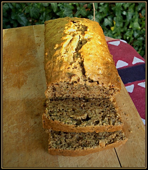
Watching this photo, many things come to mind. It is clear that its subject is right on par with the challenge's theme. Most obviously, you wanted to show the art of cooking in all its splendor by presenting this visually very tasteful home made bread. The intention was very good.
Unfortunately, the photo is simply uninspiring and most probably because of the lack of inspiration in the first place.
Such a nice bread deserves all the attention it can get! :-)
In technical terms:
Visually, the lighting as it is is very flat. The use of a very low F-Stop could have helpted in creating a nice depth of field and emphasize the visual quality of the bread by isolating it from its surrounding, but even though we see the background leaves in a soft off focus, the image still looks kind of flat- most probably due to the choice of angle used and the light source. The composition and choice of angle could have been revised to find the best and more appropriate framing/omposition to present this subject in a more original way. The blue/white/purple cloth on the right is very distracting and doesn't seem to fit in the photo. The leaves are distracting as well.
Maybe a close up on the bread would have made it more interesting. Or simply putting it in a different setup.
This photo is the basic example of the high level of difficulty encountered when shooting a simple subject: the simpler the subject, the more the photographer needs to work hard on creating an interesting ambiance (lighting, setting, angle and composition) to reach the viewer.
Your "Photographer's Comment" indicates to me that you were aware about the basic problems of this photograph. My suggestion would be to listen to your instincs and to use these thoughts to challenge yourself. When you feel your photograph is "pretty cliche and you think you couldn't come up with anything else good", my suggestion to you is to either push the enveloppe further to surpass yourself, or simply put your mind into finding something else either by yourself, or with the help of friends during a conversation or a brainstorm.
Challenge yourself.
4/10
|
|
 Photographer found comment helpful. Photographer found comment helpful. |
Comments Made During the Challenge  |
|
|
03/19/2003 06:38:44 AM |
|
I can almost smell that bread! Great shot will you send me the recipe? |
|
| Photographer found comment helpful. |
|
|
03/19/2003 01:45:54 AM |
|
Nice, but a little cluttered with the quilt, and leaves. Nice coloring. |
|
| Photographer found comment helpful. |
|
|
03/18/2003 08:35:26 PM |
|
This would have worked better on a different background. The board's color is too close to the bread. A bit of an angle on the loaf may have worked better too. |
|
| Photographer found comment helpful. |
|
|
03/17/2003 09:34:26 PM |
|
|
|
03/17/2003 05:54:53 PM |
|
That's some nasty looking bread. :) |
|
|
|
03/17/2003 04:12:09 PM |
Oh man, I'm hungry looking at this photo.
Great picture.
Meets the Challenge!
Great visual impact, focus is great, colour is fantastic showing all that grain.
Very original idea. |
|
| Photographer found comment helpful. |
|
|
03/17/2003 11:05:58 AM |
|
Nice colors, but a little more light and focus would be good. |
|
| Photographer found comment helpful. |
|
|
03/17/2003 08:34:25 AM |
|
The green shrubs and the red cloth are very distracting.Maby the bread on the cloth and just the nice grain of the wood showing as a frame--no green shrubs--would have worked better. |
|
| Photographer found comment helpful. |
|
|
03/17/2003 12:46:36 AM |
|
Home -
Challenges -
Community -
League -
Photos -
Cameras -
Lenses -
Learn -
Help -
Terms of Use -
Privacy -
Top ^
DPChallenge, and website content and design, Copyright © 2001-2026 Challenging Technologies, LLC.
All digital photo copyrights belong to the photographers and may not be used without permission.
Current Server Time: 06/28/2026 11:26:30 AM EDT.