| Author | Thread |
Comments Made During the Challenge  |
|
|
06/14/2003 11:37:18 PM |
|
good idea, and i like the title, 8 |
|
|
|
06/14/2003 06:36:54 AM |
|
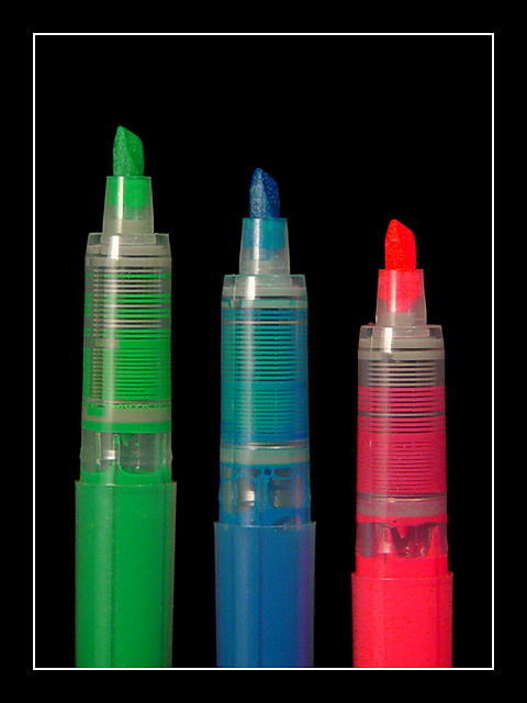
The three highlighters! This is a cute photograph. I like the intensity of the third colour, the pink (not my favourite colour though), the other two colours seem to dull in comparison! that's so weird. Nice lighting :) |
|
 Photographer found comment helpful. Photographer found comment helpful. |
|
|
06/13/2003 05:49:58 PM |
When you pun, god kills a kitten.
Very arty, sort of poster I would expect someone to hang on their wall at college style. Nice bright colours against nice dark background. Not my personal thing, but I can see other people wanting something like this. |
|
| Photographer found comment helpful. |
|
|
06/13/2003 08:26:28 AM |
|
Good choice. Very clear image with nice tones. Good luck in the voting |
|
|
|
06/13/2003 12:03:15 AM |
Black background is good choice, great composition & colors...
JB |
|
|
|
06/11/2003 05:41:20 PM |
|
Groan (for the pun, not the picture :-) |
|
|
|
06/11/2003 09:36:34 AM |
|
Very nice, clean, vibrant image. I like the simplicity of it. |
|
|
|
06/11/2003 01:16:53 AM |
|
If a Campbells Soup Can is Pop art then this must be topless art. |
|
|
|
06/10/2003 09:53:18 PM |
|
Nice composition, clear, precise, straight and in focus, nice color..... very nice job! |
|
|
|
06/10/2003 04:14:46 PM |
|
Good title. Nice composition and colors against the black background . I like the staggered lengths. It might be my monitor but the detail on the red marker tip doesn't seem as clear as the green and blue. |
|
| Photographer found comment helpful. |
|
|
06/09/2003 08:54:28 PM |
|
Good concept and color. This was something I wanted to do. The frame is a good touch. However, I don't like the light reflection. |
|
|
|
06/09/2003 06:56:17 PM |
|
Wonderful. Excellent use of colors. Nice composition. 10. |
|
|
|
06/09/2003 01:25:15 PM |
|
Nice idea, the different levels of the pens looks great too. Background is good... I can certainly imagine this hanging in an office. Good luck with it. |
|
| Photographer found comment helpful. |
|
|
06/09/2003 12:03:24 PM |
|
|
|
06/09/2003 04:02:43 AM |
|
Clever idea, clean picture, maybe too much red saturation - lost the detail in the red nib. |
|
Home -
Challenges -
Community -
League -
Photos -
Cameras -
Lenses -
Learn -
Help -
Terms of Use -
Privacy -
Top ^
DPChallenge, and website content and design, Copyright © 2001-2026 Challenging Technologies, LLC.
All digital photo copyrights belong to the photographers and may not be used without permission.
Current Server Time: 06/28/2026 06:30:14 PM EDT.