| Image |
Comment |
| 12/15/2002 02:32:22 PM |
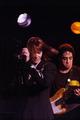
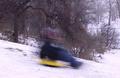
Tributeby ManicComment: 1)Does the Photo fit the theme?(6)
2)Color(5)
3)Composition(6)
4)Focus(5)
5)Background(6)
6)Lighting(5)
7)Title(5)
Overall Score:5.42 rounded to 5
Commentary:
I think John Cleese said it right. "and now for something different"
This is a decent job. I like this shot. I think the lighting with the flash is a tad bit harsh. Your motion is good and you blur is nice. Personally I think the focus was a little weak. I would not hang this print in my house, but with a little tweak I could see this as an album cover. Good shot.
John (TurboTech) |
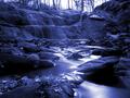
| 12/15/2002 01:37:58 AM |
The Fallsby jmsetzlerComment: 1)Does the picture fit the Challenge?(7)
2)Color(8)
3)Composition(8)
4)Focus(9)
5)Background(9)
6)Lighting(8)
7)Title(6)
Overall Score:7.85 Rounded to 8.00
Commentary:
Not much to say here but, Bravo friend. You did very well with this shot. This would be a print I would hang in my house. You did a very good job with everything. It is a tab bit blue but you caught the water in a great way. Nice leaves. The light is a bit Harsh but, there is no point deduction becuase it makes the picture. Wonderfull Job.
John (TurboTech) |
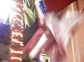
| 12/15/2002 12:21:47 AM |
DISCO FEVERby babymaderoComment: 1)Does the photo fit the challenge?(4)
2)Color(3)
3)Composition(3)
4)Focus(4)
5)Background(4)
6)Lighting(6)
7)Title(5)
Overall Score:4.14 rounded to 4
Commentary:
There are some things here that I would have done different. In a good motion photo there needs to be something in the shot that is not moving. This in my oppinon gives better sense of motion that is going on in the picture. If done correctly it will not take away form the shot, but add to the shot.
John (TurboTech) |
| 12/15/2002 12:12:52 AM |
Grinding Showerby CubComment: 1)Does the photo fit the challenge?(4)
2)Color(5)
3)Composition(5)
4)Focus(4)
5)Background(6)
6)Lighting(5)
7)Title(6)
Total Score:5
Commentary:
This is a decent shot. I do not feel it fits the theme of this challenge. I consider 5 better than average. This is a nice tight photo. It is compact and everything it belongs. I would hang this print in my shop. The lighting could have been a tad bit better in the background. I would consider a bit more depth for focus. Good Job.
John (TurboTech) |
| 12/15/2002 12:05:30 AM |
"Flocking at the Door"by Mo ElfComment: 1)Does the photo fit the challenge?(3)
2)Color(3)
3)Composition(4)
4)Focus(2)
5)Background(3)
6)Lighting(4)
7)Title(4)
Overall Score:3.28 rounded to 3
Commentary:
Visually there really is nothing pleaseing about this shot. The highlights of the shot are lighting. Seems to be a bit dark. Not harsh though. WEll that is all I can say here. Sorry I was critical. :-(
John (TurboTech) |
| 12/14/2002 11:53:08 PM |
Mary Lee's Corvetteby kendallComment: 1)Does the photo fit the challenge?(3)
2)Color(4)
3)Composition(4)
4)Focus(4)
5)Background(5)
6)Lighting(5)
7)Title(3)
Overall Score:4
Commentary:
Lighting is the best thing about this photo in my oppinion. The picture is a bit grainy.for my taste. I think this photo would fit a better theme. I do not see motion depicted in this shot. Maybe I am blind. Sorry to be so critical. At least there is a prtion of the photo that is in Focus. That is more than I cna say for some of the submissions.
John (TurboTech) |
| 12/14/2002 11:44:57 PM |
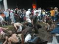
MUD SLIDEby SunChildComment: 1)Does the photo fit the challenge?(3)
2)Color(3)
3)Composition(2)
4)Focus(2)
5)Background(3)
6)Lighting(4)
7)Title(4)
Overall Score:3.0
Commentary:
Focus is of utmost importance. There is nothing here that representing motion. Lines of compostion have a bit of static in them. This looks more like a Battle Royal Mud Wrestle. Would I hang this print on my wall. Maybe my Dorm with a Blacklight for a cool effect if I were stoned.
John (TurboTech) |
| 12/14/2002 11:38:08 PM |
Freedomby Brenna KimiComment: 1)Does the photo fit the challenge?(4)
2)Color(4)
3)Composition(3)
4)Focus(2)
5)Background(3)
6)Lighting(3)
7)Title(4)
Overall Score:3.24 rounded to 3
Commentary:
Sorry about this. I Realize it is a flag, but that is all I realize. This is not a print I would hang in my living room. That is basically my grading system. Would I hang this in my house on the wall for all to see. Something that is going to represent a 3D world in a 2D photo. |
| 12/14/2002 10:08:10 PM |
Swishby cykhansenComment: 1)Does the photo fit the challenge?(6)
2)Color(4)
3)Composition(4)
4)Focus(5)
5)Background(6)
6)Lighting(5)
7)Title(4)
Overall Score: (4.84 rounded to 5)
Commentary:
This has to be a difficult shot to set up. considering the Blur you want and the speed the subject is moving. Personally I would have tried to get the focal point more on the left to add more direction to the shot. You did well at getting something in the shot that was not moving ie the trees in the background. Overall you did a nice job.
John (TurboTech) |
| 12/14/2002 08:20:43 PM |
Sunny Side Upby DougPazComment: 1)Does the photo fit the theme?(8)
2)Color(7)
3)Composition(7)
4)Focus(5)
5)Background(7)
6)Lighting(6)
7)Title(7)
Overall Score:(6.71 rounded to 7)
This is a great shot. There are a few things that would make it better. I think the focus is a little out. That is understandable as I think I am Familiar with the method you used to set this up. The light might be a little harsh. From the reflection you have on the bottle of oil I can assume you used the on Cam flash. I would personally put a sock over it and close the Apperture just a little more. Just off to the left of the pan there is a yellow color. Is this Egg Yolk or reflcetion of something. Can not figure it out. Anyway you have a great shot here.
John (TurboTech) |
Home -
Challenges -
Community -
League -
Photos -
Cameras -
Lenses -
Learn -
Help -
Terms of Use -
Privacy -
Top ^
DPChallenge, and website content and design, Copyright © 2001-2025 Challenging Technologies, LLC.
All digital photo copyrights belong to the photographers and may not be used without permission.
Current Server Time: 08/23/2025 12:00:52 AM EDT.