| Image |
Comment |
| 01/27/2003 06:24:13 PM |
Timesquare in Electrocityby deadbirdComment: Neat shot. Shame about the sticker near the top but otherwise this is cool. Great work with the DoF, you got iit spot on. |
| 01/27/2003 06:06:12 PM |
|
| 01/27/2003 01:32:24 PM |
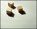
Three Squareby DougPazComment: Nice simple composition. Lighting and exposure are good, but the image doesn't really grab the viewer. Needs something extra to make it stand out from the crowd. |
 Photographer found comment helpful. Photographer found comment helpful. |
| 01/27/2003 01:25:08 PM |
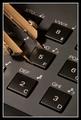
All Sides Equal...by DavenitComment: Technically perfect. The things that grab me are the sharpness and the gold reflections on the keypad. Composition is great. Well done. |
| 01/27/2003 12:48:41 PM |
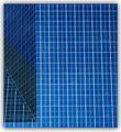
ArchiSquaresby Dallas_TXComment: They look slightly rectangular to me, and there's a whole bunch of triangles going off in there ... but oh! what a cool photo!
The left hand side adds a bit of interest to what would otherwise be a very plain, repetitive shot. Nice work, well done. |
| Photographer found comment helpful. |
| 01/24/2003 03:39:23 PM |
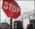
the Madnessby moondoggieComment: Excellent. Great composition, nice colour desaturation and a good message. Top work. 10 |
| Photographer found comment helpful. |
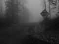
| 01/23/2003 08:43:33 PM |
Onward by AlecComment: I like the fog which fits in with the sign very well. B&W works well here too. I would have prefered a tighter crop to cut out at least the black patch in the foreground. Nice work. |
| 01/22/2003 08:07:09 PM |
DUH!by MustbelostComment: LOL! Great title. Composition is great, I like the way the sign dominates the right hand side and the road runs up the left edge (maybe a bit too close, but it works). |
| Photographer found comment helpful. |
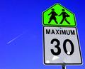
| 01/22/2003 07:10:16 PM |
maximum thirty studentsby ParentxComment: Nice vivid colours. A shame about the plane, I would have prefered a clear sky. I would also have zoomed out a touch, so that the signs were not so close to the edge of the frame. Otherwise, great shot. I like it. |
| Photographer found comment helpful. |
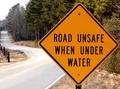
| 01/22/2003 06:23:42 PM |
cow sex prohibitedby Pep VentosaComment: Where does it say prohibited? Looks like 'Warning: Cows shagging ahead" to me ; )
Composition is good, but the background is very cluttered/distracting. If you had shot from further away, with full zoom and a tight DoF the background should have blurred out nicely. |
Home -
Challenges -
Community -
League -
Photos -
Cameras -
Lenses -
Learn -
Help -
Terms of Use -
Privacy -
Top ^
DPChallenge, and website content and design, Copyright © 2001-2025 Challenging Technologies, LLC.
All digital photo copyrights belong to the photographers and may not be used without permission.
Current Server Time: 08/06/2025 09:25:42 AM EDT.