| Image |
Comment |
| 01/22/2003 10:26:57 PM |
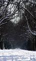
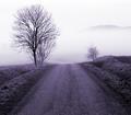
road to nowhereby miss parkerComment: Critique Club critique:
Composition/Content: Good contrast between the snow and the dark tree trunks. I like the subject, a tunnel of tree limbs lining a snow covered road. But there seems to be two points of interest: the end of the tunnel, and the light at the top of the image. It's difficult to tell what might remedy that. Widening the shot might depending on what is on each side.
Camera Work/Technical: The low camera angle does well for this shot. Exposure is good. Closing down the aperature would give greater depth of field.
Digital Processing: Processing looks good, color balance, noise, contrast.
My Opinion: I like the image. But the image needs a single point of focus that is interesting to my eyes. When my eyes are drawn to the light at the top I am disappointed because there is not much there. When my eyes travel back to the end of the tunnel there is not much there either to focus on. I believe opening up the shot with a slightly wider angle might help with the interest because I could then see the tree trunks framing the road. Maybe even a landscape orientation or someone down the road to focus on. You have a great idea with good technique that just needs a little something to top it off.
|
 Photographer found comment helpful. Photographer found comment helpful. |
| 01/22/2003 08:30:10 AM |
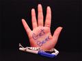
Redneck Palm Pilotby ShiiizzzamComment: Critique Club critique:
Composition/Content: Very funny image. The simplicity gives the image it's impact. It's also funny that a redneck would have to write down such a note. I think the rectangle works great being a natural photo shape, it helps the subject stand out and be the center of attention. The angle of the writing also brings the eye straight to the message. Using a woman's hand makes it even funnier. The ribbon adds to the picture in that is represents to me that this redneck doesn't want to lose the pen either. Nice shot.
Lighting: Good lighting.
Background: Good choice in background as it accentuates the subject.
Camera Work/Technical: Good exposure. The soft focus could have been a little sharper but doesn't distract from the image very much.
Digital Processing: The image could benefit from some jpeg artifact removal. It would also make the reddish shadows look better.
My Opinion: This image could easily be a commercial for a beer company. Very creative and well done.
|
| Photographer found comment helpful. |
| 01/19/2003 08:38:16 PM |
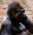
The Monkees (Then I saw her face, now "I'm a believer")by MorganComment: Critique Club critique:
Composition/Content: I look at the ape and wonder what he is looking at. The angle of his gaze makes the subject of interest off of the frame. I too want to see what has his interest. If the challenge was hair or apes then this image would really apply. But the topic is Song Titles and I think that your image would have scored better if the subject represented the song title "I'm a Believer".
Lighting: The natural outdoor lighting fits the subject, but some details are lost in the shadows.
Background: The natural colored background fits the subject.
Camera Work/Technical: If was possible to zoom in more to get just the face in the frame the exposure might have been longer and more detail might have shown in the face. As the picture was taken, the exposure looks good.
Digital Processing: Color balance looks good and the image is clear.
My Opinion: I think this is a technically excellent photograph. I like the subject and the colors. I like the depth of the image. It is clear what you were trying to accomplish although it might have done better if you chose the title "The Monkees" and actually photographed some monkeys. This image shows talent and technique.
|
| 01/15/2003 07:11:51 AM |
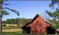
Farmscapeby KrazyKatComment: great composition and color. i like the tree on the left but it's cut off a little too much or not enough. the trunk of the tree causes a bit of an imbalance in the image. |
| Photographer found comment helpful. |
| 01/15/2003 07:10:00 AM |
|
| Photographer found comment helpful. |
| 01/15/2003 07:08:54 AM |
|
| 01/15/2003 07:08:14 AM |
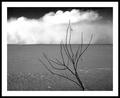
Desertby JackoComment: i like the simplicity of this image. i also like the clouds in the background rising from the edge of the land. great composition. the border is a little overdone. |
| Photographer found comment helpful. |
| 01/15/2003 07:06:45 AM |
|
| Photographer found comment helpful. |
| 01/15/2003 07:05:17 AM |
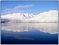
Reflections Under Ice by gminishComment: i like the way the blue water gets darker at the bottom of the image. it adds depth and contrast to it. great shot. |
| 01/15/2003 07:04:01 AM |
|
Home -
Challenges -
Community -
League -
Photos -
Cameras -
Lenses -
Learn -
Help -
Terms of Use -
Privacy -
Top ^
DPChallenge, and website content and design, Copyright © 2001-2025 Challenging Technologies, LLC.
All digital photo copyrights belong to the photographers and may not be used without permission.
Current Server Time: 08/24/2025 06:24:18 AM EDT.