| Image |
Comment |
| 01/04/2006 11:14:48 AM |
Teardrops by Tom_RobbrechtComment: Lovely colors and interesting shapes are present in this 'abstract' presentation. I like how the white circles are repeated and captured in the glass 'teardrop' shapes. My critique is that this composition could be improved if the presentation was a tighter crop - say a square crop that would bring the eye into a tighter focus on 'teardrop' shape. I think that too much of the 'stem' is present in the picture and it really doesn't need to be for it draws attention away from the main focus which is the teardrop shape containing all those sharply focused circles. |
 Photographer found comment helpful. Photographer found comment helpful. |
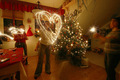
| 01/04/2006 11:09:40 AM |
Shape of my Heartby unicumComment: I like how you captured this "heart-shape" made from a person waving a sparkler. It is a good action capture, but it suffers from too much being in the scene - the scene is too cluttered with other things that distracts attention from the main subject. The eye tends to wander the room as the main subject is swallowed up by so many things surrounding her. A tighter crop to speciffically center on the main action would have been better....Or if during the shot you had another person facing the woman making the heart (a mother or a sinificant other) such that the visual idea would be that she is making this heart for them. This shot would also have to be tightly cropped so that focus remains on the main elements of the shot. |
| 01/04/2006 01:21:20 AM |
Untitledby ballyhooComment: The main subject is what really captures and holds the eye's attention. Love how you effectively captured the light coming off this light fixture - the light flows off and accents the curves of the piece as well as the shadows. I have two critiques on this piece. First the stem of the light fixture is too distracting - the more you can eliminate from changing the angle the better it would be. Speaking of changing the angle if you had angled the shot such that the main light fixture remains in the center with the background showing "two triangles" dividing the rectangle format you would have captured a multitude of interesting shapes that all complimented each other. Had you angled the line between wall and ceiling to match up with the opposite corners of the rectangle format of this photo it would have created the illusion of a trianglated background - one light brown the other chocolate brown. |
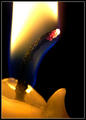
| 12/14/2005 10:17:38 PM |
Wick-ed! (Careful, it's hot!) by davidus428Comment: A really nice close-up shot where we get a sharp as a tack view of the very hot wick within the candleflame. My only critique on this piece is too make it more visually appealing is to have included the full flame in the shot as well. |
| Photographer found comment helpful. |
| 12/14/2005 10:14:07 PM |
Tulips in a Pitcherby banmornComment: I am going to have to assume that the scene is lit by candlelight since there is no candle present in the scene. The vase and the tulips are lit dramtically and they really pop off the black background such that they are visually eyecatching. My only critique is that I see a bit too much ambient white light that may have assisted in illuminating this still life scene. I don't see those warm soft orange/yellow tones/hues so closely tied and assoicated with candlelight scenes. It is those warm tones that could bath this still life in such warm lovely hues that would make it even more appealing. Still tis a good composition with nice flowing lines from the vase to the flowers that is visually appealing. |
| Photographer found comment helpful. |
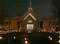
| 12/14/2005 10:03:18 PM |
Remember Meby Resusit8uComment: I like all the candlelight that surrounds this building - a quiet solitude nighttime scene. There are some things here in the composition of the picture that weaken the overall impact of the scene. First, I think the orientation of the photo would be better suited if you had framed it vertically instead of horizontally. The reason is that it would compliment the center of the structure which has the triangular features which travel in an upwards, vertical motion as well as that spire that further continues upwards in height. Of couse I would also recommend moving back to get the whole building and the two trees on either side into the frame. Those two trees would/could also act nicely as borders framing the edges of the photo. Lastly there seems to be a tad bit too much 'noise' on the left hand upper side of photo that is distracting - neatimage, running the photo through photoshop/paintshop to decrease noise levels, or decreasing exposure time could all help to illuminate that problem. Not to mention reducing the amount of light you let in by decreasing exposure time would also make the night sky more darker is tones giving a better backdrop for contrast with the many lights seen illunimating the scene. It would make it visually "pop" more. |
| Photographer found comment helpful. |
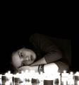
| 12/14/2005 09:50:34 PM |
incandescenceby xtineComment: I like this portrait shot where the subject face is softly illuminated by only the candles we see present. As added interest here pose is lying down on the floor amoung all the tea lights - her expression is one of contemplation as she stares at the little dancing flames. Composition is very good - I think the large amount of negative space above her serves the picture as well. It is a blanket of darkness that 'covers' the lighted objects - they are all that is there that emerges from the darkness. The light only draws our eyes ever more to the illuminated scene and away from the darkness such that we come out of the darkness to join her by sitting next to these candleflames. My only critique is that I would have liked to have seen more distintive detailed candle flames instead of the lighted bloob shapes - less exposure time could take care of that by letting less light in but one would have to be careful as to not have the model's face lost to shadows. |
| Photographer found comment helpful. |
| 12/14/2005 09:41:52 PM |
Quoth The Ravenby donnievComment: I like the composition and the mood that you are trying to capture here. I think the overall mood of errie/spookiness/dark horror that so many of Poe stories have would have been better accomplished if the only light illuminating the scene was candlelight (perhaps even one off frame to cast a bit more light to illuminate the main objects of focus. There is too much ambient light here that it totally washs out any of that warm soft light (and those shadows) cast by candlelight. We see too much that distracts our attention from the objects that should have our full attention. The seeing the details of wood grain of the desk takes away so much from creating a dark/mysterious/spooky atmosphere. Most of the desk should be in shadow with the only objects illuminated or partially illuminated being the book, the candle, the paper with the opening quotes from The Raven, the quill and the hand. |
| Photographer found comment helpful. |
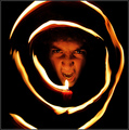
| 12/14/2005 09:32:21 PM |
Pyromancyby elsapoComment: Wonderfully hypnotic effect with the swirling candleflame - the eyes are attracted to the swirling flame to be further drawn into the center with the snarling face. My critique on this piece is that it would have been better not to have broken the swirl spiral pattern - perhaps not zooming in so tight or tight cropping would have avoided breaking that nice swirl you have going such that it would have been complete. Lastly I think cropping this to a full square format would suit the composition nicely. |
| Photographer found comment helpful. |
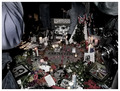
| 12/13/2005 11:31:53 AM |
imagineby misterjoshComment: This is an photo of interest in regards to photojournalism -documenting events. My critique is that the scene is way to busy as that there are tooooo many elements present that the eye does not have a main subject dominating the scene for us to train our attention on. There are numerous photos of John Lennon, flowers, candles a person's pants and elbow visible on the left hand side, a camera visible on the right hand side, etc. It comes off too much like a quick snapshot. Training the composition to focus on a few objects in the scene would greatly strengthen the visual and emotional impact of the photo - say a tighter focus on John Lennon's face on the center and the words imagine is one suggestion. Another is if you were positioned at a different angle such that when that person in the background was placing that lighted candle down next to the words "Imagine" would be another (visually and emotionally this would be a great photo for it says in a visual message that his words and hope for a better world has not died out - the flame still burns brightly as does his memory) |
| Photographer found comment helpful. |
Home -
Challenges -
Community -
League -
Photos -
Cameras -
Lenses -
Learn -
Help -
Terms of Use -
Privacy -
Top ^
DPChallenge, and website content and design, Copyright © 2001-2025 Challenging Technologies, LLC.
All digital photo copyrights belong to the photographers and may not be used without permission.
Current Server Time: 08/09/2025 04:50:54 AM EDT.