| Image |
Comment |
| 09/20/2007 08:46:45 AM |
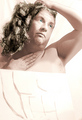
(498973) Hey, to da femmes, view a bust, unachievedby posthumousComment: Upon first glance I thought, Now what the heck is this sup--Oh - My - Lord!!!!! Giggles fall to chuckles. I am sure you are getting alot of commentary thanking you on your parody that this gave them either fits of laughter or a few chuckles. This is the sort of thing that makes me really think that the wording of this Deja challenge should have allowed for parody just to invite more creative spin into the challenge. I am sure you are most likely getting hammered but the creative out-of-the box thinking of yours is good. It is just the technicals that really detract from the overall composition. I know that you were greatly hampered on how to effectively 'blend' the drawing with your live model (Expert Editing and all). That hard line really is distracting and I wish your left hand fit better with the drawn arm that it is supposed to be attached too. Hmmmm, I wonder...hmmmm, might a skin colored spandex fabric (you know the kinda form fitting tights that most superheroes go running around in;-) stretched out like the paper worked better. The spandex fabric would then have your charcol drawing of a manly chest with your model's pose 'fitted' to look like he is the continuation of the drawing. You would also have to adjust the White Balance on the camera just to make sure that the tones don't vary too much. Then with this being Advanced Editing you may have been able to get away with cloning/blurring out the 'line' between drawing and live model. |
 Photographer found comment helpful. Photographer found comment helpful. |
| 09/19/2007 09:04:44 PM |
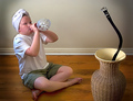
Tribute to Scalvet's Charmerby wingyisleedsComment: Nice job in emulating Scalvert's photo! Lighting and sharpness in details in your composition is good. The young adult/child's pose greatly mimics the original as a snake charmer that calls forth the deadly 'beltsnake'. My only critiques are that I wish we saw more of the eyes and expression of the Snake Charmer playing the bottle 'flute'. In the original we see the eyes reflect some attention grabbing catchlights and the youngster's mouth shows as she/he is about to blow on the flute. Facial expressions are important in establishing human & visual interest. Message edited by author 2008-02-27 15:52:29. |
| Photographer found comment helpful. |
| 09/19/2007 08:51:21 PM |
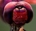
Green Dragon (Macro V) Deja Vu ... opps it's red insteadby andrewtComment: Wow nice sharp details seen in the top portion of the eyes of this dragonfly. The red color is really bold and vibrant. The composition could be stellar (don't get me wrong this is an above average shot) if the middle portion of the 'face' and bottom of the eye lens showed much more detail and was illuminated better. Those portions are either lost in shadow or not as crisp in detail as the top portion of the dragonfly's eyes. Good job though. |
| Photographer found comment helpful. |
| 09/19/2007 08:44:54 PM |
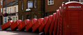
"Public Telephone Boxes" by redmoonby DistantColoursComment: Nice sharp details and bold, deep reds on these toppling telephone boxes. Very nice emulation of the original but this composition has much more deeper & richer tones. A tad off topic, but if these were blue Police Call Boxes I'd almost expect the good Doctor & Martha (Dr. Who) to emerge from one;-) |
| Photographer found comment helpful. |
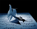
| 09/19/2007 08:23:18 PM |
Swan Lake (De Sousa) - Adagio (MAK)by WalesPComment: A fairly well done emulation of De Sousa's Swan Lake. The musical wake as the swan 'swims' past is what really makes the both compositions demand our attention and play with our imagination. Lighting and details are good in your composition. There are a few things that I think can be done to improve the composition such that it moves from the above average category to the excellent category. First is that I think that the flow of the disrupted music should be stretched out more on an angle to give a stronger appearance of a wake behind the swan. Here the wake is probably at a 70 degree angle whereas a 45 degree angle would be better. The other suggestion is that angling the swan at a 45 degree angle would be more visually appealing than one that is angled almost perpendicular to the viewer. I think showing the wings curled adds a different dimension to the composition (for I really do think of MAK's Adagio in the wings challenge) but in the long run the view from behind doesn't work as effectively for the shadows thrown behind on the wake really obsure the music. A swan with sharper folds and angled such that the majority of the shadows thrown is off to the side of the wake making the wake & it's music much more prominent. |
| Photographer found comment helpful. |
| 09/19/2007 08:09:39 PM |
DeSousa's Swan Lakeby scarbrdComment: Nicely done emulation of De Sousa's Swan Lake. The musical wake as the swan 'swims' past is what really makes the both compositions demand our attention and play with our imagination. I cannot be sure if the sheet music you used is from Swan Lake - I certainly hope so for that would strengthen the composition. Lighting is good but could be better as that there is a bit of harsh spotlight just right in front of the swan that is a bit blown out. Perhaps diffusing the light with a white cloth a few inches away from the main light would cut the glare down. Your photo composition has a bit more of a bluish cast to it. I'm not quite sure if it is a positive or negative. I do like the more crisp natural light in the original but the bluish cast in yours can be seen as a nice touch for it does give a subtle nod to the color of water. |
| Photographer found comment helpful. |
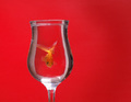
| 09/19/2007 07:57:13 PM |
Goldfish Revisitedby sarrobiComment: The bold and vibrant red background really pops out at you in this composition. I really like how you caught the goldfish in a position that it is looking at us - probably a task that took much patience while it swam around freely in the glass. A good attempt in trying to emulate the original. However, there are several things you could do to improve the visual impact of this photo in order to move it out of the above average category and into the stellar category. First, the reflections on the glass are a real distraction especially since it takes away from what could be just clean lines of the glass and the main subject which is the goldfish. A good polarizer will help minimize or remove those reflections for you. Second, while bold, the background appears flat. The original has a variation in the tones of the reds (a fade from deep red to a lighter red) which gives it added dimension and thus more visual pop...mayhap adjusting the light source so that the top is not as brightly illuminated as the center would help. Certainly the polarizer will serve to darken the image abit as well. Third, The goldfish is not in as sharp a focus as it could be. Not quite sure as to how you could effectively capture sharpness as that I have never tried shooting something in a glass which I am sure adds a measure of difficulty epecially since that subject is moving. A combination of a higher aperture setting (6.3 and above gives better DOF as well as details), lower ISO (50-100 also gives good details), and alot of luck in getting it focused on the goldfish a nanosecond before the shutter fires. |
| Photographer found comment helpful. |
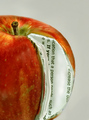
| 09/19/2007 07:42:02 PM |
iBook Re-readby J-MeComment: Your lighting, sharpness and details are good in this composition. I can 'read' and see the words clearly. The only problems I see with this composition is the edges of the pages and the orientation of the words. For the viewers to 'bite' that the pages naturally belong in the apple it has to look the part. The edges of the book pages need to be nice & sharp as well as cleanly rounding them to the exact shape of the apple (not an easy task I'm sure but one that would pay off in the end). The other critique is that the orientation of the words going on the vertical plane just doesn't work effectively. The words really should be oriented on the horizontal axis much like it would be when you crack open a book to read. None-the-less you made a good attempt at emulating the original. |
| Photographer found comment helpful. |
| 09/19/2007 01:36:35 PM |
The New iBook. Now with Dual Core.by h2Comment: Your lighting is wonderful in this composition for it illuminates all the elements within. Colors are also great. And extra kudos to you for making the edges of the book pages nice and sharp as well as rounding them to the exact shape of the apple. They really look like they fit in there! Sharpness and details are wonderful I can 'read' and see the words clearly. I also like soft focus of the two apple seeds in the background...I guess that is the dual core that you 'plug' in:-)You did a fine job on emulating the original. |
| Photographer found comment helpful. |
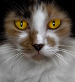
| 09/19/2007 01:26:57 PM |
18-Years by Yankoby SandyPComment: It is the amber golden glow of the cat's eyes that draw the viewer in for they are very hypnotic. Colors and lighting is great. The area that needs a tad more improvement is the sharpness in the details of this feline. The lack of sharpness is most noticeable on the whiskers of the cat. It's the sharpness in the detail that would move this from out of the above average category and into the stellar category. Generally a higher aperture (6.3 and above)and an ISO of 50-100 will give you a sharper DOF and greater detail. Of course, you would have to use a slower shutter speed and a cat is sometimes notorious for not cooperating when you want them too:-)None-the-less, good job on emulating the original. |
| Photographer found comment helpful. |
Home -
Challenges -
Community -
League -
Photos -
Cameras -
Lenses -
Learn -
Help -
Terms of Use -
Privacy -
Top ^
DPChallenge, and website content and design, Copyright © 2001-2025 Challenging Technologies, LLC.
All digital photo copyrights belong to the photographers and may not be used without permission.
Current Server Time: 08/19/2025 07:07:18 AM EDT.