| Author | Thread |
Comments Made During the Challenge  |
|
|
09/23/2007 10:13:48 AM |
|
This must be a artwork somewhere, I like it! In your rendition I like the richer textures, even to the point IMHO better than the original….10 |
|
 Photographer found comment helpful. Photographer found comment helpful. |
|
|
09/23/2007 02:40:34 AM |
|
I actually like this version better...it is richer...with more pleasing controls over the shadows and contrast. |
|
| Photographer found comment helpful. |
|
|
09/20/2007 08:27:14 PM |
|
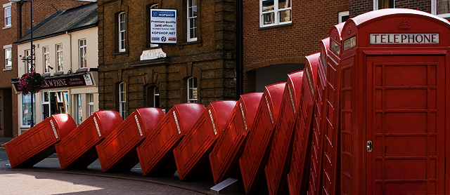
What a wierd sculpture. 7 |
|
| Photographer found comment helpful. |
|
|
09/19/2007 11:51:38 PM |
|
great job re-making this! |
|
| Photographer found comment helpful. |
|
|
09/19/2007 08:44:54 PM |
|
Nice sharp details and bold, deep reds on these toppling telephone boxes. Very nice emulation of the original but this composition has much more deeper & richer tones. A tad off topic, but if these were blue Police Call Boxes I'd almost expect the good Doctor & Martha (Dr. Who) to emerge from one;-) |
|
| Photographer found comment helpful. |
|
|
09/19/2007 04:16:39 PM |
|
I'll give you the edge on this one. You have better contrast and color. nicely done. |
|
| Photographer found comment helpful. |
|
|
09/18/2007 11:56:10 PM |
Wow, its been 3 years, and they havent cleaned these up yet :)
I actually prefer the darker image you took, opposed to the original. |
|
| Photographer found comment helpful. |
|
|
09/17/2007 07:06:46 AM |
|
i think yours is a much better picture. richer colors and whatnot. the angle is a LITTLE differant from the original. your also doesn't have the annoying black whatever in the lower right corner. probably explains your angle. |
|
| Photographer found comment helpful. |
|
|
09/17/2007 04:57:30 AM |
|
I would like to see the first box completely. but it is nice. |
|
| Photographer found comment helpful. |
Home -
Challenges -
Community -
League -
Photos -
Cameras -
Lenses -
Learn -
Help -
Terms of Use -
Privacy -
Top ^
DPChallenge, and website content and design, Copyright © 2001-2026 Challenging Technologies, LLC.
All digital photo copyrights belong to the photographers and may not be used without permission.
Current Server Time: 06/28/2026 02:29:50 PM EDT.