|
|
|
Showing 131 - 140 of ~593 |
| Image |
Comment |
| 05/12/2006 12:47:43 PM | Shrine of the Porcelain Godby fluxnComment: Well done post processing. But... its a bad cliche in a (generally) very respectful challenge. I'm all for thinking out of the box, but I feel like this challenge called for a certain amount of respect, which this photo does not give. |  Photographer found comment helpful. Photographer found comment helpful. |
| 05/08/2006 01:00:09 AM | Teathered blue boatby kari1Comment: Greetings from the Critique Club!
First Impression - the most important one: Poor Post Processing Killed The Shot!
Composition: The composition of this photo is very good. I like the strong diagonal lines drawing the eye towards the center of the frame. I also like the fact that the boat is cut off where it is. There is enough of the boat to make it recognizible as such, but the tight shot and tight crop allow one to take in more detail of the environment. The only nit to pick with your composition is the grassy bank in the background left corner. It doesn't add anyting to the shot and only distracts the eye. Maybe if you had moved around a little bit, or elevated the camera a bit more and shot down a little bit more you could have gotten rid of it. Worst case, I think you probably could have cloned it out without running afoul of the "major elements" rule, but I'm not sure.
Subject: It is interesting. Not spellbinding, but interesting enough. The boat itself has strong color that draws the eye into the photo. The small strip of yellow is a complimentary color that is also pleasing. However, it is in the end a static subject, so it's not going to be horribly exciting. In such cases it is up to you, the photographer to create excitement in this scene. How do you do that? Keep reading... :)
Technical (Colour and light): Here's where I think you blew your chance. As every commenter noted, this photo is indeed over processed. The wood chips, in particular, belile the excessive sharpening that you used. In addition, you've got loss of detail in both highlights (bottom right corner of the boat) and in the shadows (grasses, leaves, wood chips under the boat and around the chain). In addition the entire photo seems washed out and lacks contrast.
To grow its vote?: Post processing. A simple levels adjustment (or a more complex curves adjustment, if you know how) would clear the blown out highlights. Photoshop's "Shadows and Highlights" filter does wonders, if you use Photoshop. Less sharpening.
A final, non-photoshop suggestion. This photo looks like it was taken under very harsh lighting conditions, probably between about 11:00 am and 3:00 pm. Photographers call the hour after sunrise and the hour after sunset the "golden hour" because the sunlight is just that, golden. I think that if you were to return to this scene at one of those times you would be able to see the difference with your eyes, before you even raised the camera.
Summary: Remebember, that in static shots it is up to the photographer to create emotion. Careful use of lighting can go a long way towards that goal. Watch the sharpening in the future and I think you'll do much better.
Critique the Critique: A lot of effort goes into writing these critiques and I would appreciate feedback on how I'm doing. Do my comments make sense? Am I on track or way off base? Do my comments make you want to pick up a meat cleaver? Please let me know via a PM if you found these comments helpful, or not so much so.
Thanks!
---A | | Photographer found comment helpful. |
| 05/04/2006 05:24:20 PM | Captivatedby scalvertComment: Shannon, would you consider making a print available of this? | | Photographer found comment helpful. |
| 05/04/2006 05:19:11 PM | Just a Kid IIby tryals15Comment: I liked the tight crop better. :( Also unsure about the duotone. The contrast is better though, you can see the details in his forehead that were blown out before. Still could use a bit more shadows, IMHO. | | Photographer found comment helpful. |
| 04/26/2006 04:07:13 PM | Old Ideaby idnicComment: Cindi,
I like to think of myself as a thoughtful and refelctive voter who takes his time to figure out the artist's intended relation to the challenge before I deduct points for DNMC.
That said, I never would have gotten this without the other comments, and even your hint in Doc's thread.
I get it now, and it is, indeed, great, but I probably would have given you a 5 if I had voted on this one.
Heh, but now that I do get it... I keep chuckling to myself. :)
Edit: Me == retard. Read the title, stoopid. Still good work though!Message edited by author 2006-04-26 16:09:21. | | Photographer found comment helpful. |
| 03/13/2006 04:19:37 AM | Bond. James Bond.by LeokComment: I wonder how many people here aren't going to know they were books before movies...
Technically a feat, for sure. I hope you'll grace us with a how-to after voting. The edges of the mans jacket, where they transition to white, both to the shirt and to te background, are very jagged. I assume this is to to the inadaquicies of our 640 pixel JPEG canvas, but they still could have been cleaned up a bit,I think. Also, I wish the guy's face was in better focus.
All in all well done, in my opinion. Clean up those minor technical issues and you've got a 10 from me. | | Photographer found comment helpful. |
| 02/08/2006 04:05:50 PM | Just a Kidby tryals15Comment: I'm not Dr. Achoo, but I'll throw you a comment...
I think the think keeping this from being a 6 or more is contrast.
This shot is very flat with a lot of grey. Bump up the contrast which would lighten the background, darken the skin tones, and generally give it more "punch."
At least that's what I get just from looking at it...
---A | | Photographer found comment helpful. |
| 02/08/2006 03:29:49 PM | Spinning Blue (Da Ba Dee)by livitupComment: OK, I think I know one problem off the bat... After the resize the title of the song on the turntable (BLUE, buy Eiffel 65), which was a major element of the photo, wasn't that prominent.
But I couldn't find a composition that included all the elements of the scene, but highlighted the album title. I didn't want to take a picture of a record, but a picture of the whole setting...
*sigh* |
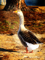
| 02/01/2006 01:40:20 PM | Gothic Gooseby fotomann_foreverComment: ::: Critique Club :::
Greetings from the critique club! This guy looks ready to attack!
First Impression - the most important one:
Could be a cute shot, but the post processing is holding it back.
Composition:
The composition is good and follows the "rules," as the goose's eyes (my first focal point) are up in a corner. My eye then naturally follows the curve of his neck over his body and settles at the tail feathers and his feet. Good use of the photographic canvas. Distracting background elements are kept to a minimum by careful composition.
Subject:
Totally appropriate for the challenge. Even a DNMC stickler like myself can't argue that this bird ain't likely domesticated. He may eat food tossed by passers by, but he's not anyone's pet.
Technical (Color and light):
Here's where this photo starts to fall apart. I do like the 'texture' of his wings and back. There's an interesting pattern of feathers by his neck, but those are a little blown out due to USM or saturation boosting. His head is the real problem, and specifically his bill. The orange of his bill is really blown out and over saturated, and that's one of the first places I want to look.
The second problem is the hard edged burning that you did on the path around his body and the pine needles around his head. It looks like there's a light with barn doors under his chest, aimed at the tree. This is just unnatural, and it's obvious that you did it in PS. If the burning was really needed then I would have done it with a much softer edged brush, and much more discriminatively.
To get a Ribbon?:
Clean up the post processing and it would have gotten an above average score from me, as a voter. Perhaps to bump you into '7 land' a different composition (tight on the head/back) might have made it even more interesting? It's hard to say.
Summary:
It's a whimsical image. However, it's a rather average animal, in a rather average setting, so you got a rather average score. In flight, or with babies in tow, or something else to make it exotic and you've got a winner.
Finally, I'd like to ask you to consider "critiquing the critique." A lot of effort goes into these critiques, and I enjoy learning how I can do them better. Does what I said make sense? Is it way off base? Did I enlighten you? Offend you? Please let me know via a private message what you think of this critique, so I can give better ones in the future.
Thanks, and good luck at DPC!
---Livitup Message edited by author 2006-02-01 13:41:09. | | Photographer found comment helpful. |
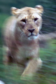
| 02/01/2006 01:19:39 PM | Lioness on the moveby hubbardr1Comment: Since you called out my comment (I don't mind) I figured I'd give you a little follow up.
So it was all done in camera... incorrect assumption on my point, but there's still something wierd going on here.
Typically if you move the camera and your subject is stationary, relative to the background, then everything will be blurry. If you pan with a moving subject, then the subject should sharp (or close to it) and the background will be blurred.
You have a bit of each... the background is blurred, the body is blurred, but the head is far less blurred than the rest of it. That's why I assumed it was done in PP. You could explain this by the lion walking toward the photographer, head on, but then you'd expect to see some vertical blur, as the lion's head moved up in the frame.
I guess what I'm trying to say is that this shot confuses me, and beliles what I know about motion and photography. But I guess it's not suprising that there's something out there that I haven't seen before. | | Photographer found comment helpful. |
|
Showing 131 - 140 of ~593 |
Home -
Challenges -
Community -
League -
Photos -
Cameras -
Lenses -
Learn -
Help -
Terms of Use -
Privacy -
Top ^
DPChallenge, and website content and design, Copyright © 2001-2025 Challenging Technologies, LLC.
All digital photo copyrights belong to the photographers and may not be used without permission.
Current Server Time: 08/02/2025 04:46:33 PM EDT.
|