| Author | Thread |
Comments Made During the Challenge  |
|
|
03/19/2006 12:37:19 PM |
|
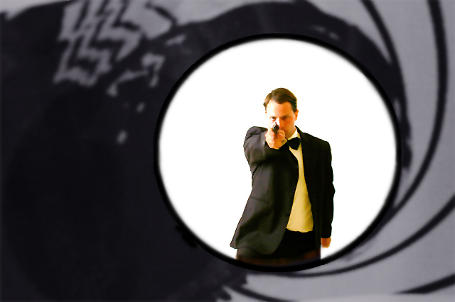
Cool effect and nice composition. The highlights on the right side of his face are blown out and missing detail. |
|
 Photographer found comment helpful. Photographer found comment helpful. |
|
|
03/18/2006 01:31:16 AM |
|
pretty nice attempt. really looks like bond. |
|
| Photographer found comment helpful. |
|
|
03/17/2006 07:49:16 PM |
|
Well doone but one minor complaint. James Bond would only have a white shirt with his tux. |
|
| Photographer found comment helpful. |
|
|
03/17/2006 07:24:27 PM |
|
| Photographer found comment helpful. |
|
|
03/17/2006 03:17:31 PM |
|
| Photographer found comment helpful. |
|
|
03/16/2006 06:48:43 PM |
|
| Photographer found comment helpful. |
|
|
03/16/2006 05:39:07 PM |
|
nice representation. My only nitpic is the shirt appears more yellow than white on my display. |
|
| Photographer found comment helpful. |
|
|
03/15/2006 09:35:44 PM |
|
Good re-creation of the movie title, but there's a line around Bond's left side that doesn't look right. |
|
| Photographer found comment helpful. |
|
|
03/14/2006 07:10:56 AM |
|
Would love to know how you did this. Great idea. |
|
| Photographer found comment helpful. |
|
|
03/14/2006 05:44:01 AM |
|
| Photographer found comment helpful. |
|
|
03/13/2006 11:32:30 AM |
|
Your Bond is looking a little petulant... |
|
| Photographer found comment helpful. |
|
|
03/13/2006 09:40:53 AM |
|
is it a book too? nice job |
|
| Photographer found comment helpful. |
|
|
03/13/2006 09:02:43 AM |
|
This is great! Looks just like the actual movie posters. Top finisher IMO. Good luck! 10 |
|
| Photographer found comment helpful. |
|
|
03/13/2006 04:19:37 AM |
I wonder how many people here aren't going to know they were books before movies...
Technically a feat, for sure. I hope you'll grace us with a how-to after voting. The edges of the mans jacket, where they transition to white, both to the shirt and to te background, are very jagged. I assume this is to to the inadaquicies of our 640 pixel JPEG canvas, but they still could have been cleaned up a bit,I think. Also, I wish the guy's face was in better focus.
All in all well done, in my opinion. Clean up those minor technical issues and you've got a 10 from me. |
|
| Photographer found comment helpful. |
|
|
03/13/2006 01:00:19 AM |
|
the white balance seems to be the tiniest bit off on the subject's shirt. Ingenious framing device, though. :) |
|
| Photographer found comment helpful. |
|
|
03/13/2006 12:19:12 AM |
|
Awesome idea! Looks to be some USM halo around the jacket though. Still cool. |
|
| Photographer found comment helpful. |
Home -
Challenges -
Community -
League -
Photos -
Cameras -
Lenses -
Learn -
Help -
Terms of Use -
Privacy -
Top ^
DPChallenge, and website content and design, Copyright © 2001-2026 Challenging Technologies, LLC.
All digital photo copyrights belong to the photographers and may not be used without permission.
Current Server Time: 06/28/2026 04:51:30 AM EDT.