| Image |
Comment |
| 01/20/2006 09:19:31 AM |
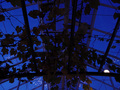
Fishing Floats Collection 1by KathycComment: I think this could have been a real interesting piece if you work the texture, contrast and colours. Definitely some potential. |
 Photographer found comment helpful. Photographer found comment helpful. |
| 01/20/2006 09:15:34 AM |
|
| Photographer found comment helpful. |
| 01/20/2006 09:13:24 AM |
|
| 01/20/2006 09:11:10 AM |
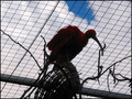
The Birdby HsteinarComment: The 2 basic things that instantly marr this photo is the light and how it's composed. It's so dark that all details of the bird are lost and yet it can't pass off as an interesting and clean silhouette. Composition is usually (altho' not in all cases) more interesting if you follow the Rule of Thirds. Here you could probably position the bird more to the left on an imaginary vertical third of the frame because it's facing right. Let me know if you'd like some help. I'm no expert but a couple of basic things can certainly be done here to show you instantly a difference. |
| 01/20/2006 09:04:15 AM |
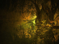
Frosty Foggy Morningby bugsy55Comment: From the little I can see, it seems to be quite well-composed. Nice diagonal line of the rock formation and the wooden structure seem almost at an interesting vertical third. Unfortunately all other details are lost because of the size. DPC allows up to 640px (you can follow the tutorial available) as long as it doesn't exceed 150kb. |
| Photographer found comment helpful. |
| 01/20/2006 09:00:14 AM |
Oasisby bkctComment: Can't make this image out and the first thing to do is look up the tutorial on DPC to re-size correctly and to your photo's advantage. |
| 01/20/2006 08:58:45 AM |
Any one for Cricketby zed3Comment: The subject looks interesting but I had to look a few times and real hard to get it. Most basic elements to improve:
- crop it to the maximum limit allowed for DPC ie. 640px (see the tutorial available)
- overall focus could be a lot sharper
The light looks ok but it's hard to tell since it's too small to appreciate the details. |
| Photographer found comment helpful. |
| 01/20/2006 08:54:54 AM |
Scenic_Munnaarby laindComment: I think here, the main problem is DoF. There is a hint of scenery but it's strongly marred by being OOF for most parts, with the sharpest area being the foliage foreground. In fact, it might have been better to just crop that part out to direct the viewer to the landscape beyond. Other elements that don't help this image are:
- the tilt of the landscape, seems to slope down to the right. Most editing software can easily correct this by just rotating it to the degree needed
- the sky looks blown out (over-exposed)
- the colour suffers from the glare as well (I could be wrong and if I am, I apologize, but this looks like it was taken around mid-day when the sun was highest)
Finally, for a scenic image, a bigger size is better. |
| 01/19/2006 01:13:45 PM |
Sea Urchin, Beauty in Deathby BethanComment: Nice idea and yes they can be real beauties. (My uncle used to dive to collect them and dry them to make decorative pieces). Unfortunately, the beauty is lost here and here are the main reasons I see:
- the composition is not too bad altho' the center point could have fallen into the vertical third partition on the right
- but the subject itself looks out of focus overall and this is really the main thing that hurts this image
- as it's so dark in itself, perhaps a white background would have worked better to reflect the white spots
On the side, wondering why you didn't just leave the colour in? Altho' the b&w does play up the pattern... |
| Photographer found comment helpful. |
| 01/19/2006 01:03:48 PM |
Goodbyeby Shiva DasComment: The message of the image has some merit. Some problems I see:
- you're shooting right at the sun, so the glare is very harsh
- it's too small and looks pixel-y
- the composition is overly busy (could you have gotten closer and to the side?)
- the grey tones are overly dominant here (some editing on contrast may have helped)
Hope this helps. |
| Photographer found comment helpful. |
Home -
Challenges -
Community -
League -
Photos -
Cameras -
Lenses -
Learn -
Help -
Terms of Use -
Privacy -
Top ^
DPChallenge, and website content and design, Copyright © 2001-2025 Challenging Technologies, LLC.
All digital photo copyrights belong to the photographers and may not be used without permission.
Current Server Time: 08/08/2025 05:31:55 PM EDT.