| Image |
Comment |
| 10/12/2006 09:51:21 AM |
|
 Photographer found comment helpful. Photographer found comment helpful. |
| 10/12/2006 09:49:53 AM |
He see's you!by ShutterHackComment: Good shot, although you mustve gotten thousands of "Thats not a rubber ducky" or "Read the challenge description" already.
Still, kudos for originality. |
| Photographer found comment helpful. |
| 10/12/2006 09:48:37 AM |
Hidden Duckyby deacueductoComment: Okay, this is a clear cut example of a great idea, but a not-so-great execution :) I think a closer crop to the hidden ducky in a bigger picture (imagine a portrait on a wall, with the ducky in one of the corners, hidden like it is now) but without forcing flash onto the leaves. THe flash blew the leaves a little out of proportion whereas soft lighting might have actually worked a lot better. If it's the sun, then afternoon sun in that case. The shot is not bad - on the contrary. I just think with by changing a few things like I suggested it couldve been a lot more impactful. Good luck with the next challenge :) |
| Photographer found comment helpful. |
| 10/12/2006 09:44:31 AM |
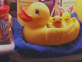
Enjoying The Westhouse!by 777STANComment: I like this shot and the soft lighting, however (and this may just be my screen) the duck feels a little grainy. Still, composition is good. I understand the setting of doing it in the fridge, but perhaps a cleaner background wouldve contributed a bit more. Good luck with the next challenge :) |
| Photographer found comment helpful. |
| 10/12/2006 09:41:26 AM |
Ducky Mayhemby Darkend_SwordComment: Shot is a little dark and busy. I find it hard to understand where the Mayhem fits in. If it's because of the torn off nose, there's nothing to support it in the shot so it kinda loses its impact. Focus on lighting and perhaps a cleaner, more focussed composition next time and the results should speak to themselves! |
| Photographer found comment helpful. |
| 10/12/2006 09:39:39 AM |
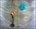
AB-DUCK-TION by NaldComment: Mmmhh... this shot is very nice but there's one very distracting element that avoids me from thinking perfect!
The "light" from the top, the white one, isnt completely round around the duck. I feel that with your center position of the duck it kinda needs the circle around it.
Well done on a good shot though :) 6 |
| Photographer found comment helpful. |
| 10/12/2006 09:36:21 AM |
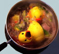
DUCK SOUPby whitewolfComment: Cool idea, (if a little grotesque) The ducky also looks a little grainy, but the composition is good and tight. I wouldve just let some room for the top of the pot too. Good luck with the next challenge :) |
| Photographer found comment helpful. |
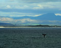
| 10/05/2006 04:07:33 AM |
whale season.jpgby danica22Comment: You gotta love the whale watcher at hermanus!
What a character.
Anyhow, wont comment as extensively as I did on the previous one, but I think the same law applies.
Your subject here isnt singled out dramatically and feels a little lost with all the other colours. Judging by the overcast conditions, there wasnt a lot you could do though! |
| Photographer found comment helpful. |
| 10/05/2006 03:53:59 AM |
the pier.jpgby danica22Comment: COmposition in this shot is great. I like the way the pier moves deeper into your picture.
I dont know if it's my screen but the clouds above are a little 'too' intense and adds a bit too much of a grey feel to the overall photo. Also, I think if you cropped a little off the clouds on top, it'd be a little more impactful perhaps!
Hope it helps :) |
| Photographer found comment helpful. |
| 10/02/2006 02:33:53 AM |
Mitosis by yankoComment: COngrats Yanko, well deserved!!
And it's about freakin time!
:) |
| Photographer found comment helpful. |
Home -
Challenges -
Community -
League -
Photos -
Cameras -
Lenses -
Learn -
Help -
Terms of Use -
Privacy -
Top ^
DPChallenge, and website content and design, Copyright © 2001-2025 Challenging Technologies, LLC.
All digital photo copyrights belong to the photographers and may not be used without permission.
Current Server Time: 08/05/2025 02:25:47 AM EDT.