| Image |
Comment |
| 01/02/2003 02:34:42 AM |
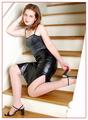
Kicking Up Her Heelsby magnetic9999Comment: Really nice and artistic. Maybe a softer lighting would have made it more glamorous and sensual? Or maybe it's just the levels that make it seem "high key"... The lady is beautiful! |
 Photographer found comment helpful. Photographer found comment helpful. |
| 12/31/2002 04:42:57 PM |
|
| 12/31/2002 04:42:27 PM |
Stayed Homeby mcraelComment: westfalias rule, I've got a '78 myself. Put a tarp over it!!! :) |
| 12/31/2002 04:41:37 PM |
|
| 12/31/2002 04:41:22 PM |
|
| Photographer found comment helpful. |
| 10/21/2002 01:20:00 AM |
GearWerkzby mcmurmaComment: Nice lighting, I really love the blueish tone. Great DOF and Details... Looking good in the challenge! |
| Photographer found comment helpful. |
| 10/21/2002 01:21:00 AM |
man of darknessby heartsdivideComment: Wow, great B&W tones. I really like the nice diffused look. The type of picture that belows on a CD cover! |
| 10/14/2002 03:13:00 AM |
reeseby john22132Comment: I don't understand the B&W, it could have looked stunning in vibrant colors. It should make me hungry but it doesn't. |
| 10/14/2002 03:08:00 AM |
Just mine...by bmarquezComment: Good idea, nicely done. Macro could have been a little bit more in focus, try a little unsharp mask maybe? |
| 10/14/2002 03:15:00 AM |
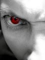
Become Wrath by greenem2Comment: Woah, mean looking!!!! The type of thing that spot edit would make soo much nicer. Good job anyways. |
Home -
Challenges -
Community -
League -
Photos -
Cameras -
Lenses -
Learn -
Help -
Terms of Use -
Privacy -
Top ^
DPChallenge, and website content and design, Copyright © 2001-2025 Challenging Technologies, LLC.
All digital photo copyrights belong to the photographers and may not be used without permission.
Current Server Time: 07/18/2025 07:58:13 AM EDT.