| Image |
Comment |
| 07/16/2003 11:57:33 PM |
Nude Ceramicby barahooComment: it's not as interesting as a real human figure.. and the image quality seems rather low here, but I like how the tones flow into the background. |
 Photographer found comment helpful. Photographer found comment helpful. |
| 07/16/2003 11:54:59 PM |
Role Reversalby robsmithComment: The scar draws attention to itself, but I don't get the impression that it's supposed to be an important part of the shot. The item at the bottom right is distracting as well and some better lighting might have made this more interesting. I like the idea for the shot though, and I think the crop works well. |
| Photographer found comment helpful. |
| 07/16/2003 11:47:00 PM |
Nipple Noiseby ArtessaComment: I like the concept here, but the composition on this shot doesn't work very well for me. I'm not sure how I'd suggest to improve it, since I'd probably just suggest trying a lot of different things and seeing what works (which you probably already did). I guess the one thing I think might improve it would be more separation of the breast from the rest of the body. Just thoughts. |
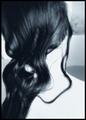
| 07/16/2003 07:57:57 PM |
Sweet love in blueby dasserComment: I enjoy abstract shots and I like this one. I think it might have been interesting to have the hair in a sharper focus or to have more dramatic lighting on it, but it is effective as it is as well. The crop is great and I love the flow of the hair. The tone you chose works very well as well. |
| Photographer found comment helpful. |
| 07/16/2003 07:55:34 PM |
Fruit Bathby photogooComment: what a bizarre look this has to it. I think it's a bit overdone, but the idea isn't bad at all. Using the bananna to add depth to the shot was a good call, but it'd have been nice if it came through a bit clearer (perhaps better lit). |
| Photographer found comment helpful. |
| 07/16/2003 07:55:00 PM |
Body Artby mbardeenComment: I like the composition a lot on this shot. The crop seems just tight enough and the points of interest (tatto, head, hand) are in good places. The hair adds interesting character to this shot as well, with the one strand hanging down and both light and dark strands showing. Originally I really didn't like the grain and the harsh contrast on this shot, and now I'm not so sure. It looks like this was overexposed enough to lose detail on the skin, and then darkened, (although that's just a guess) resulting in areas of the skin that are neither blown out or very detailed, which comes out kind of drab. So I guess my main wish here is some more detail on the skin, or else a high key look all around, but I don't have as much of an issue with those things as I originally did. Great work. |
| Photographer found comment helpful. |
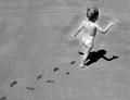
| 07/16/2003 07:47:34 PM |
Free Spiritby SonifoComment: Thsi shot turned out very well. I suppose it'd have been nice if the line in the concrete weren't there, but that was probably beyond your control. This definately embodies the idea of your title well. The footprints leading up to the subject are perfect, and I like the postprocessing you've done on this shot. It really makes the kid's body stand out from the background with a sort of subtle glow. The crisp shadow is a nice touch as well. It might have been fun to experiment with different crops with the kid partway out of the frame or perhaps overlapping into a boarder, but I've got no complaints about thei crop. Great work. |
| Photographer found comment helpful. |
| 07/16/2003 04:12:14 PM |
Maria Di Capiby zeuszenComment: I realize you are going for a stylistic extreme here, but I don't like the result. I don't know why she's wearing sunglasses or those things around the bottom of her legs. They don't seem to fit into the shot very well. The lighting is harsh, and it doesn't seem to create an interesting effect. The framing here is wide, and doesn't seem to function well either. I'm sure all the things I've pointed out you were already aware of and intended to be as they are, so I suppose this won't be very helpful, but at least you know why I didn't like the shot. |
| 07/14/2003 09:01:43 PM |
Light and Colorsby wingyComment: Oh well. I at least appreciate when my shots at the bottom are someone's favorites. = ) |
| 07/14/2003 01:24:13 AM |
Sun baskerby kiwinessComment: Very expressive, I love the smooth skin textures and the arched back. The hands on breasts might be a little unnatural looking, but it doesn't come off as a real problem. I like the background as well. |
| Photographer found comment helpful. |
Home -
Challenges -
Community -
League -
Photos -
Cameras -
Lenses -
Learn -
Help -
Terms of Use -
Privacy -
Top ^
DPChallenge, and website content and design, Copyright © 2001-2025 Challenging Technologies, LLC.
All digital photo copyrights belong to the photographers and may not be used without permission.
Current Server Time: 08/25/2025 07:45:17 AM EDT.