| Image |
Comment |
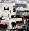
| 08/11/2005 01:19:07 PM |
1955by CutterComment: I like this picture with the selective desat, however for some reason the signs about the counter seem way too sharp and are slightly distracting. |
 Photographer found comment helpful. Photographer found comment helpful. |
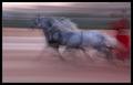
| 08/11/2005 01:17:14 PM |
1788by labudsComment: Nice shot, perhaps a bit too "neatened". |
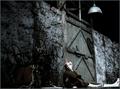
| 08/11/2005 01:16:00 PM |
Circa 1865by JeileenComment: Nice shot, however I think that I would have rather of seen the front side of the cart |
| Photographer found comment helpful. |
| 08/11/2005 01:15:24 PM |
1934by kongphooeyComment: I see where you were going with this, but the modern looking sign and the very modern cars take awy from that 1934 feel. |
| Photographer found comment helpful. |
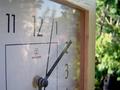
| 08/11/2005 12:26:02 PM |
|
| Photographer found comment helpful. |
| 08/11/2005 12:24:59 PM |
|
| 08/11/2005 12:23:13 PM |
1977by aimee_skittlesComment: I really like the the look of this picture. The blown sky actually works in this setting I think, however I just wish that the highlights inthe rear of the car were still there. |
| Photographer found comment helpful. |
| 08/11/2005 12:16:58 PM |
|
| Photographer found comment helpful. |
| 08/11/2005 12:12:06 PM |
3000 B.C.by anthonyczajaComment: Great idea and well executed. However I think that the orange color is a bit too over powering in this picture... would have preferred a little less saturation. |
| Photographer found comment helpful. |
| 08/11/2005 12:11:07 PM |
1941by grainman9Comment: I really like this picture a lot, however it appears that the highlights on the face and legs are slightly blown. |
Home -
Challenges -
Community -
League -
Photos -
Cameras -
Lenses -
Learn -
Help -
Terms of Use -
Privacy -
Top ^
DPChallenge, and website content and design, Copyright © 2001-2025 Challenging Technologies, LLC.
All digital photo copyrights belong to the photographers and may not be used without permission.
Current Server Time: 08/28/2025 03:05:53 PM EDT.