| Image |
Comment |
| 06/03/2015 07:56:05 AM |
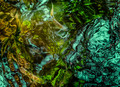
Rolling in the Deep by hotpastaby MargaretNetComment: Really nice - well seen and shot - I just want to get rid of that stuff in the background ;)
double-take: just realized how much this is a carbon-copy of the original - and I in fact prefer this version. Obviously this is the same location form the same vantage point. The wider lens seems to have significantly more distortion but doesn't bother me. |
 Photographer found comment helpful. Photographer found comment helpful. |
| 06/03/2015 07:56:03 AM |
|
| Photographer found comment helpful. |
| 06/03/2015 07:55:41 AM |
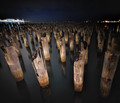
Entwination II by Samantha_TComment: A fantastic tribute. Obviously a lot of effort went into making this very very similar to the original.
My only minor critical comments would be; it feels like it needs a very slight rotation counter-clockwise; and it it a bit too clean (noiseless). Still worthy of an 8 of course. |
| Photographer found comment helpful. |
| 06/03/2015 07:39:01 AM |
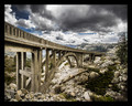
Donner Summitby Jackson_HComment: Great image with great color. Feels like it needs a rotation.
Like this? 
Edit to add: the border, while ppl commented on it, IMHO wasn't a major flaw -- but yeah, not a good idea on DPC =) Message edited by author 2015-06-03 07:40:09. |
| Photographer found comment helpful. |
| 06/02/2015 10:51:04 PM |
Spawn by PenelopeKComment: A beautiful sketch of the pen of nature. I'd love this to be wallpaper or something huge to explore on a wall :) |
| Photographer found comment helpful. |
| 06/02/2015 07:18:23 AM |
|
| Photographer found comment helpful. |
| 06/01/2015 02:41:57 PM |
the green green grass of home!by GilesComment: This comment LOL ...
Originally posted by Tiny:
If this was better it would be good.7. |
That was my thinking ... a bit more time playing with this might do the trick.
Originally posted by vawendy:
I'm glad that Lydia commented. When I was voting, I was stunned by this shot. What a bunch of work, and what wonderful idea! I loved the feet.
But then I looked at it and I didn't like the color cast. It seemed a tad underexposed. And the shot itself just didn't do it for me. I gave it a 6, but I really, really wanted to give it a 9. The idea and pieces were sooooo excellent, but I really think it could have been a better photo, even with a color balance/exposure correction. Add some more processing to make it pop and bit more and it would have been truly spectacular. |
|
| Photographer found comment helpful. |
| 06/01/2015 02:20:44 PM |
|
| Photographer found comment helpful. |
| 06/01/2015 02:19:15 PM |
|
| Photographer found comment helpful. |
| 06/01/2015 01:00:56 PM |
|
| Photographer found comment helpful. |
Home -
Challenges -
Community -
League -
Photos -
Cameras -
Lenses -
Learn -
Help -
Terms of Use -
Privacy -
Top ^
DPChallenge, and website content and design, Copyright © 2001-2025 Challenging Technologies, LLC.
All digital photo copyrights belong to the photographers and may not be used without permission.
Current Server Time: 08/14/2025 07:39:36 AM EDT.