| Image |
Comment |
| 01/11/2009 06:15:43 PM |
Fall in West Cornwall (APAW-1)by PGerstComment: I think this is a big improvement on the original. I dont think there is too much contrast, and I really like how the lines draw you toward the centre. |
 Photographer found comment helpful. Photographer found comment helpful. |
| 01/11/2009 06:14:29 PM |
Spider Lily '05by Pug-HComment: Great photo. I really like the shallow DOF, and the water drops a refracting some interesting shapes as well. As with the other comments, the grain is the only drawback. Some noise ninja, or other noise reduction should fix that easily. |
| Photographer found comment helpful. |
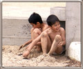
| 01/08/2009 10:25:18 PM |
Beach-people-copy-Sand-boys.jpgby jomariComment: I agree with nshapiro. The cropped version is a huge improvement, but I dont like the border. You changed a busy shot into a nice simple shot with your crop. |
| Photographer found comment helpful. |
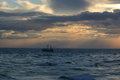
| 01/07/2009 09:17:02 PM |
APAW-2-Original-2027.jpgby PGerstComment: Lovely shot... the sky is really cool, and the light coming from the clouds is really nice. I wouldnt necessarily crop any more ocean out... i kinda like the 50/50 composition here, but I would fix the tilt in the horizon. Nice photo. |
| Photographer found comment helpful. |
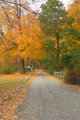
| 01/07/2009 09:14:47 PM |
APAW-1-Original-1253.jpgby PGerstComment: I think this is a very nice scene, but it could be improved by a few edits. The colours seem a little flat, so I would add contrast. I think this would also be nice with the sky cropped out. Its blown out as it is. Have you considered a horizontal crop, keeping the far end of the roadway in the center? |
| Photographer found comment helpful. |
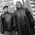
| 01/07/2009 09:11:13 PM |
Mr. and Mrs.by bvyComment: I really like this photo, despite the androgynous woman. They both have a very genuine smile on their faces, and look very happy. Nice photo. |
| Photographer found comment helpful. |
| 01/04/2009 11:05:55 PM |
1-jan 09 archive foto. dreamscapeby rozComment: That is very cool. I have no idea how to do something like this, but I can only imagine the amount of time it takes. Looks like a hybrid painting/photograph. |
| Photographer found comment helpful. |
| 01/04/2009 12:23:44 PM |
Manhattan Lightsby NeilComment: I agree with Melethia... this one is better because of the wider view. I am unsure about the observation deck however. There is a lot going on in the shot, so I didnt notice it at first, but even now that I know its there, I dont find it a distraction because it isnt very bright or prominent, so I still end up looking at the buildings/sky/sunset.
What building where you on when you took this photo? (yes... If I am ever in NY I hope to try it myself) |
| Photographer found comment helpful. |
| 01/04/2009 02:51:48 AM |
E - 3/18/07by colorcarnivalComment: What a great shot... his eyes are intense. I agree about the green cast... the original photo seemed to have a red cast (though... my monitor is far from being calibrated itself). One way to overcome any of that without calibrating your monitor would be to convert this to black and white. |
| Photographer found comment helpful. |
| 01/04/2009 02:48:53 AM |
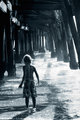
Curtis 1264 edit 2by MelethiaComment: This is my favourite of the three edits, although, I would prefer if the boy was a little brighter. Have you tried doing a brightness layer, and masking out everything but the boy.
Even without the extra brightness, I really like the emotion in this shot. It really does a good job a kid being a kid. |
| Photographer found comment helpful. |
Home -
Challenges -
Community -
League -
Photos -
Cameras -
Lenses -
Learn -
Help -
Terms of Use -
Privacy -
Top ^
DPChallenge, and website content and design, Copyright © 2001-2025 Challenging Technologies, LLC.
All digital photo copyrights belong to the photographers and may not be used without permission.
Current Server Time: 08/14/2025 11:55:53 AM EDT.