| Image |
Comment |
| 07/28/2005 06:03:35 AM |
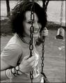
Happy Aloneby Joey LawrenceComment: :: Critique Club ::
I really like the empty swing in the background. One of the distracting elements of the background is hoe it goes from the shadow of the tree into the bright sunlight. To really emphasize the aloneness I think I would have had her not smile, but have her looked a little more depressed. The chain in front of her face really gives an isolated and caged feeling along with the empty swing.
One of the lighting problems I see is you lose all detail in her left eye and her hair, her right shoulder is a little bright. My two suggestions for the shadow for her face is either get rid of it or what I would do is use it. Cover her eye with her hair and have her look down to give a gloomy feeling to the photo.
With it being b&w it coveys more of a depressing feeling. The blacks in this photo are supper rich, but the whites suffer here.
So to conclude I want to say she has a really great smile but it doesn�t work with the shot. I think going for an isolated feel here would work better. Or if you rotated the angle so she isn�t stuck behind the chain. I like you taking a chance here sometimes it works and sometime it doesn�t.
|
 Photographer found comment helpful. Photographer found comment helpful. |
| 07/26/2005 06:12:57 AM |
Foward Movementby jseyerleComment: :: Critique Club ::
The first thing I see with this photo is the overwhelming background In sports photography it usually doesn�t hurt to use a shallow depth of field but it does hurt this photo since there is a lack of action in the subject. Using the motion blur is alright here but it would have help to give something else in focus to show that it wasn�t just camera shake or something like that. Maybe include other aspects of the sport.
The lighting here has some problems as well, there seams to be a good amount of overexposure in the photo most noticeable on his shoulder. A larger aperture would allow you to keep a slow shutter speed along with increasing depth of field.
I like that you gave room in the frame for the subject to move but giving him a reference point something he is running to or from would help even more.
I hope what I said was helpful feel free to PM me if you have any questions. Thank you.
Nick
|
| Photographer found comment helpful. |
| 07/25/2005 10:50:38 AM |
getting hit unawareby benlenzComment: :: Critique Club ::
Well I guess I'll start with the lighting, it is a little harsh causing dark shadows most noticeable under the chin. There is a lot of reflection off the person's face.
There doesn�t appear to have much effort put into the photo, it looks like a snapshot when you where messing around with some buddy�s. Showing the object that hit him would have help as well as stepping back to capture more of your subject. Because you are so close his head seams to be disproportioned to his shoulders as well.
The background doesn�t help the photo either you lose the persons hair in it. The dots next to his mouth are distracting as well. Lighting would have helped this as well. If you were trying to convey boxing try hinting at it in the background too, Like maybe seeing people sitting behind red white and blue ropes.
I hope this has helped feel free to PM me if you have any questions or would like more clarification on anything. Thank you.
Nick
|
| 07/25/2005 06:24:48 AM |
Safe on Secondby WildflowerJoyComment: Greetings from the Critique Club,
One of the first and most distracting things that I see in this image is the lighting; I know you don�t have much control with this. The backs of the pants appear to be overexposed and the dark background really exaggerates this. Also the dark areas like the boy on the lefts glove and the runner�s uniform almost disappear into the wall. The focus seems to be a bit off as well. The color could be a little brighter the uniforms look faded and dull while the socks look over saturated.
The way the two boys are looking off too the left leads you eyes out of the frame instead of leading into it. Just moving your angle to the right about 75 degrees would improve the photo dramatically, showing the boy about to touch the base while the ball was coming toward them giving it more suspense as well as showing all three faces. The dust is a good element but perhaps there is a little too much.
Thank you for entering this in I hope everything I said helped you, feel free to PM me if you have any questions for me.
Nick
|
| 07/16/2005 02:03:15 PM |
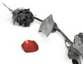
Lost Loveby genghisComment: The first thing that stands out to me is the desat color looks a little off. the shadows bothered me too but I dont really know why? The rose pedal would be better if it was a deep red this may just be my screen. The top left corner looks a little blown out. Good subject placment |
| Photographer found comment helpful. |
| 07/16/2005 01:21:23 PM |
Cymbalsby CutterComment: I imagine the lighting was a pain. There are some hard shadows in here and you lose detail in his jacket. I like the angle and how you filled the frame with it. I might experiment with a longer shutter speed to give a litle motion to his hands. i would say this does a good job conveying a jazz atmosphere. would look great as a set of prints each featuring a diffrent part of the band I think. |
| Photographer found comment helpful. |
| 07/15/2005 12:40:40 PM |
Lunamosityby SJCarterComment: This is great I really like how you filled the frame with it. great color and detail. I think the background might be a litle too out of foucs. looks like the moth is floating. |
| Photographer found comment helpful. |
| 07/15/2005 07:04:14 AM |
The inner circleby gprinslooComment: well I agree that this photo is way to dark you lose your viewer trying to make out a subject. I cant say alot more about this since I barly make out a subject. sorry that so many people get hung up on titles. |
| Photographer found comment helpful. |
| 07/15/2005 07:00:54 AM |
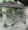
Bridge (gone) to greener pasturesby gprinslooComment: I like the flow of the water but there is a lack of color in the photo. like someone mentiond below use of a filter or small app. is what you would need to do. |
| Photographer found comment helpful. |
| 07/15/2005 06:57:43 AM |
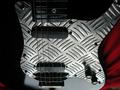
Sounds Metallicby gprinslooComment: I think the angle is what hurts since you took it laying down then flipped the photo it has a weird distracting look to it. I had a real hard time looking at it. The light isnt great reflecters could have helped. also when you use a backdrop or anything make sure you cover all the background unless it is on purpose I'm talking about the botom right hans corner it is a bit distracting. the red works well with the black. |
| Photographer found comment helpful. |
Home -
Challenges -
Community -
League -
Photos -
Cameras -
Lenses -
Learn -
Help -
Terms of Use -
Privacy -
Top ^
DPChallenge, and website content and design, Copyright © 2001-2025 Challenging Technologies, LLC.
All digital photo copyrights belong to the photographers and may not be used without permission.
Current Server Time: 08/24/2025 02:33:09 AM EDT.