| Image |
Comment |
| 07/27/2005 03:38:42 PM |
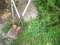
Garden Toolsby CyndaneComment: Not too crazy about this picture. Is that dirty snow? Appears over-sharpened. I think it would help this photo if you were to move the tools to a nicer background with enough light and get closer to your subject bringing out better detail in the metal/rust and wooden handles. |
 Photographer found comment helpful. Photographer found comment helpful. |
| 07/27/2005 03:35:05 PM |
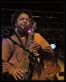
The Music Manby khdossComment: Very nice picture. I wish I could hear the music. I don't really like where the colored lights are positioned. Caused annoying hot spots. Too bad it wasn't more uniformed lighting above the musician |
| Photographer found comment helpful. |
| 07/27/2005 03:32:04 PM |
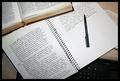
The Write Stuffby OdysseyF22Comment: Ack...hand written homework. Don't know if I could still do it now that I'm so addicted to my computer and keyboard. Nicely composed work space. Lovely handwriting. Only complaint is the slight glare on the notebook paper. 8 |
| Photographer found comment helpful. |
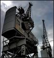
| 07/27/2005 03:29:26 PM |
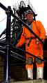
Pickaxe & shovel no longer requiredby p2jvrComment: I can't really tell what line of work this guy is doing. His orange coveralls seem way over saturated and dominate the picture. Rest of the picture pretty much non-descript. |
| Photographer found comment helpful. |
| 07/27/2005 03:27:42 PM |
|
| Photographer found comment helpful. |
| 07/27/2005 03:26:31 PM |
Pocket Acesby reemasComment: Good hand. Nice DOF. Like the colors but appear a little over-saturated. Skin tones on the hand too orange and unnatural. |
| Photographer found comment helpful. |
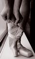
| 07/27/2005 03:25:23 PM |
Dancer's Necessitiesby pidgeComment: Very elegant. I really like the lighting. Not too crazy about the window ledge background. Appears to be a platform more appropriate for a gymnist (balance beam). |
| Photographer found comment helpful. |
| 07/27/2005 03:21:44 PM |
Paybackby kmanzComment: Good use of lighting and shadow. Appropriate for B&W. The angle looks kind of awkward. A tighter picture of this subject probably would be nicer. |
| Photographer found comment helpful. |
| 07/27/2005 03:20:08 PM |
Cant Stand it Anymore.by ElickzerComment: Boy, i don't know. First of all, there doesn't seem to be enough light overall except at the one end of the carrot. Also, the yellow hue on the right side is not very pleasing. The shadow and the reflection of the blade on the wall is kind of neat. |
| Photographer found comment helpful. |
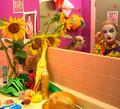
| 07/27/2005 03:17:11 PM |
"Clowning Around"by tmorninglory96Comment: WOW! What a collision of colors. Very busy with lots to look at. My only complaint - Way too much yellow. I think all it would need is to have the color cast removed. |
| Photographer found comment helpful. |
Home -
Challenges -
Community -
League -
Photos -
Cameras -
Lenses -
Learn -
Help -
Terms of Use -
Privacy -
Top ^
DPChallenge, and website content and design, Copyright © 2001-2025 Challenging Technologies, LLC.
All digital photo copyrights belong to the photographers and may not be used without permission.
Current Server Time: 08/27/2025 07:55:35 PM EDT.