| Image |
Comment |
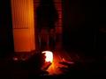
| 04/27/2005 01:54:25 AM |
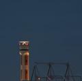
Radarby ceyvalComment: This is minimalist in the classic sense more than in the only-small-portion sense, but I'm not docking points for that. Unfortunately, the eye is drawn to the light at the top, which seems blurry, and I do dock points for that. The image is also somewhat drab. Boosting contrast might have helped. |
 Photographer found comment helpful. Photographer found comment helpful. |
| 04/27/2005 01:51:29 AM |
A Dogwood's Requiem for Springby rblantonComment: Well, it's certainly minimalist, and even pretty, in sort of an abstract way. Unfortunately, I have absolutely no idea what it is that I am looking at, and I'm not getting much help from the title. Also, the item-on-solid-color motif is somewhat uninspired. |
| Photographer found comment helpful. |
| 04/27/2005 01:49:06 AM |
Wall Flowerby sharkavComment: Nice texture on the wall, and an interesting color match, but there seems to be glare on the flower and the shadow in the lower right seems unbalancing. |
| Photographer found comment helpful. |
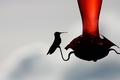
| 04/27/2005 01:48:03 AM |
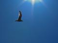
Peaceby kosmikkreeperComment: The slight halo around the bird is distracting. The light in the feathers would be nice if it weren't against a blue sky. Also, whatever it is at the top that I guess is supposed to represent the sun looks completely artificial. |
| Photographer found comment helpful. |
| 04/26/2005 05:27:30 PM |
Spring Is Here!!by rexComment: I actually like having the background as it is. It provides a sense of context. The slight greenish cast is unfortunate, as is the way the edge got chopped off during the framing. |
| Photographer found comment helpful. |
| 04/24/2005 10:41:41 PM |
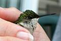
hummingbird1.jpgby BeagleboyComment: That's a beautiful sheen on the top feathers, and a deadly looking beak. I can believe it was shot at ISO800, though: the grain is still visible in the solid color areas of the background. Did you run it through any noise correction, or is this straight out of the camera? |
| Photographer found comment helpful. |
| 04/24/2005 10:39:10 PM |
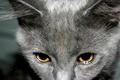
It's the eyes.jpgby ErnstComment: Very pretty, almost haunting. The wisps of fur coming off of the ears look somewhat surreal. The forehead is oddly blurred, in contrast to the areas right around it. I would be interested in seeing if it would look better with some selective sharpening. |
| 04/24/2005 09:11:43 PM |
|
| Photographer found comment helpful. |
| 04/20/2005 02:26:41 AM |
R&Sby figmentComment: I unfortunately can't make out exactly what this picture is of, exactly. |
| 04/20/2005 02:23:08 AM |
Big Red Rockby beamsclanComment: Saturation seems overdone, and the image could probable use some contrast boosting. |
| Photographer found comment helpful. |
Home -
Challenges -
Community -
League -
Photos -
Cameras -
Lenses -
Learn -
Help -
Terms of Use -
Privacy -
Top ^
DPChallenge, and website content and design, Copyright © 2001-2025 Challenging Technologies, LLC.
All digital photo copyrights belong to the photographers and may not be used without permission.
Current Server Time: 08/22/2025 11:27:23 PM EDT.